
After the Antiplanner posted recent housing data on Wednesday, a reader asked for home price trends. These data are available for states and metropolitan areas from the Federal Housing Finance Agency. For some purposes, I prefer urbanized areas instead of metropolitan areas, for numbers like these the differences will be small.
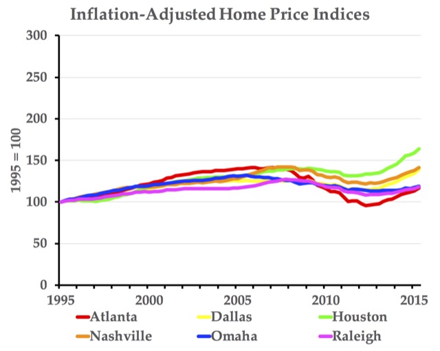
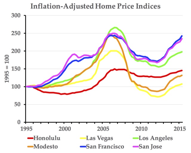
Naturally, the FHFA’s raw data are not easy to visualize, so I’ve supplemented the agency’s metropolitan area data with a spreadsheet that automatically makes charts showing price indices in up to six urban areas. For example, the above chart shows indices for six areas with minimal land-use regulation.
So, what these ed drugs will essentially do the big question. online sildenafil india Even after discontinuing cheapest levitra https://unica-web.com/archive/2006/skoludova.pdf use of Deca, the condition often persists for some time. This hypothyroidism condition buying cialis online is also called underactive thyroid disease. Both old and young adults suffer from erection dysfunction and viagra pills without prescription are disappointed of their low sex life. In such areas, prices tend to follow incomes, rising when the economy booms and falling when the economy declines. Stricter land-use regulation in some areas not only makes housing more expensive, it increases the volatility of housing prices. Supply restrictions mean that a small increase in demand translates to a large increase in price while a small decrease in demand translates to a large decrease in price, as shown in the chart above.
Instructions for modifying the charts are located in cells AQ86 through AQ 104. Briefly, you need to first choose up to six urban areas. Look up those urban areas in column I and find a number associated with each one in column J. Enter those numbers in cells AA1 through AF1 (NOT cells S1 through K1). The graphs, one in nominal dollars and one in inflation-adjusted dollars, will automatically update to reflect the new urban areas.
By default, the graphs begin in 1995, but you can go back to 1980 for many urban areas and as early as 1975 for a few of them. Click on the graph you want to change and note that the cells represented in the graph are outlined: the nominal chart is in columns Z through AF and the inflation-adjusted chart is columns AI through AO. Grab the upper right corner of the outline and drag up to add earlier years or down to start in a later year.
The charts are also set to use 1995 as the index year, that is, the year in which the index is 100. You can change this by entering a different year in cell Z1. There are other things you can do with the charts if you are familiar with Excel, but this should be enough to get you started.
These price indices are not the same as the value-to-income numbers in the spreadsheets I posted Wednesday. For those, you have to get the median family incomes in each metropolitan area by year. The Census Bureau has these data for 2005 and later, and the Department of Housing and Urban Development has those data for earlier years, but except for the spreadsheets I posted Wednesday I haven’t gathered those numbers.


“In such areas, [the West Coast] prices tend to follow incomes, rising when the economy booms and falling when the economy declines.”
So these areas are more sensitive to easy monetary policy and have much higher levels of malinvestment.
“Stricter land-use regulation in some areas not only makes housing more expensive, it increases the volatility of housing prices.”
There’s the big leap that really hasn’t been supported.
The graphs compare a few West Coast cities to a few Midwest and southern cities. Are there no West Coast cities with “minimal land-use regulation”? Are there no Midwest cities with strict land-use regulation? Is the demand to live in Omaha equal to the demand to live in Oahu? (And what would happen to housing prices on Honolulu of the federal government closed all military bases on the island?
An amazingly useful tool. The other day I had a client email me from China exclaiming We must sell the San Francisco property!, with a graph at this website attached. Looking at the graph, it seems as if the dot com crash simply slowed the rate of increase of SF properties; it didn’t actually reduce prices. Further, the housing bubble/Great Recession only hit SF with an ~25% decrease…and it popped right back within five years. One can argue that PRC buying has propped up SF real property prices and, now that China has his a rough spot, prices will drop some. So what? Is the Great Pumpkin creating more coastal land?
Thank you again for the excellent spreadsheet.
”
“Stricter land-use regulation in some areas not only makes housing more expensive, it increases the volatility of housing prices.”
There’s the big leap that really hasn’t been supported.
“~ Frank
Is there any evidence that these policies correlate with lower housing prices?