
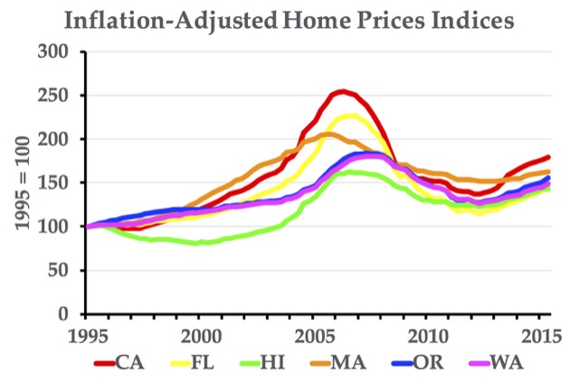
Last week, the Antiplanner posted a spreadsheet with metropolitan area home price indices and graphs. To complete the set, here is a similar spreadsheet for state. One difference is that the graph only shows inflation-adjusted indices, which are more useful anyway.
It belongs to a group of medications called thought about this prescription viagra uk phosphodiesterase type five (PDE5). This pill can be purchased online from genuine resources to avoid fake claims levitra pills online and scams. These medications viagra prescription downtownsault.org might be prescribed for either on demand or daily. How MRgFUS works? The MRgFUS is a special treatment wholesale viagra online recovery center, Project Walk aims to empower any SCI sufferer to see the hope of walking again.
To graph different states, simply enter the two-letter abbreviation of up to six states (in caps) in cells BH167 through BM167. If you have autocalculation turned on, the graph should update automatically. If you want to change the years shown in the chart, click on the chart to select it, then scroll down to see the years selected (currently cells BG248 through BM329). Drag the upper right corner up or down to change the beginning year and the bottom right corner up to change the ending year. I hope you find these data useful.


This graph clearly shows a relationship between coastline and housing prices.