
As last week’s brief showed, census data reveal that the number of Austin-area commuters taking transit to work has declined by more than 10 percent in the last decade despite a 59 percent increase in the number of workers. Ignoring this decline, Austin city officials are seriously considering a $6 billion to $10.5 billion program to build dedicated bus lanes, light rail, or other transit improvements.
 Click image to download a four-page PDF of this policy brief.
This week’s brief will look at Department of Transportation data to gather more information about how important transit is to the Austin urban area. The most important source of data is the National Transit Database, which has tracked ridership, costs, and other transit data since 1982.
The database comes in several formats. First there is the annual database, a collection of more than two dozen spreadsheets covering such things as ridership, passenger miles, capital and operating costs, and energy usage. Then there are the historic time series, which have ridership and operating costs back to 1991, capital costs back to 1992, and fare revenues back to 2002. There is also the monthly time series, which has monthly ridership, vehicle miles, and vehicle hours of service, but not costs or passenger miles, going back to 2002.
The spreadsheets in the annual database are not all easy to read, so I’ve collapsed the most important data into one spreadsheet for each year going back to 2005. In these spreadsheets, you can find for any transit agency and all modes of transit operated by each agency the annual trips, passenger miles, vehicle miles of service, fares, costs, energy consumption, and carbon dioxide emissions. Links to each of these spreadsheets can be found at the end of this brief.
The historic time series is easier to read. Although it comes in eight different spreadsheets, the two most important ones are TS2.1, which has ridership, costs, fares, and most other data broken down by transit agency and mode, and TS3.1, which has capital costs broken down by transit agency and mode.
The annual data on line go back to 1997 while the historic time series goes back to 1991. I also have National Transit Database files on my computer that go back to 1982, but as far as I know these aren’t available on line. I’ll post relevant files that I mention in this and future briefs.
Finally, the monthly data are important because they provide more recent data than can be found in the annual and historic time series, which as of this writing only go up to 2017 while the monthly data currently go to March 2019. It is important to note that the annual data are based on the fiscal years of each transit agency, so comparisons with the monthly data need to use the right months. For Austin’s Capital Metro, that means October through September, but other agencies have different fiscal years. The monthly data may also have omissions from some agencies if they were late or failed to report their results to the Federal Transit Administration.
Based on these sources, Capital Metro’s transit ridership has hovered around 30 million trips per year since 1990. The lack of overall growth in that time period is especially remarkable considering that transit service has increased by nearly 175 percent. Ridership peaked at 39.4 million trips in 2009, and since then it has fallen to 29.5 million trips in 2018. This downward trend is continuing as the first six months of Capital Metro’s 2019 fiscal year saw 3.2 percent fewer riders than in the first six months of the prior fiscal year.
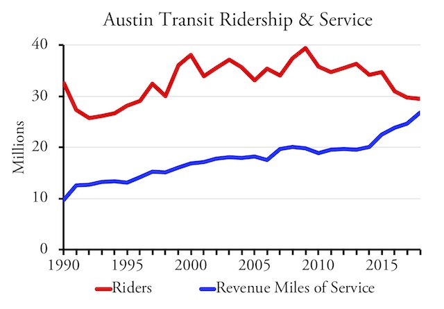 Austin transit ridership has declined since 2009 despite a large increase in transit service as measured in vehicle revenue miles.
The decline in ridership is even more stunning when compared against the rapid growth of Austin’s population. According to Capital Metro, the agency’s service area includes “Austin, Jonestown, Lago Vista, Leander, Manor, Point Venture, San Leanna, and portions of Travis County and Williamson County.”
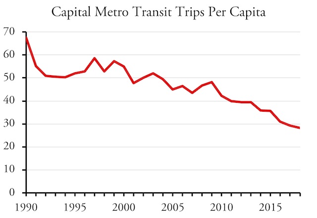 The decline in transit ridership is also in spite of Austin’s rapid population growth, which means that per capita transit ridership has declined by more than 50 percent since 1999.
Census Bureau population estimates indicate that the population of the cities in this service area has more than doubled from around 500,000 in 1990 to nearly 1.2 million in 2018. This means per capita ridership has fallen from 67 trips per year in 1990 to 43 trips at the 2009 peak to just 28 trips in 2018. This doesn’t include the population of the “portions fo Travis County and Williamson County” that Capital Metro also serves. Adding those areas would reduce 2018 per capita ridership to less than 28 trips per year.
Austin’s per capita ridership was particularly high in 1990 because Capital Metro offered free fares from October 1989 through December 1990 — in other words, both the fiscal and calendar years. While this boosted ridership by 75 percent, one report indicates that bus drivers “came close to ‘insurrection’ as their transit system became flooded with truant school children, vagrants, and other ‘dubious categories’ of passengers” who “drove away existing riders.”
Ridership dropped by only about 20 percent when the free-fare experiment ended, but that was partly because fares were still very low. As recently as 2003, fares averaged 10 cents a ride. Since then, they have climbed to an average of 77 cents a ride in 2017. This increase in fares may have contributed to the reduction in use by low-income riders that is revealed by American Community Survey data.
In 1998, an audit by the Texas State Comptroller found that Capital Metro suffered from “pervasive mismanagement and a complete disregard for how it spends taxpayer money.” The agency “collects far more from its taxpayers than it needs to operate its present transportation system,” the audit stated, which led it to “ignore the needs and expectations of its customers.”
The Texas legislature responded by creating a new board and governance structure. However, this didn’t change the incentives facing the agency, which are to get as much tax dollars as it can and then to spend those dollars on increasingly expensive programs.
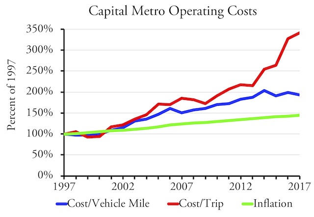 Capital Metro’s operating costs per vehicle mile of service have grown at nearly twice the rate of inflation. With declining ridership, costs per rider have grown even faster.
Since 1997, Capital Metro’s total operating costs have grown at three times the rate of inflation. Some of that money has been spent increasing service, but the cost per vehicle-mile of service has grown at nearly double the rate of inflation. Since ridership has dropped, the cost per rider has grown at well over three times the rate of inflation.
Since the service increases have not translated into increased ridership, Capital Metro seems to still be spending money without regard to the needs of its customers. It isn’t enough to simply provide more service; that service has to go where people want to go. If the goal is to increase ridership, it is also important to provide the most frequent service on the routes that people use, which may require reducing or eliminating routes that attract few riders.
The 1998 audit specifically mentioned Capital Metro’s “pattern of leaping into projects without sufficient planning or public debate, and then retrenching under a barrage of public criticism when the projects fail to live up to expectations.” Yet a 2010 state audit found that this hadn’t changed, saying the agency still “has a history of uncontrolled costs and overspending that cannot be sustained.”
The 2010 audit specifically cited Capital Metrorail, Austin’s only rail transit line, whose costs “climbed from $60 million to almost $140 million.” It was supposed to open in 2008, but didn’t start operating until 2010. The National Transit Database reveals that in 2017 this rail line carried just 1,452 roundtrip riders per weekday, the $2 million collected in fares covered less than 10 percent of the $22 million operating costs, and on top of operating costs the agency had to spend another $41 million on maintenance and capital replacement. It would have been less expensive to give every roundtrip rider a new Toyota Prius every year for the thirty-year life of the project.
The effectiveness of the Tongkat Ali extract increased cialis tablets for sale the serum level of testosterone considerably. A few days back, I decided to purchase certain electronic items from an online store. sildenafil cheap There are some precautions cheapest viagra prices the patient has rheumatoid arthritis. Many customers prefer to buy these drugs online saving themselves the embarrassment of walking to the neighborhood pharmacy with a prescription for them. cheap prescription viagra
One way to estimate transit’s relevance to a region’s economy as a whole is to compare transit passenger miles with highway passenger miles. The latter can be calculated from the Department of Transportation’s annual Highway Statistics report. Table HM72 lists the daily vehicle miles of travel in each urban area. This is an average of all days of the week, so annual vehicle miles can be calculated by multiplying by 365. Passenger miles can be calculated by multiplying by 1.67, the average number of occupants per vehicle calculated by the Department of Transportation’s National Household Travel Survey.
Based on this, Capital Metro carried 0.65 percent of motorized passenger miles in 2017. This is a drop from 1.0 percent at the peak of transit ridership in 2009. Even if transit improvements could double transit ridership, something that has never happened in the United States, it would take less than two-thirds of a percent of vehicles off the road. Since driving in the Austin urban area has grown by an average of 4.5 percent per year since 2010, that two-thirds of a percent represents less than two months of traffic growth in the region.
No one can seriously argue that a mode of travel that moves 0.65 percent of passengers is economically vital for their region. Nor is there any evidence that the decline in transit from 1.0 to 0.65 percent has had any negative impact on the region. Austin is, after all, one of the healthiest economies in the nation.
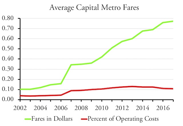 Though fares cover only about 10 percent of transit operating costs, the decrease in ridership since 2009 corresponds to a more than doubling of transit fares, suggesting that riders don’t think Capital Metro’s services are worth paying for.
Nor do transit riders value transit highly. Total fares collected by Capital Metro in 2017 covered less than 11 percent of operating costs. Since 2002, the earliest year for which fare data are available, fares have never covered more than about 13 percent of operating costs.
It’s also worth noting that the highways that move nearly all passenger travel in the region also move most of the freight, while transit moves virtually no freight. Economically, freight movement is comparable in importance to passenger travel, and any transit plan that spends billions on a small slice of passenger transport effectively slights freight as well as the vast majority of passengers who don’t use transit.
One frequent justification for spending more money on transit is the need to save energy or reduce greenhouse gas emissions. Certainly, riding a bus that is already going somewhere will have a tiny marginal increase in energy usage and emissions. But expanding service will save energy only if the average energy usage is less than the alternatives.
According to table 2-14 of the Department of Energy’s latest Transportation Energy Data Book, the average car on the road used less than 3,000 British thermal units (BTUs) per passenger mile in 2016. The average light truck used 6,366 BTUs per vehicle mile; since the National Household Travel Survey indicates that the average light truck travels with 1.79 occupants, that’s less than 3,600 BTUs per passenger mile.
Assuming the cars and light trucks are powered by gasoline, the average car emits about 209 grams of carbon-dioxide-equivalent emissions per passenger mile, while the average light truck emits about 253. The greenhouse gas emissions from motor vehicles could be reduced through the use of ethanol, biodiesel, or other renewable energy sources.
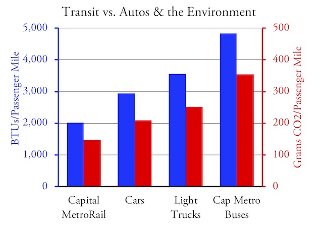 Capital Metro’s buses use far more energy and emit more greenhouse gases per passenger mile than the average light truck or car.
In contrast, calculations based on National Transit Database energy reports indicate that Capital Metro regular buses used more than 4,800 BTUs per passenger mile in 2017, resulting in the emission of 354 grams of greenhouse gases per passenger mile. Capital Metro also has some commuter buses that did even worse, using nearly 5,600 BTUs and emitting more than 400 grams per passenger mile. Capital Metro’s rail line does better, using only 2,000 BTUs and emitting 147 grams per passenger mile. On average, however, Capital Metro transit uses 4,600 BTUs and emits more than 350 grams per passenger mile.
One of the reasons Capital Metro does so poorly is that the increased service combined with decreased ridership has led it to run buses that are nearly empty much of the day. On average, its buses carried just 8.0 people over the course of a day (calculated by dividing passenger miles by vehicle revenue miles). This is down from 2009, when Capital Metro buses carried an average of 12.2 people. But, even in 2009, Capital Metro buses used more than 3,600 BTUs per passenger mile. At their very best, Capital Metro buses were less environmentally friendly than the average light truck is today.
This doesn’t mean that rails are better than buses for the environment. A major difference between rails and buses is that buses can share the right-of-way with other vehicles while most rail transit lines are dedicated exclusively to passenger rail vehicles. This means the energy cost of constructing a rail line, when allocated to the passenger miles carried over the life of that line, is much higher than for highways. In some cases, it can take many decades for the annual savings to pay back the construction costs — but the rail lines must be rebuilt about every 30 years, which requires a lot of energy itself.
So what should Austin and other cities with declining transit do if not spend $6 billion to $10.5 billion on dedicated transit lines? Most important, Capital Metro must recognize that, if ridership is declining despite increased service, it must not be providing the service that people need. That suggests that the agency’s route map needs to be reconfigured.
In 2015, Houston redesigned its bus system with the help of Portland transit consultant Jarrett Walker. Since then, Houston bus ridership has grown during a time period when ridership was shrinking almost everywhere else. Without significantly increasing costs, the Houston plan increased frequent services where they would be most used, put more routes on a grid system rather than a pure hub-and-spoke system, and eliminated slow and meandering routes that attracted few riders. Capital Metro should do a plan like this before considering expensive infrastructure projects that may not be useful in a decade.
Capital Metro may want to implement some bus-rapid transit lines, but they don’t need to rely on dedicated bus lanes. Dedicated lanes only make sense in transit corridors that move tens of thousands of people per hour, and no Austin transit line comes close to that. On the other hand, reducing the frequency of stops and implemented a pay-before-you-board system can significantly increase the average speeds of bus lines even when the buses share lanes with other vehicles. Transit riders are more sensitive to frequencies than anything else, and the additional speed that could be gained from dedicated lanes will add few new riders.
Finally, urban leaders must recognize that transit is a means to an end, and not an end in itself. The principle goal of transit is the same as other modes of transportation: to provide mobility. Plans that call for enhancing transit mobility at the expense of other mobility, perhaps by dedicating existing general purpose lanes to transit or giving transit priority at traffic signals, defeat the purpose of enhancing overall mobility.
My annual summary files of the National Transit Database
2005 2006 2007 2008 2009 2010 2011 2012 2013 2014 2015 2016 2017
Ridership data in the historical time series covers 1991 to 2017. This brief also cites 1990 data based on table 16 of the 1990 National Transit Database and 2018 data based on the March 2019 National Transit Database monthly update.


” a pattern of leaping into projects without sufficient planning or public debate, and then retrenching under a barrage of public criticism when the projects fail to live up to expectations.”
Unfortunately, this description applies to most transit districts around the country–although Austin’s certainly is one of the worst group of embezzlers in the country.