Home Price Data and Highway Update

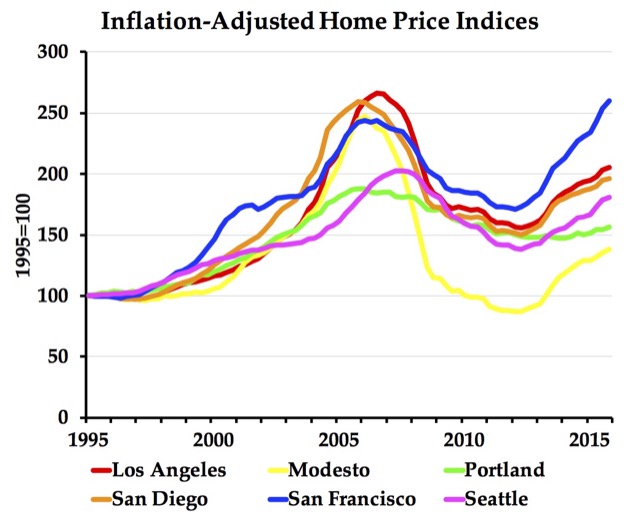
The Federal Housing Finance Agency (which oversees Fannie Mae and Freddie Mac) has published home price index data through the fourth quarter of 2017. These data go back as far as 1975 for the states and many urban areas.

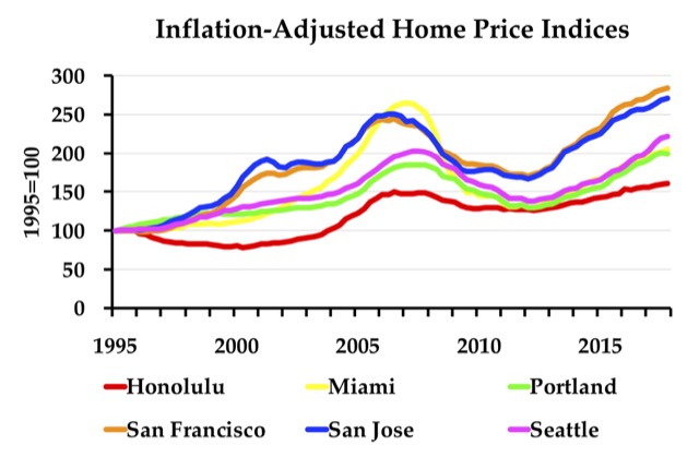
The Antiplanner has posted enhanced spreadsheets that use the raw data from the state and metropolitan area files to create charts like the one above showing housing trends. The metropolitan area spreadsheet allows users to create charts showing price indices in nominal dollars or dollars adjusted for inflation. The state spreadsheet only creates charts for inflation-adjusted indices. Continue reading

San Francisco Home Prices Are Far Out, Man

Last week, the Federal Housing Finance Agency released its quarterly home price indices for the fourth quarter of 2015, so we now have a 41-year time series for every state and many metropolitan areas. The numbers show that, even after adjusting for inflation, housing prices in the San Francisco Bay Area have exceeded prices during the peak of the housing bubble.

The data show that prices are also rising for some metro areas, such as Houston and Dallas, that didn’t bubble in the 2000s (see chart below). However, this increase is due to higher incomes in those areas; the home value-to-income ratios have remained about the same, while those for the metro areas in the above chart have increased from the post-bubble crash. Austin’s increase is partly caused by strict regulation in the city, though many of its suburbs remain affordable.

Continue reading