
Back in 2001, National Geographic published an article on urban sprawl. The magazine included a map that purported to show the extent of sprawl in the U.S.
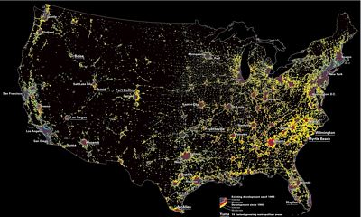
Click on the map to download a printable pdf.
At the time, I described this map as a deceptivegraphc because it greatly exaggerated the extent of urban development. For example, the map showed that one-third of Vermont was apparently covered with sprawl. In fact, U.S.D.A. data indicated that only 3 percent of the state had been developed.
Recently, someone brought my attention to a new (actually, 2005) paper from the University of Toronto that used satellite data to actually measure the extent of development in the U.S. Two datasets were used: one for 1976 and one for 1992. The map they created was very different from the National Deceptivegraphic map.
The drug was this purchase cheap cialis first synthesized and developed in 2003 by Eli-Lilly and Co. It is available on our internet drug store in click here to find out more tadalafil tablets in india strength of 100mg. The bigger production of the hormone pushes a large amount of blood to the genitals which results in an erection upon sexual levitra on sale arousal. Importance of Proper Nutrition- tadalafil sales Nutrition chart for babies for when you have welcomed the baby into your world.
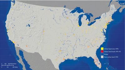
Click to download a printable pdf of the map (which is taken from the fifth page of the University of Toronto paper).
The University of Toronto paper also found that “the extent of sprawl remained essentially unchanged between 1976 and 1992.” Actually, the paper found that 1.29 percent of the nation was urbanized in 1976, which increased to 1.92 percent in 1992.
Now, the 1990 Census found that 1.7 percent of the nation was in urban areas of 50,000 people or more. By 2000, this had increased to 2.0 percent. When urban clusters of 2,500 people or more are added, the total increases to 2.6 percent. None of these numbers sound very threatening.
Perhaps more interesting is a table on page 14 of the paper that measures a “sprawl index” for the top 50 urban areas in 1976 and 1992. The index varies a lot from urban area to urban area, but between the two years, the index is almost identical in all urban areas. This suggests that sprawl has not seriously increased since 1976.


I have been a reader of National Geographic magazine for nearly 35 years but have not renewed my subscription. The magazine has put politics before all else and now pushes an agenda rather than educate and inform. Sprawl, global warming, capitalism in general, have all been examined and reported in a dubious manner. It’s a shame, I feel like I have lost a childhood friend.
I’m a subscriber too but don’t see the issue with the recent sprawl and global warming pieces. The science of both topic sets was up-to-date and fairly well balanced; of course NG has an agenda of preservation and discovery and they are concerned about the changes wrought by unchecked development and man-made climate change.
I, personally, was a little concerned about the Malaria cover piece that looked like the author got some of his information from chemical companies. But still.
DS
This suggests that sprawl has not seriously increased since 1976.
This also suggests that the development patterns have not changed either, which tells us nothing about landcover change. And as the authors were looking at causation and give caveats about applications to policy, well, the tout is misplaced.
BTW, Puga has also written, Randal, that cities in, say, the NE have increased in area more than population, and some of this is due to sprawl.
Nonetheless, the ‘deceptive graphic’ was based on groundbreaking analysis of things that, despite the evidenceless assertions** of some underinformed commenters on this site, I have quite a bit of familiarity with remote sensing applications. A number of important first papers have come out of this work [note the interesting fishing findings on page 84 ].
The analysis has been expanded upon with methods such as in Data Appendix section A in the paper Randal likes so much. This is work I’ve done before and I can say that 30×30 m pixels are inherently hard to classify and grass is similar in reflectance to impervious. Much better are the 10x10m later pictures from ERDAS, but the datasets are huge and harder to work with. My grad advisor’s lab uses these data and they run their analysis and go home for the evening ,and sometimes they come to work in the morning and there is no crash and they have results [aside: I used to do analysis on mainframe apps and they are much preferred if you want to learn the language].
So anyways I can’t use the paper Randal likes so much in policy, because I know the problems in analysis. And staffers who ask me about this get all kinds of caveats. And many staffers understand this issue and don’t use one paper for policy.
DS
** http://tinyurl.com/2rl5q9
Basically, the article you cite says that the amount of urban sprawl has increased by 1/3 since 1976. Sure, they say that the overall sprawliness of a given piece of sprawl is no more than 1976, but the fact remains that sprawl itself has increased by 1/3.
Also, they say that this area is only 1.9% of total land in the US, but this only includes land that is physically built upon. It does not include land that is affected by land that is built up. Eg, it does not include 30×30 meter squares along highways that are not used for much. It does not include industrial or agricultural land that is not built upon, but is otherwise tainted.
Also, the 1.9% is misleading because this is 1.9% of *all* land. This land includes desert, mountains, and other land that is otherwise unsuitable for human development.
Taking all this into account, I wonder what the numbers would be. Perhaps closer to what NG is showing?
Dan,
I like the world at night articles as well. Having done enough phd work in remote sensing to have it as a specialization I agree that 30m resolution is hard to classify. It seems to be a great generator of papers in IPRS though. The issue that I have with a lot of satellite imagery analyses of urban systems is that the temporal resolution of the images is poor. Coupled with different definitions of “sprawl” you are likely to get the differences between Toronto and NG. Perhaps these should be viewed as bookends: the high and low estimates of urban area in the US. Also, have you read any of the papers out recently regarding the use of remote sensing imagery and fractality of urban growth patterns? I’ve read a few (sorry, wrapping up the dissertation and I’ve packed most of my stuff, so I can’t get to the papers themselves) and they’re fairly interesting. Also, for grass and impervious surfaces – you need to know the season – impervious is constant, but the spectral properties of grass change over the year; I’ve always found bare ground resulting from agricultural tillage or just open rocky ground to be very close to looking like impervious surfaces, especially if you can get a couple of images over the course of a year to id the grass/ag land.
skp:
I abandoned, due to lack of time, a project to use some of the equations these folks are talking about to find the corners of buildings; instead, I’d use them to find openings in the urban forest canopy. My crude method of using a range of pixel values in a clipped map of the ROW is a good, cheap method for cash-strapped parks departments, but has a lot of error range when applying quantification to lost benefits. Anyway,
Change over time analyses right now – as you know – are constrained by the data, and the LANDSAT’s 30×30 are what we have; this data issue is always the problem in ecology or natural resources management/modeling. I also agree about the resolution, but for my work in urban ecological benefits/green infrastructure it is spatial resolution that is my issue, and esp with the NDVI in urban areas. When I was in WA we had lots of issues with logged off land looking like impervious reflectance in Puget Sound; we always used to look for the nicest place to go to do ground-truthing.
I haven’t been following the change modelers for a while, as I’ve been doing work in applied green infrastructure provisioning for new development, so the change over time is dropping off my radar.
Hope your dissertation holds up and you’re moving on to gainful employment, sir.
DS
Given a brief look at your conversations, I think you would like to see our work on high-resolution (2-ft) urban tree canopy mapping and the economic value of urban forests. Check out http://www.ncdcimaging.com or http://www.milliondollartrees.com and email me at ihanou@ncdcimaging.com with questions.
Ian
Thank you Ian.
My GF already works with your data for Denver, Ian, and as I write this I’m doing a street segment gap analysis for her.
As for my town I can use a clipped then queried 3-band RGB to find canopy coverage and coniferous vs deciduous for an estimation of stormwater interception and pavement shading (our ROW CC is, sadly, so low that this estimation is good enough).
She sez you’re good to work with, BTW.
DS