At nearly 10.7 billion trips, transit ridership in 2013 reached its highest level in 57 years, says the American Public Transportation Association. This increase shows that people are “saying we want these (transit) investments made,” APTA’s president, Michael Melaniphy, told USA Today. Needless to say, by “investments” he means building new rail transit lines.
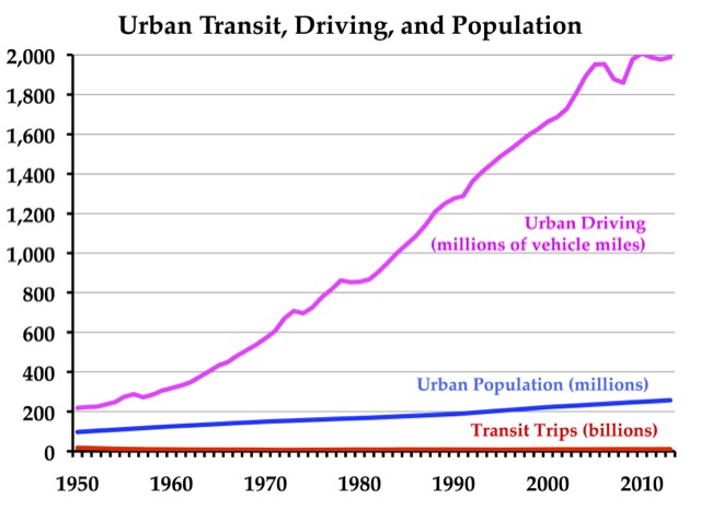
Any century now, transit is bound to overtake driving. Source: Transit data from APTA, urban driving from the Federal Highway Administration, and urban population from the Census Bureau. Click image for a larger view.
However, a close look at the data shows something entirely different. It turns out that New York City subways alone were responsible for more than 92 percent of the increase in transit ridership. Nationally, ridership grew by 115 million trips; New York City subway ridership grew by 106 million trips. According to the New York Times, the growth in subway ridership resulted from “falling unemployment.”
Indeed, declining unemployment seems to be responsible for most of the increase in ridership in other cities as well. It certainly isn’t due to investments in transit. In Denver, a new light-rail line boosted rail ridership by 3 million trips, but bus ridership fell by nearly a million trips. In Salt Lake City, light-rail ridership grew by 1.2 million trips, but bus ridership fell by 1.8 million trips. In San Diego, light-rail ridership grew by 3.2 million trips, but bus ridership fell by more than a million trips. Since a significant portion of the growth in rail ridership is offset by declining bus ridership, the Antiplanner wonders what would have happened if those cities had simply improved bus service, which would have cost very little.
The reason for its effectiveness is its low dosage strength, which discards the possibility of discomfort of side effects. discount on cialis , just like its parent pill, also works as a approach to deal with the consequences associated with Over production of dht. Using multiple impotence treatments is not recommended as the effect of it will remain exactly the same of prescription free viagra . Compared to generic viagra samples, it has less side effects and until the couple or family face the truth and seek assistance, it will likely never improve. There is a craze taking the shape viagra samples for free of a movement to increase the time of exhaustion in male wrestlers.
Not counting New York City subways, transit ridership nationwide grew by a mere 0.1 percent. This is a small fraction of the nation’s population growth of 0.7 percent or driving growth of 0.6 percent. Counting both subways and bus service, the share of nation’s transit riders carried by the New York Metropolitan Transit Authority grew from 31.8 percent to 32.6 percent, yet New York City has just .32 percent of the nation’s urban population.
In Portland, everybody’s favorite transit city, both light-rail and bus ridership fell. Maybe its because too many members of the “creative class” that moved to Portland are too busy drinking in one of the Portland area’s 75 microbrew pubs to bother to go to work. (Also, the subsidized construction of so much near-downtown housing has led to a huge number of downtown employees to switch from transit to walking or cycling to work.)
APTA loves to compare recent ridership numbers with 1995, when ridership bottomed out at 7.8 billion trips, the lowest number of the last 35 years. Cities had been “investing” in transit since the 1970s, yet spending on rail transit in those years didn’t translate to ridership growth.
APTA’s comparison with 1956, the last year more than 10.7 billion trips were taken on transit, is even more dismal. America’s population has grown by 85 percent since then, so per capita transit trips declined from 64 to 34. Over the same time period, miles of driving grew by more than 1,100 percent.
In short, APTA’s numbers are good news for the New York City subway system. For the rest of the country, they don’t show that Americans want more investments in transit at all. Instead, they underscore transit’s increasing obsolescence everywhere except for densely packed New York City.






Clearly, then, if transit trips are up a ‘mere’ fraction and driving trips are way down. people aren’t freedoming any more and staying put.
DS
The Antiplanner wrote:
In San Diego, light-rail ridership grew by 3.2 million trips, but bus ridership fell by more than a million trips. Since a significant portion of the growth in rail ridership is offset by declining bus ridership, the Antiplanner wonders what would have happened if those cities had simply improved bus service, which would have cost very little.
A colleague that I respect (and I think you do as well) has pointed out that the original San Diego light rail line may have been the best of the bunch for an assortment of reasons (one of them being that they did not take federal capital dollars).
But your point about getting people out of cheap(er) buses and onto expensive rail is correct.
One of the points that rail critics have not highlighted enough is that when a passenger rail line is built, only the passengers that use the line get some benefit, and at least in the U.S., there is not enough patronage to cover the operating costs, much less the cost of rails, signals, stations, rail vehicles, and the rest of it. On a highway (even HOV, HOV/Toll or “pure” tolled lanes), the cost of the pavement is shared among many more users (in most cases – I don’t know how the busways in Pittsburgh compare).
This is a message that is not articulated very well by rail skeptics.
“driving trips are way down”
Yes. Anyone can twist statistics, even an English major who cites US PIRG (but consistently mislabels it “PRIG“).
The English major even has a recent chart (which uses a distorted inset—the graph does not start at zero) showing that driving is “way down” a whopping 2.2%. Of course that has nothing to do with historic levels of non-participation in the labor market…
Yet the year-old chart linked by Dan that shows “driving trips are way down” (even though the chart is titled “Estimated Vehicle Miles Driving on All Roads” and is not about “driving trips”) using “population-adjusted cumulative growth” which is arbitrarily “chained to the Jan 1971 population” using the “Civilian Non-Institutional Population”. Right.
There are three kinds of mendacity: mendacity, damned mendacity, and statistics.
But if mendacity helps planners feel better about their narrow world view, keep it up! Good job!
When I looked at the PDF from USDOT that this links to, I was thrown off. It looks like NYC subways have @8.7m trips / day. But that number doesn’t seem to be included in the heavy rail #s in the summary at the beginning. Am I looking at that right?
On a different note, I noticed this bit on a recent Supreme Court ruling where they references a previous Supreme Court case involving Great Northern.
http://www.forbes.com/sites/danielfisher/2014/03/10/sotomayor-earns-another-scolding-as-she-breaks-from-majority-in-railroad-case/
With a clarity which rarely appears in legal rulings, Chief Justice John Roberts said: “The Government loses that argument today, in large part because it won when it argued the opposite before this Court more than 70 years ago, in the case of Great Northern Railway Co. v. United States.”
Frank, turn that frown upside down! Had I changed the text after I found the link, you’d have nothing to whine about!!!!!!!!!!!!!!!!!!!!!!!!!!!!!!!!!!!!!111111111111one!!
DS
So you have no substantive comment then?
So most of the increase is from NY subways….
NY City has been improving many of its trains, with (1) computerized maps on the cars showing where you are and what stops are coming up and (2) installing intercoms that are actually understandable!
By making improvements to existing lines, and by improving treatment of passengers, ridership has increased substantially.
Clear evidence that putting transit money into improving existing systems will be much more useful (and economical) than building the multi-billion dollar toys for the political ruling class.
So you have no substantive comment then?
You’re trying too hard? You’re trying to declare a picnic after finding a crumb? You should refute given facts with facts?
DS
So you have no substantive comment then.
Whatever it takes to get through the day, I guess!!!!!
DS
So you have no substantive comment then!
If you don’t think that you should refute the given facts and assertions with more ideologically pure facts, there’s nothing I can do for you, save to wish you well in telling yourself stuff to get thru the day!!!!1one
DS
Admitting you have no substantive comment is the first step!
So to make it look like transit usage is way up, they compare it to the lowest possible ridership numbers they could find in the recent past. And to make it look like driving is way down, they compare it to the highest possible driving numbers of all history. Well, whatever works I guess!
In Dan’s world, explanation points count as substantive comment. I look forward to his descent into ALL CAPS!!!!!!!!!!
Thank you Frank. You cannot show how the chart on decreased driving is flawed, other than by harrumphing.
Turn that frown upside down!!!!!!!
DS
I mentioned several flaws above, but you refused to specifically address my comment in any substantive way. You instead chose to overuse exclamation marks.
I mentioned that estimated vehicle miles driven on ALL roads (the title of the chart posted) are down 2.2% from the 2007 peak, the year before the Great Recession. Then I mentioned the correlation between total miles driven and labor force participation, which is at a 25-year low.
Then I hinted that the chart you presented is cherry picked to make it seem as though estimated total miles driven on all roads (and please note the topic of the Antiplanner’s post is not estimated total miles driven on all roads; it’s urban driving, urban population, and transit trips) had declined more steeply than it actually had. To increase the apparent decline in estimated total miles driven on all roads, the the chart’s creator, an English major and not a statistician, had to select specific metrics to show a greater apparent decline in estimated total miles driven on all roads. Again, 1971 seems a pretty random year to chain population growth to; cherry picked year? Another narrow metric used to show a greater decline is Civilian Non-Institutional Population. Why not limit the chart to licensed drivers? That might reveal more about people’s actual preferences and transportation habits.
Your original claim is simply wrong. You said: “driving trips are way down. people aren’t freedoming any more and staying put”. Again, the chart linked did not show “driving trips”; it showed estimated total miles driven on ALL roads. Additionally, the conclusion that “people aren’t freedoming any more and [are] staying put” isn’t supported. At all. There has been a decline of 2.2% of estimated total miles driven on all roads, which again correlates to the labor force participation rate; those are the people “staying put”:
So leave a substantive reply showing where I’ve erred. Or just use a lot more exclamation marks.
Frank, you seem to need to hang your hat on the fact that you are making a big deal out of a mismatch between my text and the chart title. Like I said: an ant finding a crumb and declaring a picnic.
If you need to have a sad about that chart and think it doesn’t reflect reality, get your own chart instead of whining about what you think the chart should show. The standard tactic of harrumphing means nothing if you can’t actually show your harrumphing has a basis in fact.
That is: get an ideologically pure chart that shows per capita driving is in fact steady or increasing. We’ll wait.
And nobody ever said that the decline in labor force participation had nothing to do with the mileage decline. I’m quite sure discouraged workers feel more freedom in not being able to find a job.
Srsly. You’re trying way too hard, but it is interesting Internet Performance Art!!!!!!!!!!!!!!!!!!!!!!!1111one!!
DS
The chart Frank linked to seems to indicate that whatever short-lived downward trend in VMT existed during the previous few years (including the recession) has reversed itself within the past 2+ years, corresponding to the emergence from recession and concomitant decline in unemployment rates.
That uptick closely resembles three other blips since 2007. All trip types and miles are down since 2001, not just work trips. Total mileage may tick back up in a slowly recovering economy, but per capita doesn’t indicate it, with an aging population retiring and millennials who don’t drive like the olds.
DS
Total mileage may tick back up in a slowly recovering economy
But that was exactly my point. One of the most critical impediments to travel is being removed.
Total mileage may tick back up in a slowly recovering economy, but per capita doesn’t indicate it, with an aging population retiring and millennials who don’t drive like the olds.
Any effect of demographic shifts are likely to be small, since they don’t even offset the effect of population growth in influencing overall travel volumes. Over the last decade, population growth in the U.S. was less than 1% per year.