Transportation Energy Costs

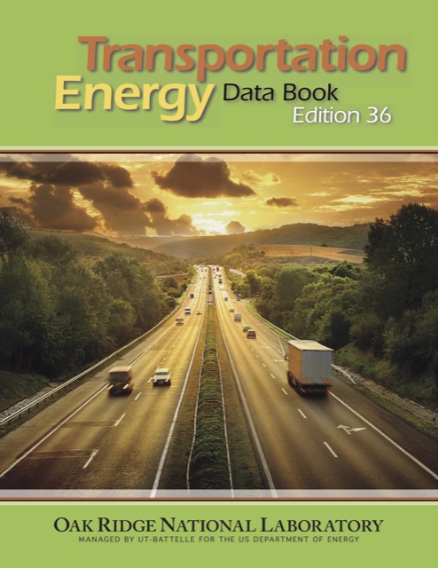
The average car on the road consumed 4,700 British thermal units (BTUs) per vehicle mile in 2015, which is almost a 50 percent reduction from 1973, when Americans drove some of the gas-guzzliest cars in history. The average light truck (meaning pick ups, full-sized vans, and SUVs) used about 6,250 BTUs per vehicle mile in 2015, which is also about half what it was in the early 1970s.

Click on the above image to download a 10.2-MB PDF of the above report. Use links below to download spreadsheets or individual chapters from the report.

By comparison, the average transit bus used 15 percent more BTUs per vehicle mile in 2015 than transit buses did in 1970. Since bus occupancies have declined, BTUs per passenger mile have risen by 63 percent since 1970. While buses once used only about half as much energy per passenger mile as cars, they now use about a third more. Continue reading

November 2017 Ridership Falls 1.9 Percent

Nationwide transit ridership in November 2017 was 1.9 percent lower than the same month in 2016, while ridership for the first eleven months of 2017 was 2.5 percent lower than the same period in 2016. If similar numbers are posted for December, then total annual ridership will have fallen below 10 billion trips for the first time since 2010.

These numbers are from the Federal Transit Administration’s November update to its National Transit Database. The update includes passenger trips, vehicle revenue miles, and vehicle revenue hours by month from January 2002 through November 2017, broken down by transit agency and mode. These numbers may be preliminary and might change slightly in later updates. These numbers are also for calendar years so will differ from the final 2017 report, which is based on each agency’s fiscal year. Continue reading

Transit Commutes Twice as Long as Driving

Americans spent an average of 25.2 minutes to get to work in 2016, according to the Census Bureau’s American Community Survey. Average travel times are calculated by dividing aggregate travel times in table B08136 by the number of commuters in table B08301, and both tables break the data down by driving alone, carpooling, transit, and walking. Other modes, such as taxi, motorcycles, and bicycles, are lumped together, which isn’t very useful as there is no reason to think that the would take about the same amount of time.

People who commuted by transit took nearly twice as long as people who drove, spending an average of 50.1 minutes vs. 25.4 minutes for people driving alone. People who walked took just 12.3 minutes, suggesting that people who walk live well under a mile away from their work. Carpooling added about 2.6 minutes to the times required to drive alone.

One reason transit takes so long is because it is slow. According to the American Public Transportation Association’s 2016 Transit Fact Book, transit speeds average just 15.3 mph. Driving in most American cities is twice that fast. Continue reading

2017: The Year in Transit

The year 2017 has been a nightmare for transit agencies across the nation. Transit carried fewer riders in the first ten months of 2017 than in the same months in 2016 in 46 of the nation’s 50 largest urban areas.

According to the latest data posted by the Federal Transit administration, the transit industry carried 1.4 percent more transit riders in October, 2017 than in the same month the year before. However, most of this growth was due to a 6.6 percent recovery of transit ridership in the New York urban area; subtract New York and national ridership fell by 2.3 percent.

After New York, the five largest urban areas–Los Angeles, Chicago, Miami, Philadelphia, and Dallas-Ft. Worth–all saw continued declines in ridership. Houston ridership grew by 8.1 percent, possibly indicating that Houston’s 2015 bus reforms are still paying off but perhaps also because so many automobiles were destroyed by Hurricane Harvey. Seattle ridership grew by 5.3 percent, Detroit’s by 6.4 percent, and small gains were also posted in the Washington, Boston, San Francisco, Portland, and a few other urban areas. But October ridership declined in 36 of the top 50 urban areas. Continue reading

Portland’s Congestion Plans Are Working

Portland’s transportation policies are working. At least, they’re working if you think their goal is to increase congestion in order to encourage people to find alternatives to driving. At least, the increased-congestion part is working, but not many are finding alternatives to driving.

According to Waze, Portland has the fifth-most-miserable traffic in the United States. Waze is an app that asks its users to rate their driving experiences. Rather than just measure hours of delay, Waze’s driver satisfaction index is based on a variety of indicators including traffic, road quality, safety, driver services, and socio-economic factors such as the impact of gas prices on the cost of living.

Waze calculates the index for any area that has more than 20,000 Waze users, which means 246 metropolitan areas in 40 countries. Nationally, the U.S. is ranked number three after the Netherlands and France. In terms of congestion alone, the United States ranks number one (that is, has the least congestion). The Netherlands and France edge out the U.S. in overall scores because of their higher road quality and safety ratings. Continue reading

2016 Highway Statistics Posted

The Federal Highway Administration has started publishing its 2016 Highway Statistics, including the latest data on highway miles, miles of driving, and road conditions. Most financial data are not yet available nor are driving data broken down by urban areas, but these should appear soon.

The data show that the number of bridges considered “structurally deficient” declined by nearly 5 percent from 58,791 in 2015 to 56,007 in 2016, continuing a trend that goes back to at least 1990, when 137,865 were considered deficient. The last American highway bridge to collapse due to a maintenance failure was Tennessee’s Hatchie River Bridge in 1989. I suspect that failure led the Federal Highway Administration to increase its monitoring of bridge conditions to encourage states to keep them maintained.

The new data also show that pavements in 2016 were slightly less rough than in 2015. The improvement was not uniform, however. The data indicate that pavements in Arkansas were much rougher in 2016 than in 2015, and the difference was so great that I suspect either a data error or someone in Arkansas was misreporting the data before 2016. Continue reading

Transit’s Accelerating Decline

Nationwide transit ridership in September, 2017, was 4.6 percent less than in the same month in 2016. That compares to a 3.5 percent drop in August and a 2.8 percent drop in July. Transit ridership for the first nine months of 2017 was 3.0 percent less than the same months in 2016.

These numbers are from the latest monthly data (8.3-MB) from the National Transit Database. As usual, the Antiplanner has enhanced this file (7.9-MB) by adding columns showing annual totals and rows showing totals by transit agency (starting at row 2100) and for the largest 200 urbanized areas (starting at row 3100).

A few months ago, Streetsblog observed that cities such as Houston and Seattle that had redesigned their bus routes (generally by replacing a hub-and-spoke system with a grid system) seemed to be exempt from the decline in transit ridership. That’s no longer the case, as Houston’s ridership declined by 4.3 percent in September and is down by 1.5 percent for the year to date. Continue reading

2nd Quarter Home Price Indices

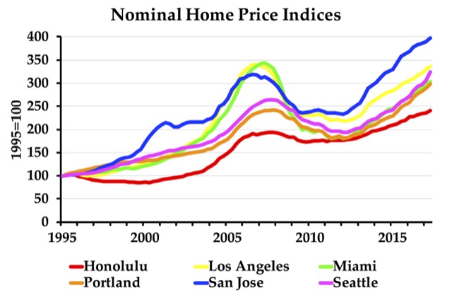
Someone just paid $1.1 million for a tear-down/fixer-upper in Mountain View, California. That’s not really news, as prices in Silicon Valley have been increasingly outrageous. What’s news is that they bought the house with the provisos that the existing owner will get to live there for seven years; the buyer didn’t get to see the interior of the home; and the buyer is required to make improvements before closing on the home. As the San Francisco Chronicle says, the new owner probably figures it will take seven years to get the permits to rebuild the house anyway.

The problem for the buyer is that the same forces that have made housing prices rise in Silicon Valley–namely the urban-growth boundaries adopted by San Mateo and Santa Clara counties–have also made prices more volatile. In other words, what goes up will come down. As shown in the chart above, San Jose prices today are already higher than they were at the peak of the 2006 housing bubble, indicating that another bubble is likely to deflate fairly soon. Continue reading

FTA Historic Times Series Through 2016

Since 1992, taxpayers have spent $364 billion (in 2016 dollars) on transit capital improvements. More than $257 billion of this went to rail transit, while $94 billion went to bus transit. The Antiplanner calculated this information on the Federal Transit Administration’s historic time series capital costs spreadsheet.

The official data show that transit ridership peaked in 2014 at 10.5 billion trips and by 2016 had declined 2.5 percent to 10.2 billion trips. This ridership includes urban, rural, and tribal transit agencies, but rural and tribal together add up to only about a million trips per year. The Antiplanner calculated this information on the Federal Transit Administration’s operations spreadsheet.

Tuesday’s post about the 2016 National Transit Database mentioned that the Federal Transit Administration has also posted the 2016 update to its historic time series, which has operating and ridership data back to 1991, capital costs back to 1992, and fares back to 2002 broken down by transit agency and mode. Except for the capital costs, which are in a separate file, all of the information is on worksheets that can be sorted in the same order, allowing users to make such calculations as operating cost per trip or fare per passenger mile. Continue reading

FTA’s 2016 National Transit Database

The Federal Transit Administration has posted its 2016 National Transit Database in the form of some two dozen Excel files. As in each of the past ten years, the Antiplanner has summarized some of the most important data in a single spreadsheet. This spreadsheet includes trips, passenger miles, fares, costs, vehicle data, rail miles, energy consumption, and greenhouse gas emissions (in grams) for every transit agency and mode of travel (rows 2 through 3798), totals for each mode (rows 3802 to 3820), and totals by urbanized area (rows 3851 through 4339). Because some of the smaller agencies were not required to report energy consumption, there are also totals for those systems for which energy consumption can be calculated (rows 3826 through 3844), making it possible to calculate average BTUs and greenhouse gas emissions per passenger mile.

In making this spreadsheet, I noticed some minor errors in my 2015 spreadsheet, mainly in some of the mode totals. So I’ve posted a revised version. It includes all of the calculations I’ve happened to make in the past year, including (in cells BH3644 through BK4150) a comparison of passenger miles by automobile vs. transit for each urban area. (Transit carried 11 percent of passenger miles in the New York urban area, 7 percent in San Francisco-Oakland, 4 percent in Honolulu, 3 to 4 percent in Chicago, Seattle, and Washington, 2 to 3 percent in Baltimore, Los Angeles, Philadelphia, and Portland, and under 2 percent just about everywhere else.) I won’t be able to make this calculation for the 2016 database until the Federal Highway Administration posts 2016 Highway Statistics.

In addition to the National Transit Database, the FTA has posted transit data tables in about a dozen different spreadsheets. The tables contain much of the same information but are a bit easier to read than the database, though a bit harder to use for mass calculations (especially since the spreadsheets have been “locked”). This year, some of the data tables come with interactive graphics, though they don’t seem to work on my Mac. Continue reading