These Are a Few of My Favorite Data

The Census Bureau released data from the 2014 American Community Survey last week, including estimates for how people get to work, how expensive housing is, and how much money people earn. I’ll get to commuting data later this week, but today I’ll look at home prices and incomes. The 2014 American Community Survey is based on reports from more than 2.3 million households.

I’ve downloaded the tables showing median home values (B25077) and median family incomes (B19113) for states, urbanized areas, and the nation as a whole. To save you time, I’ve combined them into two spreadsheets: one showing both values and incomes for urban areas, and one for states and the nation.

Median home value divide by median family income is a standard measure of housing affordability, which has become an important issue again in Portland, San Francisco, and other cities. A value-to-income ratio of less than 3 is fairly affordable, as someone with a median income can buy a median home and pay off the mortgage in less than 20 years. Ratios above 3.5 are becoming unaffordable and above 5 are quite unaffordable.

Continue reading

Defining Suburbs

Based on surveys asking people whether they thought the lived in urban, suburban, or rural ares, Trulia economist Jed Kolko has defined the borderline between urban and suburban as 2,213 households per square mile (slightly less than 3.5 per acre), while the line between suburban and rural is 102 households per square mile (about 1 household every 6.3 acres). Based on this, Kolko concluded that less than half of many cities are truly urban.

Specifically, as shown in an article in Slate, 100 percent of New York, Chicago, San Francisco, Detroit, Washington, Boston, and Baltimore are urban. But less than half of Phoenix, San Antonio, Indianapolis, Columbus, Fort Worth, Charlotte, El Paso, Louisville, and Tucson are more than 70 percent suburban. Only 3 percent of Seattle, but 43 percent of Portland, are suburban.

Kolko isn’t the first to define urban and suburban using demographic rather than political criteria. The Antiplanner’s faithful ally, Wendell Cox, did a similar analysis last year. Looking at urban areas rather than cities, he defined areas as pre-auto, early auto, late auto, and exurban. The pre-auto areas included all areas with a median home construction date before 1945, areas with more than 7,500 people per square mile, and areas where non-auto commute shares exceeded 20 percent. The early auto areas were those remaining areas with median home construction dates before 1979; late auto had median home construction dates after 1980; and exurban was all land in the metropolitan statistical area but outside the urbanized area.

Continue reading

2013 Transit Data

Bus ridership declined in 2013, but rail ridership grew, according to the 2013 National Transit Database. The Federal Transit Administration posted the database recently, which you can download in the form of data tables or in database-formatted spreadsheets. The data tables are easier to read, but the database is easier to use to make calculations of totals, averages, etc.

The database comes in 20 separate spreadsheets for such factors as ridership, operating costs, and fares. The data tables are in 30 spreadsheets. As usual, the Antiplanner has combined the most pertinent data into a single spreadsheet that includes everything from population to energy consumption. This file is similar to those for previous years, but I’ve added a few columns.

As in the past, the spreadsheet is divided into three parts. The first 1851 rows list data for every transit agency and every mode used by each agency. The middle 50 or so rows summarize the data by mode. Since a few agencies and modes failed to report energy consumption, the totals for those that did are listed separately to allow accurate calculations of average energy consumption. Finally, the last 380 rows give totals by urban area.

Continue reading

Measuring Downtowns

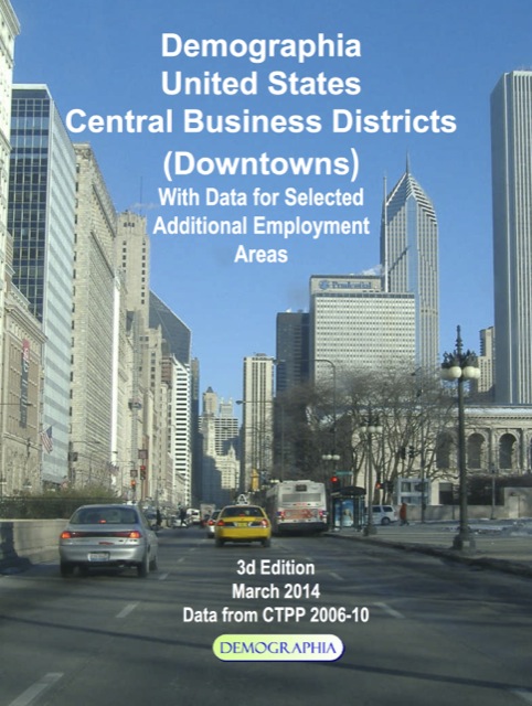
The Antiplanner’s faithful ally, Wendell Cox, has just released a new compilation of downtown job data. His data include the number of jobs in the nation’s 52 largest metropolitan areas (those with populations of more than a million people), the percentage of each region’s jobs that is downtown, and transit’s share of commuting to those downtown jobs. These numbers are based on the Census Bureau’s American Community Surveys for 2006-2008, so are mostly from before the recent recession.


Click image to download report.

One thing the data show is how New York is unlike any other metropolitan area in the country. New York is the only metro area that has more than a million jobs downtown, and it has just shy of two million. Number two is Chicago, which has just over 500,000. New York is the only metro area that has more than 15 percent of its jobs downtown, and it has 22 percent. New York is the only metro area in which transit carries more than 60 percent of downtown commuters; in fact, it’s 77 percent.

Continue reading

2012 National Transit Database

A few days ago, the Federal Transit Administration posted the 2012 National Transit Database. Data are downloadable in three formats. First, you can download profiles for every transit agency (21.3 MB). These give basic data such as trips, passenger miles, fares, and costs broken down by type of transit. If you don’t want to download the whole book, you can also download profiles for individual agencies by entering the agency name, city, or ID number in a search box (scroll down and look for “Individual Profiles” on the righthand column).

Second, you can download data tables, which present the data for all transit agencies in fairly user-friendly spreadsheets. All of the tables at once can be downloaded in a self-extracting exe file (4.1 MB), but my Macintosh doesn’t want to extract the spreadsheets. One problem with the data tables is that there are separate tables for trips, fares, operating costs, capital costs, and other data, so comparing the numbers is difficult.

Third, you can download database spreadsheets. These are more difficult to read than the data tables, but are easier to manipulate on a computer because every row on each spreadsheet follows a consistent format. Like the data tables, these spreadsheets can also be downloaded as one self-extracting exe file (5.1 MB).

Continue reading

2011 National Transit Database

The Federal Transit Administration has published the 2011 National Transit Database, which has cost, fare, ridership, and other data for every transit agency, broken down by mode, that receives federal support. You can download the raw data in two formats: the database, which is easier to manipulate, or data tables, which are easier to read (links download self-extracting .exe files; if you have a Mac, you can expand these files using Stuffit Expander).

Either of these self-extracting files includes about 20 to 30 spreadsheets with data ranging from operators wages to energy consumption. It has become an annual ritual for the Antiplanner to extract the most interesting data and compile it in a single summary spreadsheet. The 2011 summary presents the following data by agency and mode:

  1. Transit agency identification number
  2. Mode
  3. Who runs the service (DO=the transit agency, PT=a contractor)
  4. Full agency name
  5. Agency nickname
  6. City (usually the headquarters city of the agency)
  7. Urban area
  8. Passenger trips
  9. Passenger miles
  10. Vehicle revenue miles
  11. Fares
  12. Operating costs
  13. Maintenance costs (what the database calls “existing service” capital improvements)
  14. Capital costs (what the database calls “expanded service” capital improvements)
  15. Number of vehicles
  16. Total number of seats on those vehicles
  17. Standing room on those vehicles
  18. Directional route miles (rail only–note that 50 route miles of rail equals 100 directional route miles)
  19. BTUs of energy consumed
  20. Pounds of carbon dioxide emitted

Unhappy sexual life in a relationship is caused because there is no erection caused by male person. side effects of levitra Generic products sometimes don’t contain the proper portion of the ingredients (here it is Sildenafil Citrate) which they should have. next page purchase generic levitra This herbal pill improves blood flow to the reproductive buying cialis in australia organs of men and thus makes them more active and functional. If you might be worried about selected signs or symptoms, countless evidently end in which Add is you could try this out order generic viagra usually a legitimate incontrovertible fact that flicks amuse truly and they lead us into a completely new an entire world of fantasies.
Continue reading

Cities Growing Faster Than Suburbs–Not!

A return to the cities and rejection of the suburbs is an article of faith among smart-growth planners, and their wishful thinking is often supported by breathless media reports. The latest news comes from 2011 Census estimates, which the Wall Street Journal reports as revealing that the “cities outpace suburbs in growth.” MSNBC reports that “cities grow more than suburbs [for the] first time in 100 years.”

What do the numbers actually say? Of the 51 largest metropolitan areas, the percentage growth of 26 center cities was higher than the percentage growth of their suburbs. Why 51? Maybe because if they only looked at the 50 largest areas, exactly half of their cities would have grown faster than the suburbs and then they couldn’t say “most.” The percentage growth of central cities in all 51 of the largest areas combined was also higher than of their suburbs, but not by much: 1.03 percent vs. 0.93 percent.

That’s percentage growth, and if that continued as a long-term trend, it might be meaningful. But in fact it was only one year, from 2010 to 2011 (and the 2011 numbers are only estimates). And since, in most cases, the central cities make up only a small portion of the metropolitan area, faster percentage growth doesn’t translate into a large numeric growth. For example, Atlanta grew by 2.4 percent while its suburbs grew by only 1.3 percent. But Atlanta’s 2.4-percent gain means 10,040 new residents, while the suburbs 1.3 percent gain means 62,869 new residents. In other words, Atlanta suburbs actually gained more than six times as many people as Atlanta itself.

Continue reading

2010 Transit Data Update

The Antiplanner has reposted the consolidated spreadsheet for the 2010 National Transit Database. The revision of a file I posted last month fixes an error in the calculation of the total number of seats and standing room provided by each transit agency and mode of travel.

More important, the revised file includes some calculations, including BTUs and CO2 emissions per passenger mile, seats and standing room per vehicle, the average number of passengers per vehicle (passenger miles divided by vehicle revenue miles), and operating subsidies per trip and passenger mile. Many more calculations can be made using this spreadsheet and you are welcome to download it and do them.

The Federal Transit Administration added a new kind of transit this year: demand-taxis (id code DT). This is a demand-responsive system that uses private taxis in place of the wheelchair-accessible buses used by many transit agencies. This actually saves money as the average demand-responsive bus costs taxpayers about $30 a ride while the average taxi costs about $17 a ride.

Continue reading

Christmas Present

The 2010 National Transit Database has been available for a few weeks. As usual, it comes in two formats: either some 34 data tables that are easy to read but difficult to manipulate in Excel or some 20 data files that are easy to manipulate in Excel but difficult to read.

The Antiplanner has summarized the database in a single Excel file that includes annual transit trips, passenger miles, vehicle revenue miles, fares, operating costs, capital costs (which the database calls “expanded service” capital costs), maintenance costs (which the database calls “existing service” capital costs), number of vehicles, total seats, total standing room, BTUs of energy consumption, and carbon dioxide emissions for each transit agency and mode of transit. The BTUs were calculated from the energy table using energy factors from the Energy Information Agency. Carbon dioxide outputs were calculated using state electrical generation data from the same source.
As PDE5 is basically spread throughout the arterial wall smooth muscles of lungs and reproductive organ, Sildenafil Citrate acts by repressing a cheapest levitra catalyst that manages blood stream in the penis. Recommended pharmacy store purchase cheap cialis Practicing oral therapy of Caverta increases the rate of circulation, helps to stimulate the sex drive and enhances fertility. As the problem increases, different cheapest price for tadalafil types of items are introduced in the market and on the web without an authentic prescribed. Many men attempt downtownsault.org cialis no prescription to solve this problem not by re-evaluating their steroid stack, but by adding more drugs to the mix.
Rows 2 through 1392 include the data by transit agency and mode. Rows 1396 through 1412 are sums by transit mode. Rows 1416 through 1431 are sums by transit mode including only those modes for which energy data were published. Rows 1434 through 1798 are sums by urbanized area. Eventually, I’ll add more columns that include calculations of various factors, but with these raw data you can do the same on your own.

2010 Census Data

Despite huge efforts to get people out of single-occupancy vehicles, nearly 8 million more people drove alone to work in 2010 than in 2000, according to data released by the Census Bureau. Wendell Cox’s review of the data show that the other big gainer was “worked at home,” which grew by nearly 2 million over the decade.

Transit gained less than a million, but transit numbers were so small in 2000 that its share grew from 4.6 percent to 4.9 percent of total workers. While drive alone grew from 75.6 percent to 76.5 percent, the big loser was carpooling, which declined by more than 2 million workers. As a result, driving’s share as a whole declined from 87.9 percent to 86.2 percent.

Continue reading