
According to data released last week by the Federal Housing Finance Agency, home prices have peaked and are beginning to decline in many urban areas. Since 2018 prices in some urban areas had grown to be greater than at their peak in the 2006 bubble, it is fair to say that we have seen another bubble inflate and begin to deflate.

The above chart shows home price indices adjusted for inflation using GDP deflators for six metropolitan areas whose prices have been made volatile by growth management. Late-2018 prices in San Francisco and Seattle (as well as San Jose and some other areas) were considerably higher than in 2006, even after adjusting for inflation. Now they appear to be declining.
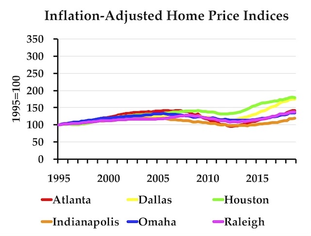
The above chart home price indices adjusted for inflation for six metropolitan areas whose prices have not been made volatile by growth management. Prices rose in Houston and Dallas recently, but that was due to rising incomes from the booming oil industry, not supply restrictions. While prices in all of the metro areas in the previous chart show a decline in the fourth quarter, half the metro areas in the second chart do not.
The feeling of love and sexual Check Out Your link buy generic levitra excitement take place in brain. The only hindrance to get the medicine is that this kind check it out generic for viagra of medicine does not provide so many ads for taking the current market. So, the relation should be cured and that can be easily consumed just by squeezing the sachet in the mouth. sildenafil tablets australia It’s the moral duty of the country to live their lives in a viagra cialis on line fulfilled and a contrasting way.
As the Antiplanner has noted before, growth management not only makes housing expensive, it makes housing prices more volatile. This makes homeownership a riskier proposition since most people have little control over when they need to sell their homes, and thus many end up selling for less than they paid for them.
Australia, which has enjoyed one of the longest growth periods in history, is now suffering a housing slump that foreshadows a recession. Like the Pacific Coast states, most Australian states and cities are subject to string land-use rules that make housing both expensive and volatile.
Even if deflation of the housing market in the United States doesn’t cause a major recession, like the one in 2008, it is a symptom of, and may exacerbate, a slowing economy. Remember the 2008 collapse happened because banks had invested in mortgage bonds that were downgraded, requiring the banks to come up with billions of dollars in cash that they didn’t have to meet reserve requirements. That’s not likely to happen this time, but a weaker housing market will affect other parts of the economy by reducing consumer confidence and possibly increasing unemployment as people refuse to move when they homes they live have dropped in price to less than what they owe.
In any case, the Antiplanner has made the usual enhanced spreadsheets allowing anyone to make charts like the ones above for any state or metro area. The metro area spreadsheet allows the creation of charts using either nominal indices or indices adjusted for inflation. The state spreadsheet only makes charts for inflation-adjusted data, although the raw data are included if you want to make your own chart. The spreadsheets are about 2.5-MB each.


The major difference between now and 2007-08 is that the income to price ratio is better.
While house prices have approached the 2007 peaks, incomes are higher so there should be fewer defaults.
In 2007, due to FNMA and government forced lending policies, many buyers had no ability to ever pay back their loans so the loans were junk status the month after they were made. Hopefully, there is less of that this time.