The Antiplanner is back from Wheeler County where I happened to meet some Portland transportation consultants who were cycling through the area. If you are reading this, I hope you had a good trip with no more mechanical problems.
I promised I would take a closer look at the transit data that the FTA released last week. The data continue to show that rail transit is lagging behind bus ridership, with rail at 57 percent and bus at 61 percent of pre-pandemic levels. Yet worst off is commuter bus, at a mere 36 percent of July 2019 numbers. Rapid bus is 64 percent, and hybrid rail is at 82 percent — though that’s because a new line opened in North San Diego County since the pandemic began.
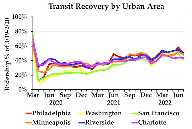
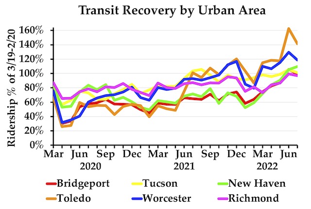
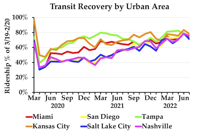
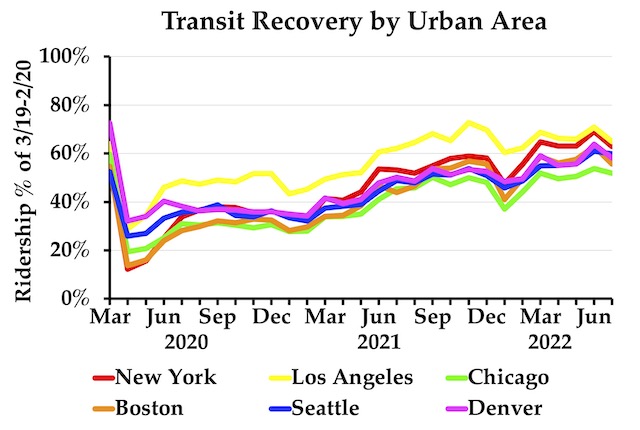
As usual, I’ve posted an enhanced spreadsheet that has totals by year, transit agency and urban area. This month, I’ve added a new feature: a graphing capability for up to six urban areas.
For example, some major urban areas where transit is doing particularly poorly are shown above; except in June, when fuel prices were high, most of them haven’t recovered to half their pre-pandemic numbers. In most cases, the downtown areas of these regions are recovering particularly slowly.
In contrast, transit in the urban areas shown above is doing particularly well. All of them exceeded 100 percent of pre-pandemic numbers in June and most remained above 100 percent in July. (Note that the vertical axis is changed to a maximum of 160 percent instead of 100 percent in the other graphs; you’ll have to make that change manually if you try to graph some of the handful of other urban areas that have exceeded 100 percent.) I don’t know what these six urban areas have in common, though Richmond is one whose transit system was reformed following Jarrett Walker’s principles just before the pandemic.
Six other urban areas where transit is doing better than average, though hasn’t completely recovered, are shown above. These tend to be urban areas where transit wasn’t very important, as a percentage of total travel, even before the pandemic.
Finally, the graph above shows six major urban areas that weren’t in the previous graphs where transit is doing about average. Of these six, Los Angeles was doing best for most of the pandemic, but has leveled off or even declined slightly. I suspect transit is also leveling off in other urban areas, but we’ll have to wait a few more months to see.
To make your own graphs, scroll down to rows 3305 through 3795 and note the UZA numbers of the six urban areas you want to graph. Enter those numbers in cells F3798 through F3803. Then scroll right or left to approximately columns IK through IU to see the graph. I hope you find this useful.





There seems to be something like a million and a half, 2 million people who were in the work force before our covid hysteria. They’re not there today. And we know they haven’t aged out of the work force.
I’m really curious who these people are? Were many of them downtown office workers? Could that be part of what’s pulling those transit numbers down?
Or is the drop in transit driven by the auto bubble, with a large chunk of previous riders currently driving cars ( that they can’t afford ) ?