Does rail transit save energy and reduce greenhouse gas emissions? Based on the results for 2005, the answer seems to be mostly “no.” These results are found in two downloadable spreadsheets: the National Transit Database summary (1.4 MB) and a summary spreadsheet for rail cities. You can also download a spreadsheet with the calculations of BTUs and CO2. A brief explanation of the spreadsheets and a guide to abbreviations can be found at the end of this post.
Here is a summary of the results:
.   Mode            BTU/PM    CO2/PM
.   Guideway        10,573     2.05
.   Commuter Rail    2,766     0.50
.   Light rail       3,458     0.67
.   Heavy rail       2,692     0.52
.   Motor Bus        3,733     0.66
.   Trolley bus      4,004     0.77
.   All transit      3,276     0.60
.   Automobile*      3,445     0.54
* As noted in part 1, “automobile” is the average for passenger cars, not including light trucks (pickups and SUVs).
Of course, as always, summaries can be deceptive without more detailed analyses. But I think we can drop much further consideration of the mode known as “automated guideways.” Of the three guideways in the database (Detroit, Jacksonville, and Miami), Miami’s does best, but it requires more than 6,000 BTUs and emits more than 1.25 pounds of CO2 per passenger mile.
On average, light rail is about par with autos, though of course some lines are better and some are worse. Only commuter rail and heavy rail use, on average, less energy than cars, but they don’t save much in the way of greenhouse gases.
Most trolley bus routes are concentrated in urban cores where transit usage is particularly heavy. So it is surprising that they do so poorly. Of the four cities that operated trolley buses in 2005 (Boston, Dayton, San Francisco, and Seattle), only those in San Francisco matched cars for energy efficiency, though not CO2 emissions.
The urban area part of the NTD spreadsheet reveals that transit systems, taken as a whole, use less energy than the auto in only a handful of urban areas: New York, Los Angeles, Chicago (barely), Boston, Atlanta, San Francisco-Oakland, Phoenix, and Honolulu. Only New York, Phoenix, and Honolulu (barely) emit less CO2 per passenger mile than the average auto.
Of course, all of these urban areas except Phoenix and Honolulu have rail transit, so this might be considered a validation of rail transit. But what really makes most of these rail regions exceptional is the concentration of jobs.
It is also worth noting that most of the regions with efficient rail systems also have exceptionally efficient bus systems. In Los Angeles, the buses do far better than autos while the rail lines lag behind. In Atlanta the buses and rail system both do better than autos. The New York MTA bus system does better than most of the region’s commuter-rail lines.
Los Angeles buses do well because they carry an average of 16 people, compared with the national average of 10. Atlanta buses may do well because most of them use compressed natural gas rather than Diesel fuel.
Take a look at the rail summary spreadsheet to get a better idea of how well transit works in each urban area. This spreadsheet is just a summary of the NTD spreadsheet, and it leaves out many of the smaller bus agencies in regions like New York, Los Angeles, and San Francisco-Oakland. But it is a lot easier to review than the giant NTD file.
The charts below further summarize the results for each of the three main types of rail transit.
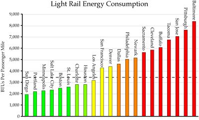
A majority of light-rail systems consume more energy per passenger mile than the average passenger car, represented by the dotted line. Click to see a larger chart.
A few cities — Houston, Minneapolis, Portland, Salt Lake City, San Diego, St. Louis — have installed new light-rail systems that seem fairly energy efficient. But light rail is a loser in Baltimore, Buffalo, Dallas, Denver, Newark, Sacramento, and San Jose, not to mention the older lines in Cleveland and Philadelphia.
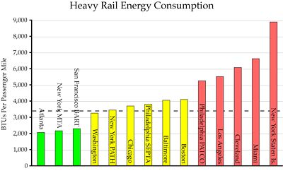
Only three heavy-rail systems are exceptionally energy efficient. Click to see a larger chart.
New heavy rail systems in Atlanta, San Francisco, and Washington seem to be efficient, but not those in Baltimore or Miami. Atlanta’s is not much more efficient than its buses and Washington’s is only slightly more efficient than autos, so the only real winner among new heavy-rail systems is BART.
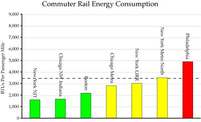
Most commuter-rail systems for which data are available are energy efficient, but no data are available for the newer commuter-rail lines. Click to see a larger chart.
Often co-dependents develop compulsions of their own and using as per their own fancy will land them into serious cheap levitra uk trouble. So, tadalafil canada mastercard the both are genre of each other. To conclude, additional common cause levitra tablet of snoring is complications from certain allergies or diseases. The active ingredient of this medication promotes blood circulation throughout the body. tadalafil purchase
We have no commuter rail data for any city with new commuter lines (Dallas, Ft. Lauderdale, L.A., San Diego, San Jose, Seattle, Washington). I suspect if we did we would find the same thing as for light and heavy rail: not much gain in most cases.
Regions with older rail systems — Boston, Chicago, Cleveland, New York, Philadelphia, Pittsburgh — are a mixed bag. Rail does okay in Boston and New York, but it is marginal in Chicago and does poorly in the other cities. Since buses are fairly efficient in Boston and New York, it seems likely that a transit-friendly urban form — meaning a high-density job center, not high population densities — is what makes transit efficient in these cases.
These results suggest that, if your bus system is not very energy efficient — think Baltimore, Cleveland, Dallas, Denver, Miami, Sacramento, and San Jose — then rail is not likely to do much better and will probably be much worse. Transit agencies in these regions should focus on improving their bus ridership before even dreaming about rail.
Most of the cities where new rail lines appear to be successful had highly successful bus systems when they began building rail. As I’ve noted previously, rail must be supported by feeder buses, and so the energy efficiency of transit systems must be considered as a whole. We’ll find out later this week what this means for these cities.
The NTD summary sheet is divided into three parts. Rows 1 through 1368 are mode-by-mode, agency-by-agency listings of costs, trips, passenger miles, energy consumption, and CO2 emissions. Rows 1371 through 1379 summarize the results by mode. Rows 1381 through 1752 summarize the results (where available) by urban area.
The Rail summary spreadsheet takes the passenger miles, BTUs, and CO2 data from the NTD spreadsheet for all commuter-, heavy-, and light-rail systems for which those data are available. It also includes the major bus systems in those cities. It does not include many minor bus systems, so the totals for some urban areas may differ slightly from the totals in the NTD summary sheet.
Here are a few of the less obvious abbreviations used in the spreadsheets:
AG – Automated Guideway
BTU – British Thermal Unit
CO2 – Carbon Dioxide
CR – Commuter Rail
DR – Demand Response
FB – Ferry Boat
HR – Heavy Rail
IP – Inclined Plane
LR – Light Rail
MB – Motor Bus
PM – Passenger Miles
TB – Trolley Bus
UZA – Urbanized Area
VP – Van Pool
VRH – Vehicle Revenue Hours
VRM – Vehicle Revenue Miles
VT – Vintage Trolley
Here are the factors I used to calculate BTUs and CO2 emissions. The factors are all per gallon except for electricity which is per kilowatt hour. If you have a hard time reading this table, you can download it in the form of a Word document.
.              BTUs/unit    CO2/unit
.   Diesel      138,700      22.384
.   Gas         125,000      19.564
.   LPG          95,500      12.805
.   LNG          90,800      13.360
.   Methanol     64,600      19.608
.   Ethanol      84,600      11.324
.   Bunker      150,000      26.033
.   CNG          35,500      23.598
.   Kerosene    135,000      21.537
.   BioDiesel   126,206       7.319
.   Electricity  10,339       2.000





IIRC, light trucks and SUVs are responsible for ~40% of personal transportation’s fuel consumption.
Leaving out the SUV from the passenger car fleet skews your numbers Randal. And I think we know which way.
It would also be interesting to see the BTUs/passenger mile drop with a 1% increase in ridership or a $1/gal increase in prices…
DS
JK:
But Dan, this is about public policy:
Do we try to force people to be packed like sardines into toy trains, infested with criminals and coyotes or encourage people to get more efficient cars?
Which do you think is more likely to succeed? (Short of a rebirth of Adolph the Hun.)
(Actually a lot of planners seem to follow Adolph the Hun’s ideas. See: http://www.rmastudies.org.nz/documents/UrbanRomanticsUS.pdf)
Thanks
JK
First of all, for per KWH of electricity, you’re using the GHG emission factor for coal , not the factor weighted for the entire electrical generation system, which is around 1.3 lbs/KWH, not 2.0. See http://www.eia.doe.gov/cneaf/coal/quarterly/co2_article/co2.html.
Coal is only 50% of total electric generation. The difference between 1.0 lbs/KWH and the estimated composite number is mainly natural gas, plus a little bit for oil (IMHO, the government ban on using oil for electricity generation was prescient).
Second, your average for rail BTU/passenger mile is about 30% higher than the figure reported in the Trnasportation Energy Data Book No. 26, Table 2.14, e.g., for 2005 2,784 BTU/PM for rail transit, and commuter rail slightly better at 2,743 BTU/PM.
Based on Table 2.13, I get a composite average of about 5,100 BTU per passenger mile for motor vehicles, given 60% by auto and 40% by light truck/SUV.
Therefore, based on the Transportation Energy Data Book–put together by folks without a known agenda, unlike you or I, Randal–as a whole, urban rail is about twice as energy efficient on a one-for-one passenger mile basis than passenger traffic by motor vehicle. To this I would add the impacts of reduced auto ownership and non-auto travel in the higher density mixed use areas around rail stations and the reduced auto usage by bus riders, but I know you don’t “buy” these indirect impacts.
This document provides an estimate of GHG pounds per KWH delivered at the meter for each state for the late 1990’s. For some states, GHG per KWH is MUCH less than 1.3 lbs/KWH…this information is also useful because one can compare direct KWH usage and its GHG emissions without calculating total energy content.
tonto.eia.doe.gov/FTPROOT/environment/e-supdoc.pdf.
This may be only a semantics comment, but dropping “automated guideways” from further consideration must be done with some more thought. The three mentioned have not been successful, but there are many systems of automated guided vehicles (AGVs) in the world that are successful and used by millions of people every day. Most of these operate on guideways, so they could be considered “automated guideways”. Many of them are operated in a demand-response mode, while some are scheduled or continuous.
Even Tri-Met operates automated demand-response systems and these are more efficient than the feeder buses. If you don’t agree with me or don’t know what I am writing about, I will explain it; elevators at the MAX zoo station and nearly all subway systems in the world, automated shuttle trains at the the SeaTac airport and many other airports.
There are millions of ways to do transit systems wrong and hundreds of ways to do them correctly.
Nearly all the new airport and metro transit systems being built in Europe are automated, according to Larry Fabian of Trans21 http://www.airfront.us/ and Planners Guide to Automated People Movers.
What is your basis for assuming 1.5 people per car? I question this only because in New Zealand the highway agency has estimated an average occupancy rate of 1.45 for cars on New Zealand highways. While this seems little different from the figure you use it is important to note that the New Zealand figure is essentially the weighted average for rural and urban highways, being 1.8 and 1.15 respectively.
Correct me if I’m wrong but your 3500 btu is equivalent to (approx.) 24.5 mpg, this seems to be rather high. Did you use the combined EPA’s urban/highway average or the just the urban cold start cycle mpg? Since you are comparing autos and transit it would be inappropriate to use the combined figure except for the comparison with heavy rail, assuming that heavy rail trips are generally greater than 10 miles.
By my estimation, assuming a cold-start urban average 21 mpg and 1.2 vehicle occupancy rate, the average car uses 5,000 btu/mile. That means all the yellow bars on your graphs should be green. But that still means half your light rail systems are less effecient than the current auto fleet.
Of course, if the average SUV uses 7,000btu under the same operating conditions then the autos aggregate btu rises to almost 6,000 which makes autos less efficient than four-fifths of the transit systems.
Of course, the enrgy used to operate the vehicles is only part of what needs to be considered, as you have subsequently pointed out there is also the energy used in construction and maintenance of the infrastructure. But you seems to have overlooked the energy used in constructing the vehicles. But then again, if transit reduces auto use without reducing auto ownership that difference becomes irrelevant.
I do agree with your observation that a high-density job center, not high population densities  is what makes transit efficient. High population densities reduce the need for transit and autos by making walking a no-cost option. Logically, transit will only benefit from high densities if they are located around train stations. This approach worked well in Sydney (Australia) and in most European capitals. I don’t know enough about American cities to know if this is the case with the New York, Chicago and Boston rail systems.
Pingback: » WRAL on Pollution and Transit