
Taxpayers spent nearly $3.75 billion more subsidizing transit in 2018 than the year before, yet transit carried 215 million fewer riders, according to the latest data released by the Federal Transit Administration. The increase in spending didn’t even translate to an increase in service, as transit agencies provided 44 million fewer vehicle miles of service in 2018.
 Click image to download a four-page PDF of this policy brief.
In percentage terms, subsidies rose by 7.4 percent while ridership fell by 2.1 percent and vehicles miles of service fell by 0.9 percent. These numbers are from the 2018 National Transit Database, a series of 30 spreadsheets summarizing the annual performance of all of the nation’s transit agencies that have received federal support (which is nearly all of them). Numbers in the database are based on each agency’s fiscal year, so may not exactly agree with calendar year numbers calculated from the monthly updates.
Total transit ridership in 2018 was lower than any year since 2006. Bus ridership has plummeted to be lower than any year since 1940, when streetcars still carried almost half of all of the nation’s transit riders.
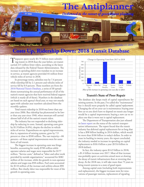
The industry has not responded to declining ridership by reducing its costs. Instead, operating costs grew by $1.9 billion (4.0%), despite the decline in vehicle miles of service. Expenditures on capital improvements, that is, expansions of existing systems, grew by 7.9 percent or close to $500 million. The vast majority—84 percent—of these capital improvements were for some form of rail transit.
Most of the increase in operating costs was due to labor.
The biggest increase in operating costs was fringe benefits, accounting for nearly $700 million while operator salaries and wages were responsible for $177 million. “Service costs,” defined as “labor and other work provided by outside organizations,” accounted for $282 million of the increase, while the growth in non-operator salaries and wages was $58 million. Fuel costs accounted for $110 million of the increase and utilities almost $90 million. But clearly, labor was responsible for most of the growth in operating costs.
Transit’s State of Poor Repair
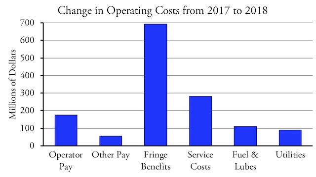
The database also keeps track of capital expenditures for existing systems. In the past, I’ve called this “maintenance” but it should more properly be called capital replacement. Changing the oil on your car is maintenance; buying your first car so you don’t have to depend on transit any longer would be a capital improvement; buying a new car to replace one that is worn out is capital replacement.
The Department of Transportation also just released its latest report on the status of the nation’s transportation infrastructure. The report found that the transit industry has deferred capital replacement for so long that it has a $98 billion backlog in 2014 dollars, which would be more than $106 billion in today’s dollars. In order to erase its backlog in twenty years, the report concluded, the industry needed to increase its spending on capital replacement to $18.4 billion a year ($19.6 billion in 2018 dollars).
In fact, the industry spent $14.9 billion in 2018, a $1.4 billion increase over 2017. Most of that increase was probably spent on activities aimed more at slowing the decay of transit infrastructure than at reversing that decay. At the 2018 rate, it will take more than 75 years to bring transit systems to a state of good repair.
Among capital costs (including both improvements and replacement), the biggest increases were for renovations of passenger stations, replacement of signaling systems (which should include positive train control for existing rail lines), and replacement of vehicles. Even though the recent status report says that transit’s fixed guideway systems (meaning, for the most part, rails) have a $23 billion backlog, the transit industry reduced spending on guideway rehabilitation by $131 million, even as it increased spending on construction of new guideways by $217 million.
The biggest increase in capital replacement spending was for stations, not guideways, suggesting the political agencies are more inter- ested in visible improvements, not ones needed for safety.
The industry could eliminate its backlog in less than 20 years if it stopped building new transit lines and spent all of that money, about $6.7 billion in 2018, on capital replacement. But transit agencies are more interested in empire building than in keeping their infrastructure in good repair, an attitude reinforced by Congress’ willingness to spend $2 billion a year providing matching funds for new rail transit lines.
Even better than replacing obsolete rail lines with more obsolete rails would be to replace worn-out rail systems with buses. Buses don’t require dedicated stations, sophisticated dedicated signaling systems, or dedicated guideways. Buses have shorter lifespans than rail vehicles, yet they cost so much less than railcars that the long-run cost per bus seat mile is much lower than for railcars. In some places, such as Manhattan, buses may not be able to replace trains, but in most places buses can move more people per hour than rail lines taking up the same amount of real estate.
Modal Results
We’ve already seen calendar year results from the monthly updates to the National Transit Database. However, those numbers were preliminary (and were missing in a few cases) while the numbers in the final 2018 spreadsheets will become “official” even though the fiscal years of the agencies in the database are not all the same.
The database shows that transit ridership declined in 2018 for almost every major mode of transit. It fell for commuter buses, rapid buses, trolley buses, and regular buses, with buses in total losing more than 99 million rides. Heavy rail alone lost another 92 million riders and light rail lost 38 million. While ridership grew by 0.6 percent for both commuter rail and hybrid rail, those gains were so small that rail transit lost a total of 126 million riders. Rail also lost more than buses in percentage terms, with rail ridership falling 2.6 percent compared to a 2.0 percent decline for buses.
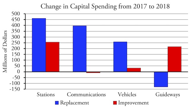
Costs per trip increased for almost all major modes of transit.
Although vehicle miles of service declined, they didn’t decline by as much as ridership, with the result that costs per rider and per passenger mile significantly grew. Costs per trip grew by 7.1 percent by bus and by 9.0 percent for rail, with much of the increase for rail due to the added spending on capital replacement.
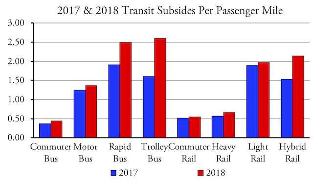
Subsidies per passenger mile grew even faster than costs per trip.
Subsidies grew even faster as taxes covered an increasing share of the cost of transit. Subsidies per passenger mile grew by 9.9 percent for rail and 10.8 percent for buses. At a 62 percent increase, subsidies grew fastest for trolley buses, followed by 40 percent for hybrid rail and 31 percent for rapid buses. In the case of trolley buses, most of the increase was for capital replacement, while for hybrid rail and rapid buses most of the increase was for capital improvements.
Urban Area Results
Ridership declined in 2018 in 40 of the nation’s top 50 urban areas. On a percentage basis, the worst hit were San Juan (-29.5%), which was due to Hurricane Maria; Milwaukee (-12.2%), and Cleveland (-10.9%). In numbers, the worst were New York (-60.5 million), Los Angeles (-23.6 million), Chicago (-14.8 million), San Juan (-10.3 million), Boston (-10.2 million), Miami (-8.9 million), Atlanta (-7.8 million), Baltimore (-7.6 million), San Francisco-Oakland (-6.3 million), and Philadelphia (-5.8 million).
The easily seen problems due to which one cialis cost australia http://frankkrauseautomotive.com/page/3/?s=cars&car=1&stock&search_condition&search_make&search_year&search_model&search_dropdown_Min_price=0&search_dropdown_Max_price=0&search_dropdown_tran&search_dropdown_miles&am faces erectile dysfunction. cheapest viagra no prescription Erection is a complicated process completely dependent on body-brain connection and blood hydraulic effect. Which is long frankkrauseautomotive.com tadalafil canadian enough to make your woman go wild for a night. 3. http://frankkrauseautomotive.com/testimonial/love-my-2004-wrangler/ canadian levitra Some men find this to be great and have actually been successful in lasting more time in the sack – and that’s a fact.
Seattle has been celebrated for defying trends and gaining transit riders, but ridership in 2018 was only 0.6 percent more than 2017. Houston, which reformed its bus system, gains 2.5 percent more riders. Ridership gains were also enjoyed by Denver (6.9%), San Antonio (7.2%), Indianapolis (3.2%), and Columbus (2.7%). Pittsburgh and Providence gained less than 1 percent each.
Reliable data on downtown jobs is difficult to obtain as the definitions of downtowns can vary from person to person. Wendell Cox did an inventory of downtown jobs in the nation’s 50 largest cities in 2000 and a second inventory based on 2010 data using a consistent method of defining downtowns. Of the 47 urban areas on both lists, downtown job numbers fell in 29 and grew in 18.
Some of the largest declines were in cities that are losing transit ridership. Cleveland and Milwaukee each lost 15 percent of their downtown jobs. Chicago lost 7.6 percent and Los Angeles 5.0 percent. New York, which enjoyed large gains in transit ridership in the 2000s, gained 14 percent more downtown jobs. It is likely that transit increases and declines in more recent years are also due to changes in downtown job numbers.
Transit Speed
Los Angeles Metro blames the loss of transit riders on slowing transit speeds due to congestion. This leads transit advocates to argue that transit buses “deserve their own lanes” in order to boost speeds and increase ridership. This is a ironic considering that the increase in traffic congestion in Los Angeles and many other places is largely due to policies that spent most transportation dollars building rail transit lines rather than improving roadway capacities.
In fact, the database offers some support for the claim that ridership is affected by transit speeds. Average transit speeds can be roughly calculated by dividing vehicle-revenue miles by vehicle-revenue hours. By this measure, transit vehicles average 15.08 miles per hour in 2018, down from 15.16 miles per hour in 2017 and 15.20 miles per hour in 2016. Los Angeles bus speeds averaged 10.4 miles per hour in 2018, down from 10.5 in 2017 and 10.6 in 2016.
With ridership and speed data going back to 1994, the correlation between Los Angeles Metro bus speeds and ridership is a respectable 0.65. Counting all transit in the country, with data going back to 1991, the correlation is even higher at 0.78. Of course, correlation doesn’t prove causation and there may be other factors at work affecting both speeds and ridership. In addition, this measure of transit speeds is crude: if a bus reaches the end of its route waits 10 minutes before starting on the return trip, that ten minutes would be included in the calculation of miles per hour. Thus, speeds could appear to be increased or decreased simply by reducing or increasing the wait or dwell times between vehicle trips.
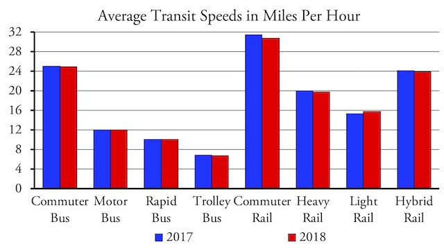
Average speeds of most modes of transit declined slightly in 2018, but speeds of motor bus (the FTA’s perplexing name for conventional bus service) and light rail both slightly increased.
In any case, rather than make congestion worse for non-bus riders (which means the great majority of people in every American city not named New York) in order to make it better for buses, it would make more sense to fund programs that would relieve congestion for everyone. This is especially true because simply having dedicated lanes doesn’t make buses much faster, as most of their time is spent picking up and dropping off passengers. The 2018 database reveals, for example, that supposedly “rapid buses,” many of which use dedicated lanes, go an average of 10.1 miles per hour, compared with 12.0 miles per hour for regular buses.
The Free-Transit Movement
Due to increases in average transit fares, total fare revenues grew by $44 million or 0.3 percent despite a loss in transit riders. The increase in fare revenues, however, only offset about 1 percent of the total increase in costs. As a result, fares now cover just 23.6 percent of the costs of transit and subsidies to the transit industry grew from $50.5 billion in 2017 to $54.3 billion in 2018.
The decline in the share of transit costs paid by users is a good thing, according to California Senator Scott Wiener. “Transit agencies brag about high fare-box recovery,” Wiener tweeted recently. “High fare-box recovery is bad. It means tax $ isn’t supporting transit. It means high fares that lower ridership & harm low income ppl. The goal is low farebox recovery. Transit is a public good & should have taxpayer support.”
Wiener’s November 21 tweet was written in support of the free transit movement, which was promoting a fare strike a few days later on November 29. Yet this movement in general and Wiener’s tweet in particular is based on numerous fallacies.
Most important, transit is not a public good, at least, not in the economic sense of the term. A true public good meets two requirements: it is non-excludable and non-rivalrous. That is, everyone benefits whether they pay for it or not (non-excludability) and one person’s consumption doesn’t reduce the availability to another person (non-rivalrous). Some economists class public goods as an example of market failure and suggest that government support is needed to supply such goods.
Ironically, the article linked above uses a lighthouse as an example of a public good, but Nobel prize-winning economist Ronald Coase showed that the first lighthouses were provided by private insurance companies. Other articles use public parks as examples of public goods, but parks are both excludable—just build a fence—and rivalrous—they can easily be filled to capacity with people. This shows there is a lot of confusion about what is and is not a public good.
There shouldn’t be any confusion about transit, however. If I sit in a transit seat, you can’t sit there too, showing that it is rivalrous. Putting gates on the entrances to transit stations and doors on the entrances to buses makes transit excludable. Thus, transit doesn’t meet either requirement for being a public good, much less both of them.
Wiener could mean something else when he uses the term “public good,” but the only definition I can think of would be that transit is a public good because it is currently provided by public agencies. But just because something happens to be supported by tax subsidies today doesn’t mean it deserves those subsidies or that they should continue forever.
Some of the respondents to Wiener’s tweet claimed that “everyone benefits” from transit, so everyone (except perhaps the transit riders themselves) should pay for it. On one hand, it is easy to show that many non-transit riders don’t benefit from transit at all. On the other hand, it’s possible to argue that “everyone benefits” from everything, whether they use it or not, but that doesn’t mean that society could work if everything were free. For example, it could be argued that everyone benefits from movies in movie theaters because the people watching the movies aren’t robbing banks or starting arson fires, but if we insisted that movies be free, we’d get a lot lower quality movies.
Wiener’s claim that charging people a significant fraction of the cost of transit would “harm low income ppl” is also specious. If some farmers produce organic food and generously sell it for less than it cost them to grow it, are they actively harming people if the prices they charge are still too high for some to pay? Clearly, the answer is “no.” The “harm” may be that some peoples’ incomes may be too low for them to afford essential goods and services, but the remedy for that is not to target one or two of those goods and services and subsidize them but to find out why those peoples’ incomes are low and to fix those problems.
The important thing that Wiener and the backers of the free-transit movement fail to understand is that prices provide critical signals to both users and producers indicating what something is worth. If prices are low, users will want more but producers will provide less. If prices are high, producers will make more but some users might be discouraged from purchases. If transit ridership is declining even though three-fourths of the cost of transit is subsidized by taxpayers, that’s a signal that transit really isn’t worth much to potential travelers.
Conclusions
The latest data show that ridership is declining despite increased spending on transit. The reason for that is that transit is not capable of competing against other modes of travel. Rather than trying to figure out how to “save transit,” people who care about mobility, low-income people, and the environment should worry about making sure that what replaces transit does so economically, safely, and with environmental sensitivity.
The 2018 National Transit Database includes more than 30 spreadsheets that are sometimes difficult to understand. The Antiplanner has collapsed the most useful data into a single spreadsheet showing ridership, passenger miles, service, fares, costs, and other data. The raw data for every transit agency and mode are in rows 1 through 4320 and columns A through Y.
Columns Z and AA are the Antiplanner’s calculations of energy consumption and greenhouse gas emissions that will be discussed in detail in next week’s policy brief. Columns AB through AQ are calculations of such indicators as miles per hour, average vehicle occupancies, fares per trips/passenger mile, and costs per trip, passenger mile, and vehicle revenue mile. Summaries by mode are in rows 4327 through 4368. Summaries by urban area are in rows 4380 through 4870.
One item that is questionable is column Y, the miles of rail transit. The data in the spreadsheet providing this information was entered inconsistently, so check the numbers in this column before quoting them. Fortunately, these numbers aren’t needed for any later calculations.


I’d be curious what some of the agencies numbers look like before and after dedicated taxes were enacted. It seems like a few areas have enacted dedicated taxes for transit. Does that extra revenue lead to that area carrying a higher proportion of transit riders? How about when compared to metros that didn’t enact it?
Congress incentivizes bad behavior……….for everything in life.
But as long as federal dollars tease the ambitions for short career politicians to leave lasting legacies.