
The number of households that lacked access to a motor vehicle declined in 2017 as did the number with only one vehicle. Meanwhile, the number with two or more rapidly grew. In fact, the more vehicles, the faster the growth: the number with two vehicles grew by 1.4 percent; the number with three grew by 2.8 percent; the number with four grew by 4.5 percent; and the number with five or more grew by an astounding 7.2 percent.
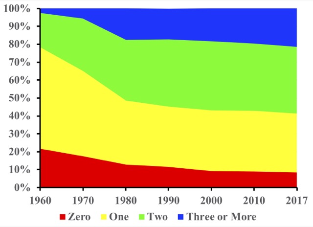
The shares of households with no cars and with three or more cars have practically reversed themselves since 1960.
The number with no vehicles declined by only 0.7 percent. But transit ridership is partly dependent on people who lack access to motor vehicles. Since transit carries less than 2 percent of passenger travel in all but a handful of urban areas, a small increase in auto ownership can translate to a large decrease in transit riders. Continue reading


