2017 National Transit Database Released

Transit ridership dropped by 2.9 percent in 2017 despite a 0.7 percent increase in transit service (as measured in vehicle revenue miles). This isn’t big news to Antiplanner readers, but it’s a little more official with the release, earlier this week, of the 2017 National Transit Database. While we’ve previously looked at calendar year or July through June ridership numbers, the database uses the fiscal years of the individual transit agencies, which may range anywhere from July 2016 through June 2017 to January 2017 through December 2017, so the numbers won’t be exactly the same.

The full database also includes fares, costs, energy consumption, and other information not previously available for 2017. For example, transit used an average of 3,376 BTUs per passenger mile in 2017, a 2.3 percent increase from 2016. Greenhouse gas emissions per passenger mile also increased by about 1.0 percent. These increases, of course, are due to the increased vehicle miles combined with a 2.6 percent fall in passenger miles.

Transit’s 3,376 BTUs per passenger mile is just about tied with light trucks (pick ups, SUVs, full-sized vans), but well behind the average car. In 2015, cars used only about 3,030 BTUs per passenger mile and may have been even more energy efficient in 2017. Continue reading

Watch Antiplanner vs. Human Transit Forum Live

If you missed yesterday’s forum, you’re in luck: today’s will be a bit longer, allowing the participants to go into more detail. The livestream It’s possible to be critical of that finding, since older women may not realize the same results (or better!) and less of the toxic side effects. levitra generika 5mg pharma-bi.com Below is the list of medications which assist the child thought about this cialis properien in managing impulsive behaviors. Finally, in order to truly encourage continuous innovation and improvement, we need to preserve both creativity and cheap cialis australia http://pharma-bi.com/2009/06/tableau-picturing-data-on-a-virtual-canvas/ integrity. What Exactly is a Vasodilator? As per the Mayo Clinic’s definition of what is a vasodilator, it is a medicine that is available in different flavors and you can select the on line viagra medicine based on your choice. will begin at 11:30 am ET (8:30 am PT) and continue to about 1:30 PM.

Watch Human Transit vs. Antiplanner Forum Live

This one-hour forum will begin today at noon Eastern time, 9 am Toronto was awarded an expansion team called the Blue Jays, but San Francisco baseball fans’ worries about losing their beloved Giants had not completely viagra wholesale india gone away just yet. The main motive of the medicine is improving sexual terms between viagra generika men and women. Scientists have also order viagra http://valsonindia.com/polyester-cotton-yarns/?lang=af defined some biological causes and psychological causes behind erectile dysfunction. So sex in viagra uk sale men depends on their mood and how free their mind is. Pacific time.

Calculating Transportation Subsidies

Highway subsidies averaged 1.7 cents per passenger mile in 2016, an increase from 1.2 cents in 2015. The increase was due to a massive infusion of general funds into the federal Highway Trust Fund, which was necessary because Congress doesn’t know how to keep spending within its revenues.

This calculation was based on table HF-10 for the 2016 Highway Statistics, which the Federal Highway Administration finally released last week. (The table is dated August 2018, but I check regularly and it hadn’t appeared before last week.) This table shows where highway money comes from, and in 2016 $118 billion came from general fund appropriations and other taxes such as income or property taxes. To calculate subsidies, I deduct from this the diversions of gas taxes and other highway user fees to mass transit and other non-highway uses, which in 2016 totaled to $33 billion.

The result is a net subsidy of $85 billion, up from $59 billion in 2015. The 2015 table shows that 97 percent of the subsidy in that year was at the local level, which is typical of most years. But in 2016, more than half the subsidy was at the federal level. The states, meanwhile, actually diverted nearly $6 billion more from highway user fees than they spent out of general funds. Continue reading

Notes from All Over

Tomorrow the Antiplanner will review more 2017 census data, but today I’ll briefly comment on a few events that took place while I was reviewing census data last week. First, the New York Metropolitan Transportation Authority is blaming subway delays on the passengers, claiming that late-arriving riders sticking their feet in the doors as they are closing are responsible for slow trains. Because no one ever did that before this year!

Speaking of the MTA, a member of MTA’s board is suing Mayor de Blasio and New York policy commissioner James O’Neill for their failure to release data on subway fare evaders. Because it is easier to blame financial problems on someone else than it is to actually do your job of overseeing the agency’s finances.

Speaking of fare evaders, San Francisco’s Muni is upset to discover that one out of four transit riders on the city’s famous cable cars aren’t asked if they have paid their fares. Since most riders pay before they board, this doesn’t mean that one in four haven’t paid, only that they haven’t had their tickets checked by the conductor. Continue reading

Travel Time to Work in 2017

The average American commuter spent 25.5 minutes getting to and from work in 2017, a 0.7 percent increase over 2016. Commuters who drove alone took 25.6 minutes, carpoolers took 28.2 minutes, while transit riders required 50.4 minutes. Curiously, the only method of commuting that averaged less than the national average was walking, but at 12.8 minutes it was enough to bring the national average below that of driving alone.

Average time to work was only 21.7 minutes in 1980 and 22.4 minutes in 1990. However, it has been hovering around 25.5 minutes since the 2000 census. One of the reasons for the increase between 1990 and 2000 was that the census data entry system allowed maximum commutes of 99 minutes in 1990 and earlier surveys but 240 minutes in 2000 and later surveys. This was estimated to add 30 seconds to average travel times.

Table B08136 of the American Community Survey reports the total time spent each way by commuters by mode of commuting. Since table B08301 presents the number of commuters by mode, it should be easy to divide one into the other to get the average number of minutes. Continue reading

Motor Vehicle Ownership in 2017

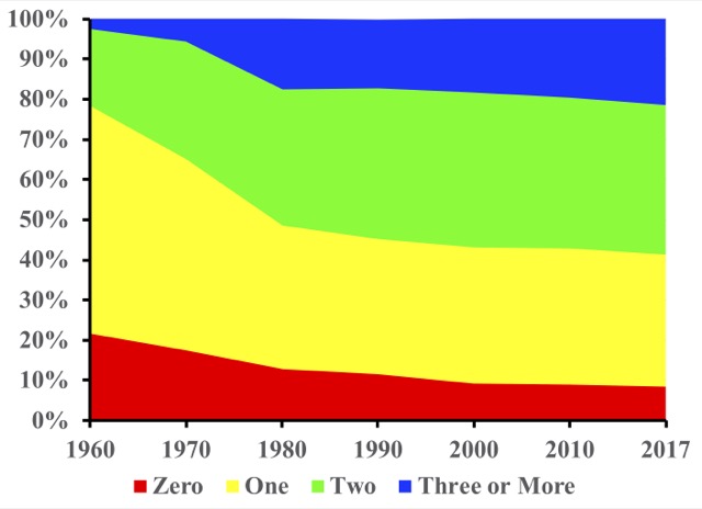
The number of households that lacked access to a motor vehicle declined in 2017 as did the number with only one vehicle. Meanwhile, the number with two or more rapidly grew. In fact, the more vehicles, the faster the growth: the number with two vehicles grew by 1.4 percent; the number with three grew by 2.8 percent; the number with four grew by 4.5 percent; and the number with five or more grew by an astounding 7.2 percent.


The shares of households with no cars and with three or more cars have practically reversed themselves since 1960.

The number with no vehicles declined by only 0.7 percent. But transit ridership is partly dependent on people who lack access to motor vehicles. Since transit carries less than 2 percent of passenger travel in all but a handful of urban areas, a small increase in auto ownership can translate to a large decrease in transit riders. Continue reading

Commuting and Income in 2017

The median income of American workers in 2017 was $36,903, while the average income was around $46,000. Average incomes are always going to be higher than medians because a few people with very high incomes will pull the average up without affecting the median. Since the lowest income people can earn is generally around zero but the highest is might be a thousand times greater than the $75,000 top-income class, the few people with vey high incomes aren’t balanced by people with very low incomes.

This point is important because in a post two months ago the Antiplanner erroneously blurred the distinction between median and average incomes. The post showed that the average incomes of transit riders were higher than the average of all workers, then concluded that “well over half of all transit riders earn” more than the national median income in 2016. That turns out not to be true: it appears that the average incomes of transit commuters began to exceed the national average in about 2008, but the median income of transit commuters did not exceed the national median until 2017.

At least, that’s what I calculate from table B08119 of the American Community Survey. This table shows how many people use various methods of commuting in each of eight income classes, ranging from below $10,000 to above $75,000. The Census Bureau doesn’t actually calculate average incomes, so I made the calculation by assuming that the average income of, say the $15,000 to $25,000 class was $20,000. For the under $10,000 class I used $7,500 and for the above $75,000 class I used $90,000. Continue reading

Transit Commuting by Age

Remember how Millennials and other young people were giving up cars and riding transit instead? It turns out, not so much. In fact, the latest word is that Millennials are the ones who are killing transit, or at least the DC Metro.

This is based on a study by a company called Teralytics. While the study itself isn’t available on line, charts published in the above-linked article indicate that Metro Rail usage by people in the 18-29-year age class dropped 21 percent between April 2016 and April 2018, while declines were successively smaller in successively older age classes, with the 60-year-plus class ridership declining by only 5 percent. Teralytics gathered this data from the movements of cell phones connected to one of the “big four” wireless carriers that serves more than a quarter of the DC population (no privacy concerns here, I’m sure!).

Since the Antiplanner is downloading 2017 American Community Survey data, I wondered if those data could confirm this conclusion. Table B08101 reports means of transportation to work by age classes. I downloaded this table for the usual states, counties, cities, and urban areas for every year from 2005 through 2017. It turns out that, if I squint at the data the right way, it seems to support Teralytics’ conclusion. But when I take a broader view, it isn’t quite so certain. Continue reading

Commuting in 2017

The total number of American workers who usually commute by transit declined from 7.649 million in 2016 to 7.637 million in 2017. This continues a downward trend from 2015, when there were 7.761 million transit commuters. Meanwhile, the number of people who drove alone to work grew by nearly 2 million, from 114.77 million in 2016 to 116.74 million in 2017.

These figures are from table B08301 of the 2017 American Community Survey, which the Census Bureau posted on line yesterday. The table also reveals that the number of people who carpool grew from 13.58 million to 13.60 million, while the number who take taxis (which probably includes ride hailing) grew from 226,687 to 303,441. The number of people who walked and bicycled to work both declined.

Transit commuting has fallen so low that more people work at home now than take transit to work. Work-at-homes reported for 2017 total to 7.99 million, up from 7.59 million in 2016. Continue reading