
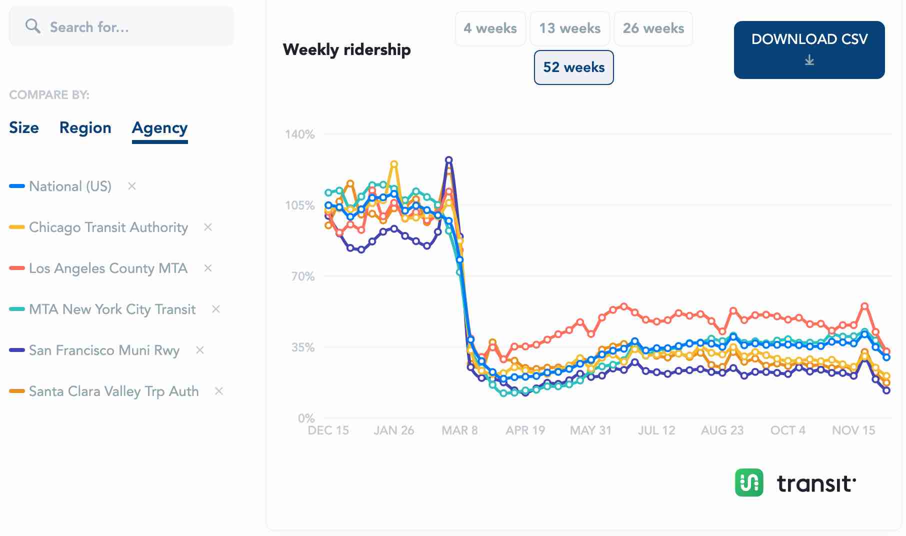
A new website designed to help people plot the demise of public transit has been posted and is being publicized by, of all groups, the American Public Transportation Association (APTA). To be fair, by “plot” I don’t mean “scheme” but “make a graph.”
Click image for a larger view.
The web site makes graphs showing weekly ridership for the nation or for any region or transit agency. Graphs can show the last four, 13, 26, or 52 weeks. Users can also access data showing ridership in the last 52 weeks either in absolute numbers or as a percentage of the same week from the year before. Continue reading


