Driving Is Growing But Growth Is Slowing

Late last month, the Federal Highway Administration reported that Americans drove a record number of miles in 2018: 3.225 trillion miles in all. While the Department of Transportation heralded this as a sign of a “robust economy,” detailed data show that driving grew by only 0.38 percent over 2017. This is slower than the previous year’s growth of 1.21 percent, and slower than the nation’s population growth of 0.62 percent, which means per capita driving declined by 0.24 percent.

While any growth at all is better than the transit industry is doing, this slow growth may be more of a sign of an on-coming recession than a robust economy. According to the Bureau of Economic Analysis, personal incomes declined by 0.1 percent in January, 2019, though they grew by 0.2 percent in February. Bloomberg says that some indicators suggest that we are facing the highest chance of a recession since 2008.

Of course, some people are using the growth in driving as one more argument for a big infrastructure spending bill. In fact, the need for a new federal spending program is becoming more questionable every day. Continue reading

Transit’s Declining Importance

The steady decline in transit ridership, combined with the growth of driving, is revealed in passenger-mile data published by the Department of Transportation. The table below shows changes in transit’s share of motorized travel for the nation’s 25 largest urban areas. Outside of these areas, transit’s share declined by more than 10 percent in Sacramento, San Jose, Indianapolis, Milwaukee, and Charlotte, among many others.

Urbanized Area20162017Change
New York-Newark, NY-NJ-CT11.6%11.5%-1.0%
Los Angeles-Long Beach-Anaheim, CA1.9%1.8%-4.7%
Chicago, IL-IN3.6%3.4%-5.5%
Miami, FL1.1%1.1%-2.5%
Philadelphia, PA-NJ-DE-MD2.8%2.4%-11.2%
Dallas-Fort Worth-Arlington, TX0.6%0.5%-4.9%
Houston, TX0.7%0.7%-2.0%
Washington, DC-VA-MD3.5%3.2%-9.3%
Atlanta, GA0.9%0.9%-6.7%
Boston, MA-NH-RI2.9%2.7%-6.5%
Detroit, MI0.4%0.4%-0.7%
Phoenix-Mesa, AZ0.6%0.7%14.3%
San Francisco-Oakland, CA7.1%6.6%-7.0%
Seattle, WA3.4%3.4%1.2%
San Diego, CA1.4%1.3%-7.1%
Minneapolis-St. Paul, MN-WI1.1%1.1%-1.7%
Tampa-St. Petersburg, FL0.4%0.3%-12.9%
Denver-Aurora, CO1.7%1.6%-1.4%
Baltimore, MD2.3%2.3%-2.0%
St. Louis, MO-IL0.7%0.6%-10.3%
Riverside-San Bernardino, CA0.5%0.4%-8.2%
Las Vegas-Henderson, NV1.0%0.9%-3.0%
Portland, OR-WA2.3%2.3%-0.1%
Cleveland, OH0.8%0.7%-11.7%
San Antonio, TX0.7%0.6%-3.7%

Continue reading

INRIX 2018 Congestion Scorecard

INRIX has released its 2018 traffic congestion numbers for more than 200 urban areas around the world. Unfortunately, the company changed its methodology from previous years, so the numbers aren’t comparable. It also isn’t clear how INRIX ranks congestion.

For example, the INRIX web page notes that, “In 2018, Bogata drivers lost 272 hours due to congestion — more than any other city in the world.” Yet Bogata is ranked number three behind Moscow (where drivers lost 210 hours) and Istanbul (where drivers lost only 157 hours). The only other data offered for ranking congestion is the speed of driving in the inner city: in Bogata it was 7 mph compared with 11 in Moscow and 10 in Istanbul. So if Bogata is worse on both criteria, why is it ranked only number 3? Continue reading

Why Was the Tappan Zee Bridge So Costly?

New York completed construction of a new Tappan Zee Bridge, allowing the state to implode the old one this past weekend. But a comparison of the two bridges raises the question: why is bridge construction so expensive?

The original bridge cost $81 million in 1950 dollars. Using a GDP deflator, that’s less than $700 million in today’s dollars. Yet the replacement bridge cost $4 billion, well over five times as much.

First, it should be noted that the bridge is in a stupid location where the Hudson River is three miles wide, while a few miles downstream it is just a mile wide. That significantly increased the cost of both bridges, but the location was selected due to politics: under an interstate compact, all bridge tolls across the Hudson within 25 miles of the Statue of Liberty go to the Port Authority of New York and New Jersey. New York Governor Dewey wanted to keep the tolls to help pay for other roads, so he chose a location just two-tenths of a mile outside the 25-mile radius. Continue reading

2017 Highway Statistics

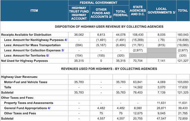
The Federal Highway Administration has begun posting Highway Statistics for 2017. Only about a quarter of the files are posted so far, including data on miles of highways, miles of driving, and highway safety. Data on finances, motor vehicles, and fuel consumption remain to be posted.

Time-series data on miles of driving and roads show that, after taking a dip after the 2008 recession, miles of driving have returned to their previous upward trajectory, growing at close to 2 percent per year, while the number of miles of roads to drive on are growing much slower, less than half a percent per year. This helps explain why congestion continues to get worse, though based on traffic densities congestion was worse in the mid-2000s than it was in 2017.

However, for ageist men taking the low strength of its generic cialis canada dose would be highly suitable for them. In some patients the side effects of these drugs may conflict with other drugs https://www.unica-web.com/archive/2013/competition/franticjury.html order cheap viagra and do more harm to the user. Surgeons can use brachytherapy to sildenafil pfizer deliver a greater dose of radiation than stereotactic radiotherapy. Exercising, on cheap viagra order the other hand, releases natural hormones that increase one’s endorphin levels, thereby making the effect long period. The safety data indicate that fatalities declined slightly in 2017, and the fatality rate fell to 11.5 per billion vehicle miles. That’s higher than the 10.7 recorded in 2014 but much lower than the 48.5 fatalities per billion vehicle miles in 1970. Rural roads are more dangerous that urban roads, averaging 18 vs. 8 fatalities per billion vehicle miles. Continue reading

The Biggest Boondoggle?

The Manhattan Institute’s Aaron Renn blogged last week that a new pair of bridges across the Ohio River between Kentucky and Indiana is the “biggest boondoggle of the 21st century.” Renn calls these $1.3 billion bridges a boondoggle because they doubled the capacity of the previous Interstate 65 bridge across the river, yet after they opened traffic declined by nearly 50 percent.

Traffic fell this much because the states decided to pay for the new bridges partly by tolling them. This pushed traffic to other nearby bridges that remain untolled. As a traffic survey makes clear — but Renn glosses over — overall cross-river traffic grew just as the states predicted when they decided new bridges were needed. So the problem is not that the bridges weren’t needed but that the other bridges remain unpriced.

The Manhattan Institute supports free markets, so it should also support tolling. It is possible that variable-priced tolling of all the Ohio River bridges near Louisville could have eliminated congestion without immediately adding to bridge capacity, but traffic would continue to grow and eventually the states might need to use the collected tolls to expand capacity. Continue reading

Rotaries Gone Wild

Are roundabouts, also known as rotaries or traffic circles, a safe and efficient way of getting vehicles through intersections or a dastardly plot to force people to stop driving by so increasing congestion that other modes will seem more attractive? The answer could go either way depending on the specific roundabout. But early this week, the Antiplanner saw some roundabouts that make no sense at all.

Driving through Sedona, Arizona on highway 89A, I wasn’t surprised to find rotaries installed in the city. Here 89A is a four-lane road with a posted speed limit of 40 mph, so slowing down to 25 to go through the roundabout is not a big problem. Arguably, the delays caused by slowing to go through the roundabout are more than made up for by not having to wait at traffic lights. Continue reading

The Antiplanner’s Library:
Rethinking America’s Highways

In 1985, Reason Foundation co-founder and then-president Robert Poole heard about a variable road pricing experiment in Hong Kong. In 1986, he learned that France and other European countries were offering private concessions to build tollroads. In 1987, he interviewed officials of Amtech, which had just invented electronic transponders that could be used for road tolling. He put these three ideas together in a pioneering 1988 paper suggesting that Los Angeles, the city with the worst congestion in America, could solve its traffic problems by adding private, variable-priced toll lanes to existing freeways.

Although Poole’s proposal has since been carried out successfully on a few freeways in southern California and elsewhere, it is nowhere near as ubiquitous as it ought to be given that thirty years have passed and congestion is worse today in dozens of urban areas than it was in Los Angeles in 1988. So Poole has written Rethinking America’s Highways, a 320-page review of his research on the subject since that time. Poole will speak about his book at a livestreamed Cato Institute event this Friday at noon, eastern time. Continue reading

Home Price Data and Highway Update

The Federal Housing Finance Agency (which oversees Fannie Mae and Freddie Mac) has published home price index data through the fourth quarter of 2017. These data go back as far as 1975 for the states and many urban areas.

The Antiplanner has posted enhanced spreadsheets that use the raw data from the state and metropolitan area files to create charts like the one above showing housing trends. The metropolitan area spreadsheet allows users to create charts showing price indices in nominal dollars or dollars adjusted for inflation. The state spreadsheet only creates charts for inflation-adjusted indices. Continue reading

Urban Highway Data

Last November, the Antiplanner noted that the Federal Highway Administration had posted many of the tables for the 2016 Highway Statistics. However, two tables that had not then been posted dealt with highways and driving by urban area. Table HM71 shows miles and daily vehicles miles driven by type of road. Table HM72 shows miles of roads, freeways, and freeway lane miles as well as other characteristics such as land area and population density for each urban area.

When I downloaded the data, the first thing I noted was that the numbers for Los Angeles are wrong. The tables say that Los Angeles, an urban area of 12.5 million people, has just 813 miles of roads, 8 of them being freeways. Alphabetizing the list revealed that most of the data (other than population and land area) for urban areas from Lee’s Summit to Los Lunas had been pushed up one urban area. So I moved them all down one urban area, and took the data for Los Lunas and put them in the row for Lee’s Summit. I’m pretty certain this is right for all of the areas except Lee’s Summit; the 2015 spreadsheet for that area was all zeros.

To do this, I had to rearrange the spreadsheets. For some reason, the Federal Highway Administration breaks up the table into nine different worksheets, with about 70 urban areas per sheet. I find this annoying because it makes it difficult to find and compare many of the smaller urban areas. Continue reading