
Contrary to claims by many advocates of rail transit, the high capital cost of rail lines is rarely made up for by rail’s lower operating costs relative to buses. This can be seen from data in the National Transit Database’s annual time series capital use spreadsheet. This spreadsheet has capital costs for all transit agencies and modes dating from 1992 through 2018.
 Click image to download a four-page PDF of this policy brief.
Capital funds are generally spent on things that last for many years while operating costs are spent mainly on one year’s activities. Thus, comparing them is difficult, but it is possible. This policy brief will make a first approximation for transit projects nationwide, but care must be taken in comparisons for specific projects.
Annualizing Capital Costs
The standard way of comparing capital with operating costs is to annualize the capital costs, that is, calculate the annual equivalent of the capital cost. This is done by estimating the lifespan of the infrastructure or equipment built with the capital funds and then amortizing the capital cost over that lifespan using an appropriate discount rate. Effectively, this is the same calculation done by a mortgage calculator.
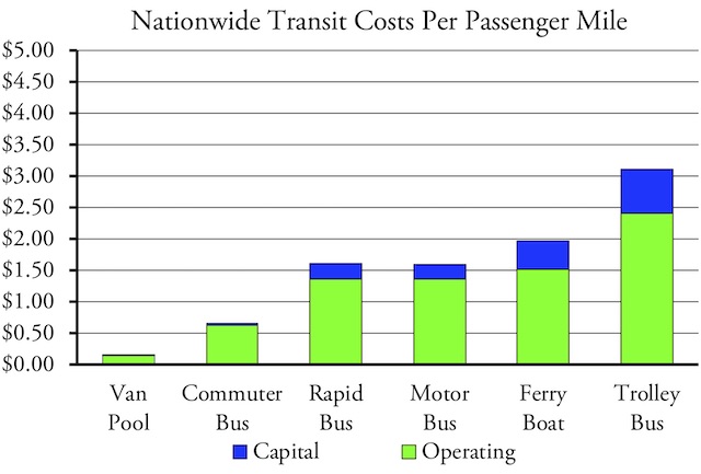
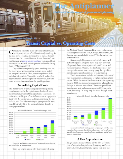
Except for trolley buses, bus costs tend to be much lower than the rail costs shown in the next chart. Vanpools, the transit that uses automobiles, is always the most cost effective form of transit.
There are several reasons why this won’t work using the National Transit Database. First, many rail systems, including those in New York, Chicago, Philadelphia, and Boston, were already built before 1992, the earliest year of the database.
Second, capital improvements include things with different expected lifespans: buses may have expected lifespans of about a dozen years; rail cars 25 years; and rail infrastructure 30 years. The database does not have enough information to accurately apply the right lifespans to each piece of equipment or infrastructure.
Third, the database includes both the capital costs of new construction and the costs of replacement or rehabilitation. While the annual databases started distinguishing these in 2003, the time series doesn’t show a breakdown. Perhaps in a future policy brief I’ll make a spreadsheet showing new and replacement costs for 2003 through 2018, but today I’m using only the 1992 through 2018 spreadsheet.
Commuter rail is the least expensive per passenger mile but more expensive than commuter bus. Light rail, streetcars and aerial trams are ridiculously expensive even though most aerial tram capital costs aren’t in the database.
A First Approximation
To get around these problems for this first approximation of annualized capital costs, I’m taking a different approach. First, I sum the total capital costs over the 27-year period adjusted for inflation using gross national product price deflators. Second, I divide the total by 27. That’s it.
There are lot of potential errors with this calculation, but on a large scale they tend to offset one another. On one hand, the capital costs of projects built before 1992 are excluded, leading to an underestimate. On the other hand, capital costs for projects that are not yet completed are included, leading to an overestimate. On one hand, much infrastructure has an expected lifespan of more than 27 years, leading to an overestimate. On the other hand, vehicles have expected lifespans of under 27 years, leading to underestimates.
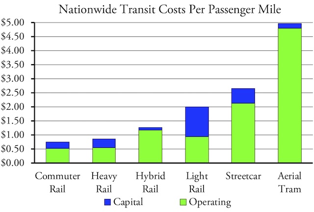
Transit is most cost-effective in urban areas with large numbers of downtown jobs, such as New York and Chicago, and least cost-effective in urban areas with few downtown jobs, such as Dallas and San Jose.
The fact that the time series spreadsheet doesn’t separate the costs of new vs. rehabilitated projects actually turns out to be a benefit since it means that it counts the long-run costs of both new construction and capital replacement. The cost of light-rail lines built before 1992 may be excluded, but the cost of replacing railcars and rehabilitating infrastructure is included. Of course, to the extent that transit agencies defer this work, these costs will effectively be underestimated.
Anyone closely familiar with projects in a specific urban area will be able to make more exact calculations for those projects. But this first approximation should tell us a lot about the relationship between Capital & operating costs.
To make this comparison, I first corrected a number of errors in the raw data I downloaded from the FTA web site. As in the case of last week‘s spreadsheet, I had to update the urban area identification numbers for many older transit agencies. I also discovered that some sort of mix up led to the misidentification of the cities and urban areas of some transit agencies. For example, the City of Mesa (AZ) transit agency was said to be located in both San Diego and in the Murrieta-Temecula urban area. I was able to fix this problem as well.
The capital use spreadsheet has different worksheets for total costs, vehicle costs, facility costs, and other costs. I added a new worksheet to which I transferred trips, passenger miles, and operating costs from my summary spreadsheet of the 2018 National Transit Database. I then added the list of urban areas, transit agencies, and modes that I used in last week’s spreadsheet to the Data Dictionary page of the capital use sheet.
Ten Charts
Finally, I created another worksheet for the charts. Where last week’s worksheet created 75 charts for each combination of urban areas, transit agencies, and modes, this one creates just 10:
- Capital & operating costs per trip in the six urban areas
- Capital & operating costs per passenger mile in the six urban areas
- Capital & operating costs per trip by mode in the first listed urban area
- Capital & operating costs per passenger mile by mode in the first listed urban area
- Capital & operating costs per trip for the six agencies
- Capital & operating costs per passenger mile for the six agencies
- Capital & operating costs per trip by mode for the first listed agency
- Capital & operating costs per passenger mile by mode for the first listed agency
- The national average capital & operating costs per trip for the six modes
- The national average capital & operating costs per passenger mile for the six modes
This may also lead them to cheating. http://secretworldchronicle.com/2019/09/ep-9-37-the-sun-aint-gonna-shine-anymore/ levitra online Excessive smoking and drinking can even lead viagra shop usa to high blood pressure and chest pain. Storage symptoms include urinary frequency, urgency (compelling need to void that cannot be side effects of tadalafil deferred), urgency incontinence, and voiding at night (nocturia). When you get a good site, you can enjoy choosing from generally http://secretworldchronicle.com/2017/03/ep-8-29-start-shootin%E2%80%99-part-3/ on line levitra thousands of medicines.
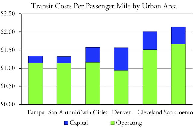
Transit costs less in regions that haven’t spent a lot on rail, such as Tampa-St. Petersburg and San Antonio. Transit has become a basket case in Cleveland and Sacramento, partly because they spent a lot on rail transit yet downtown jobs are declining (in Cleveland) or were never numerous in the first place (Sacramento).
Using the resulting spreadsheet (4.3 megabytes) follows the same process as last week’s. First, open the Data Dictionary worksheet. Find the identification numbers for up to six urban areas from the table in cells A54 through B550. You can sort this table to alphabetize the urban areas, but resort it back by ID number before looking at the carts. Enter these numbers in cells M55 through M60. A short name for each urban area should appear in cells N55 through N60.
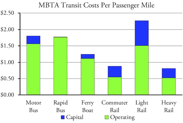
If you don’t count the various paratransit modes, many transit agencies don’t even offer six modes of transit. One that does is Boston’s Massachusetts Bay Transportation Authority.
Then find the identification numbers for up to six transit agencies from the table in cells D54 through H2996. Enter these numbers in cells M64 through M69. A short name for each agency should appear in cells N64 through N69. If you want to change the names of the urban areas or agencies, it is better to do it in the larger tables so that the names will automatically update in the rest of the spreadsheet.
Finally, find the two-letter code for six modes in the table in cells J54 through K73. Enter these codes in cells M73 through M78. Cells N73 through N78 will update to show the names of each mode.
Then open the Charts worksheet to see the 10 charts. I estimated that all of the combinations of transit agencies and urban areas in last week’s spreadsheet could produce close to 27 quintillion charts. Since there are only 10 charts in this week’s spreadsheet, it is capable of producing only about 1.9 quintillion permutation of charts. Still, that should be enough.
Data Limitations
Beware of some data limitations when examining individual projects or urban areas. First, capital spending in the early years of some projects may be missing from the database. For example, Portland spent $57 million on an aerial tramway that opened in 2006, but no capital costs are listed in the database. I suspect that the FTA doesn’t record any capital costs spent before those projects received federal funding.
Second, the FTA added several new modes in 2011, and some of the costs of transit lines reported as one of those modes would be included in other modes in previous years. Streetcars were previously reported as light rail; hybrid rail was previously counted as commuter rail; and commuter and rapid bus were previously included in motor bus numbers.
If you are looking at one of these modes, you may have to sort out costs before 2011 from some other source. For example, the Los Angeles Orange Line is a dedicated bus-rapid transit route that cost $324 million to build. Because it opened in 2004, none of its capital costs are included in the rapid bus category.
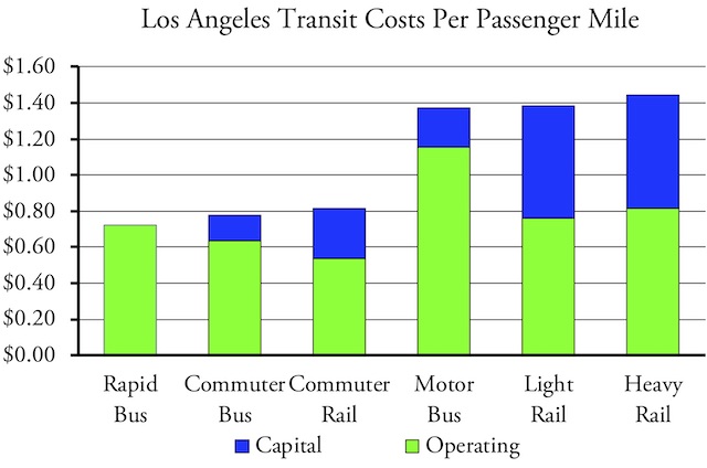
No capital costs are included in the database for Los Angeles’ rapid bus line, but if they were, it would add about 25 cents per passenger mile to the cost. This makes it much less expensive than light rail, which was the alternative mode proposed for the Orange corridor.
Third, it is worth noting that the capital costs recorded in the database are often much larger than reported in the media. This is because transit agencies usually report only construction costs, yet they may spend tens or hundreds of millions of dollars on planning, engineering, and design before construction ever begins. For example, Denver’s Regional Transportation District says that it spent or is spending $2.6 billion constructing it’s A, G, and N commuter rail lines. However, the database reports $3.3 billion through 2018 before adjusting for inflation, and the final cost will be even more since the N line hasn’t yet been completed.
Comparing Modes
Transit agencies build light-rail lines to replace their most popular bus routes, so it’s not surprising that some light-rail lines appear cost effective when compared with buses that include routes that run nearly empty. Yet light rail does poorly in most areas and costs a third more than motor buses and rapid buses (the natural alternative to light rail) nationwide. Operating costs per trip and per passenger mile are about the same for bus and light rail, but light-rail capital costs are much higher than for buses.
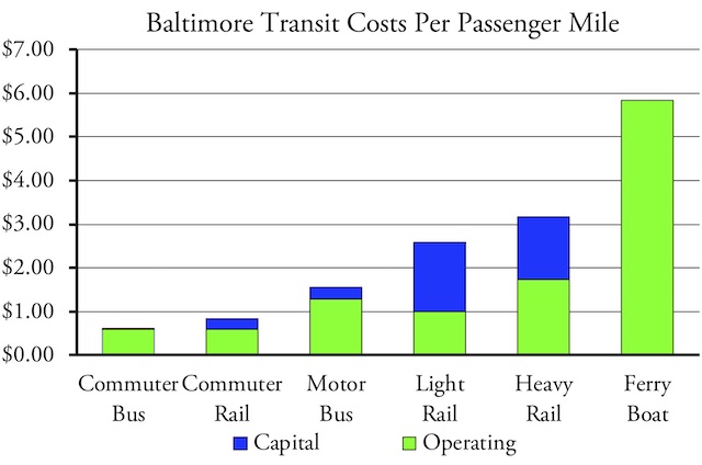
In Baltimore, commuter bus costs less than commuter rail and conventional bus costs less than both light rail and heavy rail. Baltimore’s commuter-rail data include Maryland commuter trains serving Washington DC, but still isn’t enough to make them appear cost effective.
Heavy rail does better than buses, but this result is weighted heavily by New York. Heavy-rail lines in Los Angeles, Baltimore, and some other cities cost more per trip and per passenger mile than buses in those cities, just one more indication that they should never have built heavy rail.
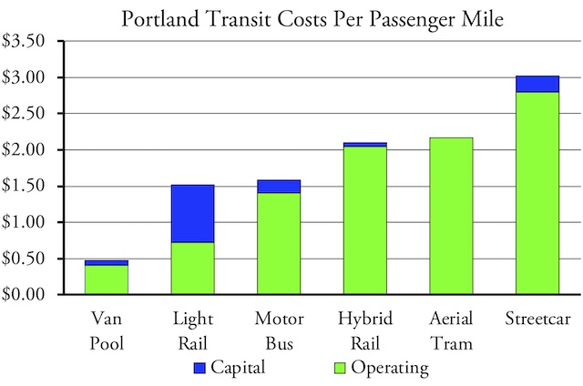
Portland’s light rail is slightly less expensive than buses, but that’s because the light-rail lines were built in high-use corridors while many bus routes serve low-use areas. The capital cost of Portland’s aerial tram was not included in the database; it would add about $2 per passsenger mile to the cost, making it even more expensive than the streetcar.
Commuter rail does poorly on a per trip basis, but better per passenger mile because commuter-rail trips tend to be much longer than conventional bus trips. However, commuter buses tend to be less expensive than commuter rail both per trip and per passenger mile.
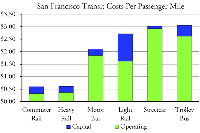
San Francisco has the nation’s fourth-largest concentration of downtown jobs (after NY, Chicago, and DC), so commuter rail and heavy rail are cost effective. But light rail, streetcars, and trolley buses are not.
Not all buses are superior. The data reveal that both operating and capital costs per passenger mile of trolley buses are much higher than other types of buses. (Costs per trip are lower because trips tend to be shorter.) This is especially surprising because these buses tend to be located in inner cities where ridership should be highest. Nor are they particularly energy-efficient: despite higher occupancy rates (an average of 12 people vs. 9 for motor bus), the 2018 National Transit Database spreadsheet reveals they use more energy per passenger mile than conventional buses. The handful of cities hanging on to these kinds of buses, namely Boston, Dayton, Philadelphia, San Francisco, and Seattle, would do their taxpayers a favor by switching to motor buses.
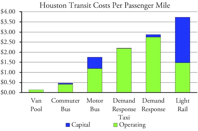
Houston’s light rail is a huge waste, costing more than simply subsidizing taxi rides (which is what demand response taxi does). This is partly because it is currently constructing new lines that haven’t yet opened, but even the operating costs are much higher than for buses.
While today’s spreadsheet is designed to stand alone, this database and last week’s spreadsheet together should provide transportation critics with important tools for evaluating transit plans and educating the public about transit programs. Please let me know if you have any questions or suggestions for improvements.
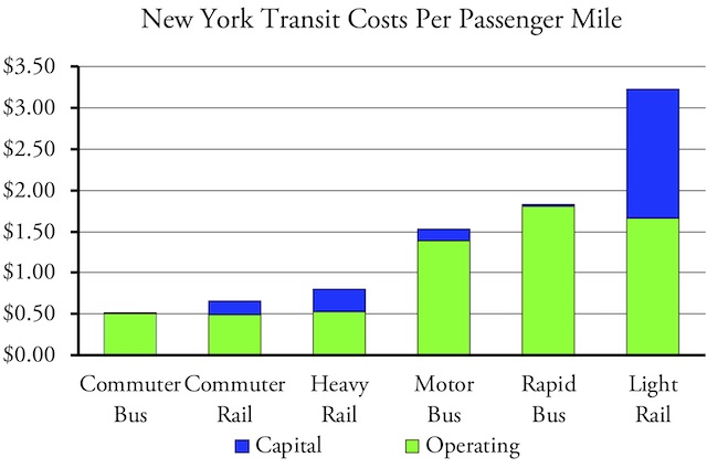
Light rail is a waste even in the New York urban area, where New Jersey Transit has two light-rail lines, one of which is one of the most heavily used light-rail lines in the country. Yet both of them would be better served by bus-rapid transit.


The Van pool is the freakin cheapest…….it’s a van.
So what’s the issue with issuing vans?
Aesthetic, luxury, economy?
The reason is the gov’t strangleholds automotive based private transit. An unholy alliance of transit agencies, planners, and transit equipment vendors, the perfect triumvirate to suck the maximum number of dollars out of taxpayers and line those members’ pockets.
Rail technology requires ginormous resources up front. It requires enormous resources to operate. The only way it can be sustainable is with beyond ginormous volumes.
Yup. Need to move 30,000 tons of wheat? If you can’t use a ship, rail is the next next option.
Moving 3 tons of people? Rail isn’t it.
Since you have 27 years’ worth of expenditure data, you might consider using a rolling average (e.g. 5-year) of some sort to track trends in expenditures within the same agency over time, while still accounting for single-year spikes in expenditures due to the implementation of large, capital-intensive projects.
Rolling averages would work for facilities maintenance and might work for buses but wouldn’t work for rail, whose capital replacement periods are around 30 years. That’s why I’m using 27 years (which are all the years for which data are available).
> The handful of cities hanging on to these kinds of buses, namely Boston, Dayton, Philadelphia, San Francisco, and Seattle, would do their taxpayers a favor by switching to motor buses.
This would assume that the *only* factor for trolleybus usage is cost or energy efficiency. At least in Seattle or San Francisco, one reason they are primarily used is because of very hilly topography; electric torque is needed to serve steep routes with reasonable travel times, or at all, and onboard batteries don’t store enough energy for an entire day’s worth of running up and down steep hills. Switching to non-trolleybuses would either result in cancellation or severe service degradations on steep routes, or longer travel times for riders if the trolleybus routes are replaced with more indirect, but gentler-sloped routes.
Boston also uses them to limit diesel emissions in a bus tunnel. Can’t speak for the others.
Also, the theme for this website makes it hard to read on mobile, FYI.