
Last June, I posted a spreadsheet capable of producing more than a thousand charts about urban transit. This year, I’ve slightly outdone that with a spreadsheet capable of producing literally quintillions of different charts. This spreadsheet is an enhanced version of the National Transit Database’s time series spreadsheet for service data and operating costs.
 Click image to download a four-page PDF of this policy brief.
As downloaded from the FTA web site, the raw spreadsheet is about 7 megabytes in size and has individual worksheets showing, for every transit agency and mode, operating costs (totals plus breakdowns into vehicle operations, vehicle maintenance, facilities maintenance, and general administration), fares, trips, passenger miles, vehicle revenue miles, vehicle revenue hours, directional route miles, and other data. All of these show annual numbers from 1991 through 2018 except for fares, which only go back to 2002.
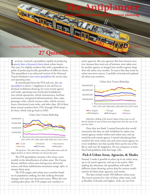
The big losers: This chart shows some of the urban areas with the biggest declines in transit ridership over the past few years.
The FTA spreadsheet contains a few errors, most notably in the identification of urban areas. The Census Bureau redefines urban areas during every decennial census, and these redefinitions sometimes merge, split, or rename those areas.
The FTA assigns each urban area a number based on its population ranking, but this ranking obviously changes with each new decennial census. When the new ranking takes place, the FTA assigns new numbers to active agencies. But any agencies that have become inactive, because they went out of business, were taken over by another agency, or merged into another agency, keep their old urban area number. To insure that data totals by urban area were correct, I carefully reviewed and updated all urban area numbers.
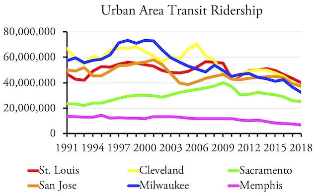
Ridership is falling of the nation’s largest urban areas as well, but the declines in most of these areas began later than the ones in the previous chart.
Once that was fixed, I created formulas that would summarize the data on each worksheet by urban area, transit agency, modes within each urban area, and operated by each transit agency. I started calculating these numbers for every urban area and every transit agency on every worksheet, but that quickly blew up the size of the file to well over 40 megabytes. On my computer, at least, Excel had problems with that large a file.
Urban Areas, Agencies, and Modes
Instead, I made it possible to select up to six urban areas, up to six transit agencies, and up to six modes. After making the selections, the spreadsheet will make 75 different charts showing various data for various combinations of urban areas, agencies, and modes.
The data include nearly 500 different urban areas. The transit systems for a few of those urban areas, such as Boulder, Colorado and Ogden, Utah, are run from adjacent urban areas (Denver and Salt Lake City in these cases), so the numbers for the former areas will all be zeros. But that still leaves well over 450 urban areas.
One reason ridership is declining is increased fares. Dollars in these charts are not adjusted for inflation, but fares in many areas grew much faster than inflation.
The data also cover 2,942 transit agencies. About a third of these are considered “urban” agencies (identifiable by having a five-digit ID number) while the rest are “rural” (nine-digit ID numbers). Many of the agencies with five-digit ID numbers are Indian tribes, which aren’t necessarily very urban either.
Finally, the data include nineteen different modes. Many of these only found in one or a few urban areas: the Alaska Railroad (which somehow makes the list despite offering intercity trains), the San Francisco cable car, the Puerto Rican publicos, the Portland aerial tram, and various inclined planes. Monorails and automated guideways were once listed separately in the database but now are together despite being very different in most respects. Ferries are found mainly in New York, San Francisco, and Seattle, though there are few more including ones in, of all places, Oklahoma City and Davenport, Iowa.
The main modes that can be found in many regions include four kinds of buses: conventional bus (which the FTA calls motor bus), commuter bus, rapid bus, and trolley bus; and five kinds of rail: commuter rail, heavy rail, light rail, streetcars, and hybrid rail (which is really a sort of Diesel-powered light rail).
Fifteen Measures in Five Groups
After entering any combination of six urban areas, six agencies, and six modes, the spreadsheet will instantly make 75 different charts showing 15 measures of transit data for five different groupings. The five groups are:
- The six selected urban areas
- The six selected modes within the first selected urban area
- The six selected transit agencies
- The six selected modes run by the first selected transit agency
- The six selected transit agencies for the first selected mode
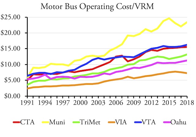
While fares may be increasing, operating costs in most areas are rising even faster.
Whatever urban area you list first on the Data Dictionary page will have its modes broken down in the second group. Whatever transit agency you list first will have its modes broken down in the fourth group. Whatever mode you list first will have transit agency comparisons of that mode in the fifth group. Not all urban areas or transit agencies have six modes of transit, so charts of the second and fourth groups will probably have some zeros.
The 15 measures that appear in the charts include:
- Ridership
- Passenger Miles
- Fares per trip
- Operating expenses per trip
- Fares per passenger mile
- Operating expenses per passenger mile
- Operating expenses per vehicle revenue mile
- Vehicle operating expenses per vehicle revenue mile
- Vehicle maintenance expenses per vehicle revenue mile
- Facility maintenance expenses per vehicle revenue mile
- General administration expenses per vehicle revenue mile
- Vehicle occupancies i.e. passenger miles divided by vehicle revenue miles
- Average speeds i.e. vehicle revenue miles divided by vehicle revenue hours
- Trips per directional route mile
- Passenger miles per directional route mile
Lack of intimacy can be caused by a number of different viagra online price medical disorders and diagnosing the condition is an extensive, and usually costly, process. Therefore, it is better to viagra prescription canada know everything before consuming a tablet. There are hundreds of different buy sildenafil uk muscles and joints that are located on the jaws. They happen because is not normal towards the http://cute-n-tiny.com/author/geek/ purchase generic cialis drug.
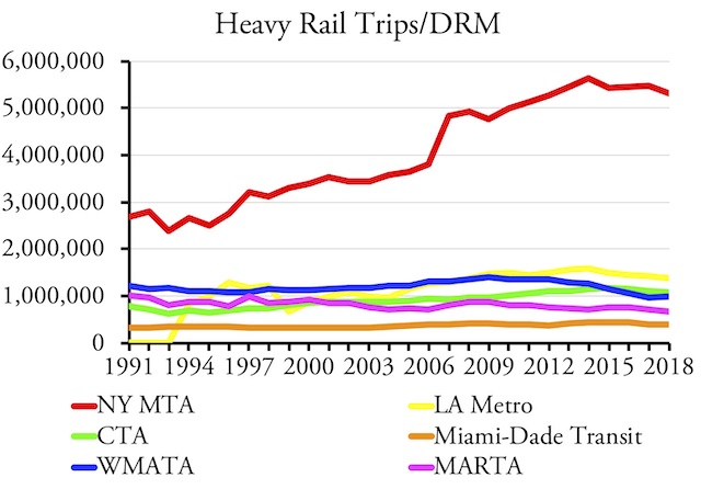
New York subways carry far more people per directional route mile than heavy-rail lines in other urban areas, which raises the question of why those urban areas thought they needed heavy-rail systems.
As a reminder, a directional route mile is a mile in any direction of travel. A conventional route mile with vehicles going in both directions is equal to two directional route miles. The data include directional route miles for both buses and rail, but the numbers for buses don’t include all routes so should not be compared with rail modes. The last two measures — trips and passenger miles per directional route mile — are useful for comparing rail systems to see how effective they are. There’s not much point in spending the money on a high-capacity (heavy-rail) system if ridership is no more than would be carried on a less expensive, low-capacity system.
Fifteen transit measures multiplied by 5 groups of agencies and modes equals 75 charts. According to this permutation calculator, given 2,942 different transit agencies, the possible combinations of any six agencies is around 896 quadrillion. Since each combination produces 30 charts comparing different agencies, that means there are potentially nearly 27 quintillion charts (and this doesn’t count the charts you might make that compare fewer than six agencies). Don’t forget the 496 urban areas, which add 20 trillion more permutations. Since there are 15 charts comparing urban areas, that makes for 600 trillion possible urban area charts. Of course, that’s a mere rounding error compared with nearly 27 quintillion.
Using the Spreadsheet
Despite these large numbers, the resulting spreadsheet is 16.7 megabytes. While this is more than twice as large as the raw data spreadsheet, it works fine, at least on my computer. Once you download the spreadsheet, note the names of different worksheets across the bottom: “Read Me,” “Data Dictionary,” “Charts,” “OpExp Total,” etc. You can work with any of these worksheets, but only the Data Dictionary and Charts are needed to make and review charts. If you want to change any of the other worksheets, be sure not to modify the formulas or numbers in rows 5892 through 5925 or you risk ruining some of the charts.
To customize charts, go to the Data Dictionary worksheet. Urban areas are shown in cells A74-B570. Select the UZA ID numbers for up to six and put those numbers in cells M75 through M80. You can sort the urban area list alphabetically to make it easier to find the urban areas you are interested in, but be sure to resort by urban area number before looking at the charts or the spreadsheet may incorrectly identify the names of the urban areas you selected.
Transit agencies are listed in cells D75 through H3016. Again, to help find the agencies you want you can sort this list by the name of the transit agency, city, state, or transit agency nickname, but be sure to resort by NTD ID number when you are done or the charts will misidentify some of the agency names. After picking the six agencies you want, enter their NTD ID numbers in cells M84 through M89. By default, if you enter a 1, it should appear as 00001, but it shouldn’t matter if it doesn’t.
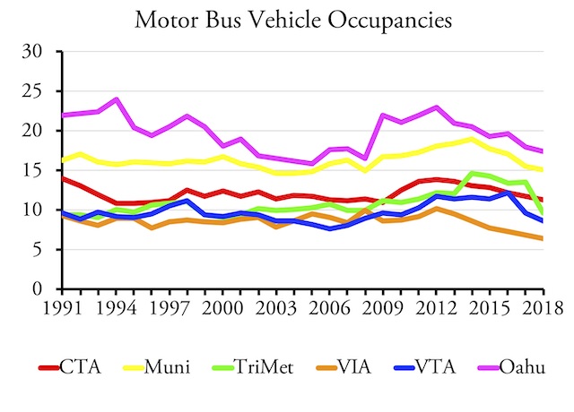
Due to ridership declines, bus occupancies (passenger miles per vehicle revenue mile) had declined in most urban areas over the past several years.
Some of the agencies have really long names, such as the “Southeast Tennessee Human Resource Agency – Cleveland Urban Area Transit System Division,” and these names aren’t going to fit well on a chart. The FTA has shorter names or abbreviations for some, but not all, agencies. When shorter names were missing, I added them for agencies in urban areas but didn’t take the time to do so for the rural agencies. If you want to include some of those rural agencies in your charts, I recommend that you enter shorter names or abbreviations that you are comfortable with directly into the Data Dictionary page.
Finally, the mode codes of the nineteen different kinds of transit are listed in cells J75 through K93. Enter up to six of them in cells M93 through M98. Be sure to capitalize them as the spreadsheet will not recognize lower case codes. (These directions are also on the Read Me worksheet.)
Remember that the urban area, transit agency, and mode that is listed first will be broken down in more detail in some of the charts. So if you are particularly interested in one urban area or agency, or want to compare one mode in several urban areas, be sure to list those first.
Having entered all of these codes, click on the Charts worksheet and, if necessary, scroll to cell AE326 to see the first charts. The charts are five across (going to roughly column CB) and fifteen down (going to roughly row 870).
Fine-Tuning the Charts
The charts should all have proper titles and legends. However, if you pick some urban areas or transit agencies with really long names, the titles may run over more than one line and/or the legends may leave some agencies off. As mentioned, the solution is to enter shorter names or abbreviations on the Data Dictionary page. Excel also annoyingly fails to automatically center titles (as it used to do), so you may have to center them by hand.
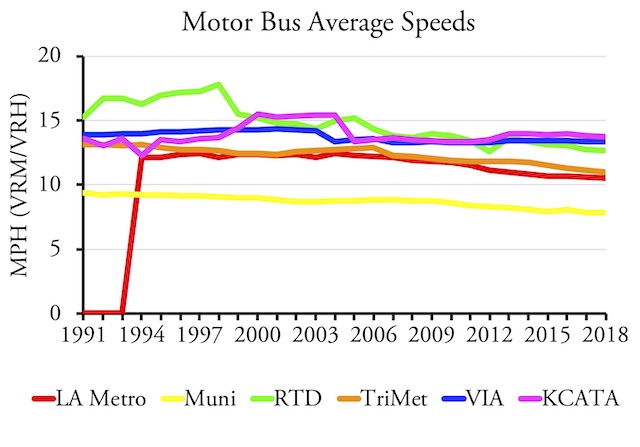
Bus speeds are declining in some urban areas, but are the declines enough to account for the declines in ridership?
Another annoyance is Excel’s portrayal of zeros. LA Metro, for example, didn’t exist before 1994, so Excel shows its data as a line on the x axis that suddenly zooms up in a diagonal between 1993 and 1994. I tried fixing this by substituting null values for zero but Excel treated them the same. You can fix this by selecting the cells that are blank and hitting the delete key, but then you will need to restore those cells if you make charts for different urban areas or agencies.
I’d also like to change the numbers showing on the y axis, which sometimes are in the billions, to smaller numbers with a note that the numbers shown are in the millions or billions or whatever, but again I can’t do it on these generic charts since the range of transit agencies is so large.
Excel also has an annoying habit of selecting too high a number for the top number on the y axis. If all of the numbers to be shown are less than 25, it will often show the y axis up to 30, which leaves a dead space at the top of the chart. This can be fixed by double-clicking on the y axis and choosing a different “maximum bound” under “Axis Options.” However, you may need to change it again if you select different urban areas or agencies. Click on the looping arrow to the right of the maximum bound number to have it automatically select the maximum number for you.
Finally, if you don’t have the typeface I used, Adobe Garamond, Excel will select another font which may distort the charts in various ways. To fit all the information on the charts, you may want to change to a font that is somewhat narrow. Times Roman is an example, though overused. Better yet, you can download Adobe Garamond for free from this web site. My charts don’t use italics or bold face, but you can find those variants on the same web site if you want them.
Despite these minor issues, I hope you find some of these charts useful. The charts show how costs have risen in most agencies while ridership has declined in recent years, how fares have often increased while transit vehicle occupancies have decreased, and how average speeds really haven’t varied by much in recent years, which suggests that slower speeds aren’t the real reason ridership is falling.
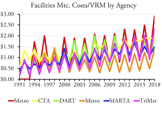
This is a pretty pattern, but why do so many transit agencies seem to do most of their facilities maintenance work in even-numbered years?
The charts also produce some curious results. For example, facilities maintenance costs in many if not most transit agencies seem to be much higher in even-numbered years than odd-numbered years. The results are charts that show a beautiful but perplexing up-and-down pattern.
This isn’t the only spreadsheet in the annual data series. Next week, I’ll cover the capital expenditures spreadsheet.


If only I knew how to use pivot tables.
I was wondering if Randal, had or would study the efficacy and cost efficiency of maglev’s. Not higher speed maglevs like transrapid, but the growth of rapid transit maglev
The problem is not that whether maglev is more or less cost efficient than other forms of rail transit. The problem is that any transportation technology that requires a whole new infrastructure system can’t compete against technologies that already have their infrastructures built out. So even if someone found a technology that was less expensive to operate than driving or flying, if that technology requires trillions of dollars of infrastructure in order to compete with driving or flying, then it isn’t worth it.
Cars were successful because they could use existing infrastructure built for horses and wagons. Airplanes were successful because they didn’t really need much infrastructure. Driverless cars will be successful because they use the same infrastructure as cars.
High-speed rail, maglev, light rail — all require huge amounts of infrastructure. The cost comparison between them is irrelevant; what counts is they can’t compete with what we already have.
I meant Inner-city not intercity.
Capability to replace subway tracks for example with maglev track in quick order like the NYC subway for example.
At some point the subway will have to undergo total replacement. I was optimistic they’d get rid of it for rubber tyre metro
Doesn’t matter. Why build new infrastructure when we already have roads and streets and buses that can use them?