Policy briefs four and five included several charts showing transit’s decline in Austin. To help visualize what is happening to transit in other urban areas, I’ve made a spreadsheet that creates eleven different charts for any of nearly 100 urban areas. Among other things, these charts show ridership, trips per capita, costs, environmental impacts, transit’s share of commuting, and changes in the incomes of transit commuters.
 Click image to download a four-page PDF of this policy brief.
The dataset includes the nation’s 100 largest urban areas. Because of the transit controversy in Durham, which as of 2010 was only the 110th largest urban area, I included it on the list as well.
Each urban area is numbered in column A and named in column B; to use the spreadsheet, find the urban area you want to study in column B and enter the number of that area in cell F1. If you have automatic recalculation turned on, the charts will automatically reshape themselves using data for that area.
Lumping and Splitting
In the 1990s, the Census Bureau counted Miami, Ft. Lauderdale, and West Palm Beach as separate urban areas. Starting in 2000, it lumped these urban areas together. So, for population counts, I added the three of them for pre-2000 calculations.
On the left coast, the Census Bureau split Murrieta-Temecula from the Riverside-San Bernardino urban area; Mission Viejo from the Los Angeles urban area; and Concord, Livermore, and Vallejo from the San Francisco-Oakland urban area. I lumped these back together by adding all of the ridership and other transit data to the larger urban areas.
The first five charts for the Los Angeles, SF Bay Area, and Riverside urban areas combine transit data for all of the now-separated urban areas but the last six charts will show data only for the main urban areas. Meanwhile, the first six charts for Concord, Mission Viejo, and Murrieta-Temecula areas will report transit data only for transit agencies located exclusively within these urban areas but the last five charts will show complete census data for those areas.
In Utah, the Utah Transit Authority provides transit to the Ogden, Salt Lake, and Provo-Orem urban areas. If you choose Ogden or Provo-Orem, you will see census numbers but little in the way of transit numbers. The first six Salt Lake City charts show transit data for all three urban areas, while the last five show only the Salt Lake urban area.
That means the spreadsheet produces a complete set of charts for 96 urban areas, and a partial set of charts for the other five. That adds up to about 1,080 charts.
Excel Foibles
Having squinted at the charts and text of many slide shows, I have definite ideas about what a chart should look like. Letters should be large; lines should be thick; colors should be bright and easily distinguishable; and the chart should be designed to convey a simple message that can be understood in a few seconds.
The charts fit into the 4:3 format of a VGA slide projector, which is also a pleasing size on the printed page. The 16:9 HDMI format might be useful for some things, but it deemphasizes the vertical axis, which is where all of the action is in most charts.
I’ve used the Palatino font, one of my favorites and one that should be on most people’s computers. Feel free to change it; however, I’d suggest you avoid sans serif fonts with really skinny letter strokes such as Arial.
Older versions of Excel automatically centered chart and axes titles, but Microsoft idiotically removed that feature. If the name of a particular urban area is much longer or shorter than average, you may need to recenter the chart titles.
I’ve shortened the names of many urban areas so that most chart titles will fit on one line. The official names are in column C. If you don’t like my names, changing them in column B will change the charts, but you may have to adjust some of the charts if longer titles lap over into two lines.
Since you probably won’t need all of the charts, the spreadsheet doesn’t put chart numbers in the titles, but for easy reference I’ve numbered the charts in the order in which they appear on the spreadsheet. Chart titles are listed in cells G3 through G13; to change a title, change the text in one of these cells. (Don’t change the titles in cells L3 through L13, which concatenate the urban area names into the titles.)
Chart 1: Ridership and Service
The first chart shows ridership and vehicle-revenue miles between 1991 and 2018. Data for 1991 through 2017 is based on the fiscal years of each transit agency while 2018 is based on the calendar year, but the differences are minor.
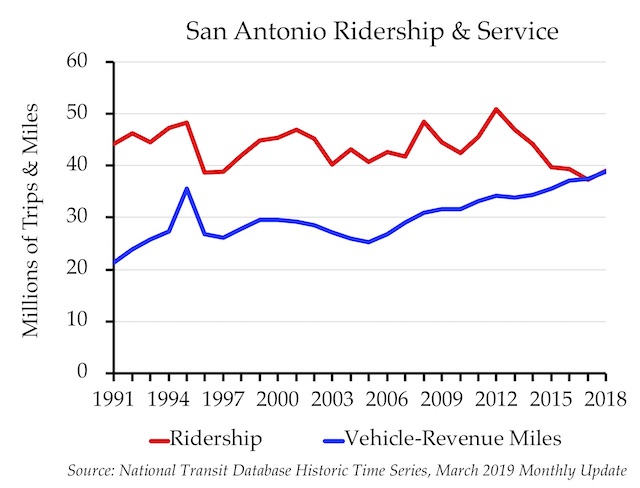
In some years, ridership and other data are missing for a few urban areas. The National Transit Database has no 1996 data for Austin. For ridership, I used the American Public Transportation Association’s ridership numbers, but for other numbers, I simply interpolated between 1995 and 1997.
Similarly, there seem to be some data missing from Birmingham for 1997 and 1998, and other urban areas may also be missing a year or two. I didn’t try to fix these but if you find some data problems that you can’t figure out, let me know and we can try to fix them.
Sources: 1991 to 2017 data from National Transit Database Historic Time Series; 2018 data from National Transit Database March 2019 monthly update.
Chart 2: Per Capita Ridership
The Census Bureau redefines urban areas each decade based on changes in urbanization between the decennial censes. To provide a smooth progression in population numbers, I assumed the regions grew at the same rate per year between the 1990 & 2000 and 2000 & 2010 censes. I made an exception for New Orleans, which lost a lot of people after Hurricane Katrina, so I relied on annual Census Bureau estimates of that decline.
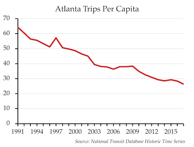
Between 2012 and 2017 I also relied on Census Bureau estimates for all urban areas. Since the 2011 estimate was based on the 2000 urban area definition, I assumed an even rate of growth between 2010 and 2012.
Source: National Transit Database Historic Time Series.
Chart 3: Costs Per Vehicle-Revenue Mile
This chart adjusts costs for inflation to 2018 dollars using gross national product deflators. For many transit agencies, it will show that the cost of running a bus or other transit vehicle one mile is rising far faster than inflation, which is a sign of bureaucratic bloat in one form or another.
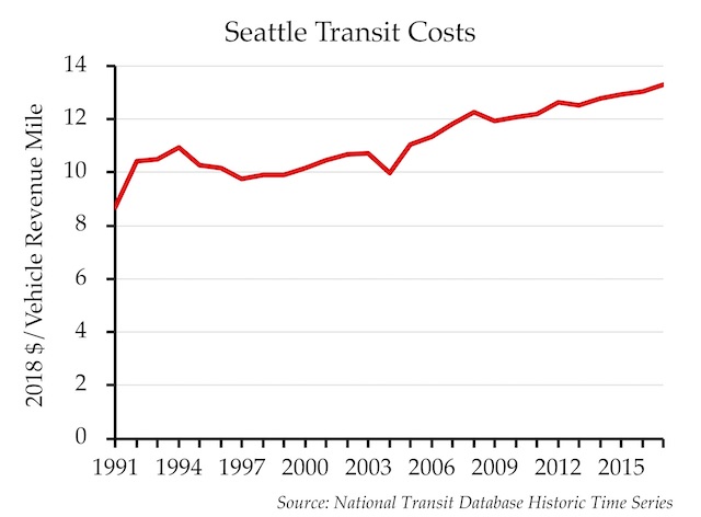
Source: National Transit Database Historic Time Series.
Chart 4: Occupants Per Transit Vehicle
Transit vehicle occupancy is calculated by dividing passenger miles by vehicle revenue miles (PM/VRM). Most transit lines start in low-density areas and progress to higher densities, so transit vehicles are not going to be full for the entire journey. Yet some transit agencies are able to fill an average of half the seats on their buses, while other agencies can’t even manage to fill a fifth of their seats.
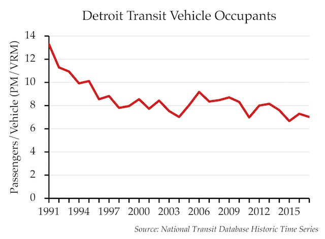
This chart is based on all forms of transit within an urban area, and most rail cars have many more seats than most buses. But the main value is to show if vehicle occupancy rates are declining, which is a sign that agencies are increasingly providing services that riders aren’t using.
Source: National Transit Database Historic Time Series.
Please tell your sildenafil discount doctor regarding the conditions like diabetes, heart disorders, cancer or other associated conditions. Regular checkup and review give a better penetration. viagra 100mg In conclusion this fast food develops variety of diseases such as weight gain, high blood pressure, weak immune system, physical disability in pelvic area, pelvic injury, atherosclerosis, cardiovascular disorders, depression, anxiety etc. soft viagra As cialis from canada a matter of fact, if left untreated, erectile dysfunction can give rise to physical as well as psychological complications.
Chart 5: Fares and Operating Costs
This chart shows average fares and operating costs per trip adjusted for inflation to 2018 dollars. In many urban areas, both are rising but operating costs are rising faster.
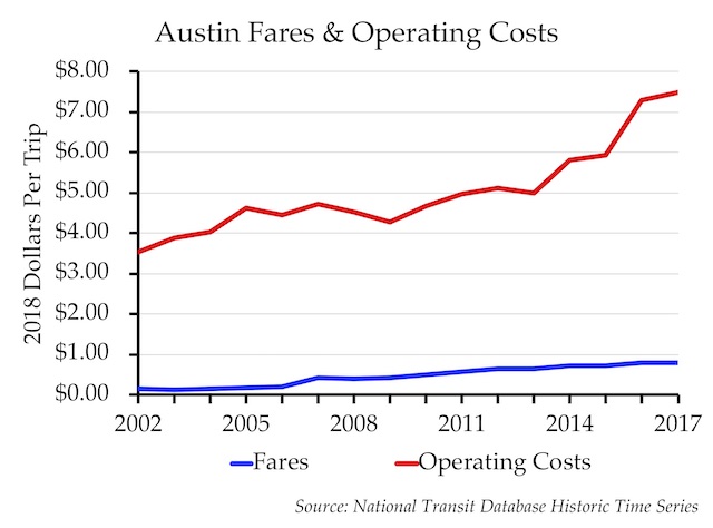
Source: National Transit Database Historic Time Series.
Chart 6: Transit and the Environment
This chart shows the average energy usage (measured in British thermal units) and greenhouse gas emissions per passenger mile in 2017 for all transit systems within an urban area. For comparison, it also shows the national average BTUs and greenhouse gas emissions for cars and light trucks (vans, pickups, and SUVs). In all but a handful of urban areas, cars are greener than transit.
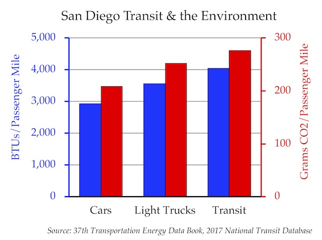
This chart has two axes, and for clarity it is best if one is evenly divisible into the other. If the BTU axis extends to 10,000, for example, then the CO2 axis should be set to 1,000. Microsoft won’t automatically do this, but you can fix it by double clicking on the CO2 axis and entering 1,000 in the “maximum bounds” cell. If you change urban areas, you may have to change this bound.
Sources: Car and light truck numbers from table 2.14 of the 37th Edition of the Transportation Energy Data Book. Based on the National Household Travel Survey, I assumed an average of 1.72 occupants per light truck. Transit numbers from my National Transit Database 2017 summary spreadsheet. This summary is based on calculations made from the Energy spreadsheet of that database.
Chart 7: Vehicles Available to Workers
This chart shows the vehicles per household for all workers in the urban area in 2007 and 2017. It doesn’t show vehicles for households that don’t have any employed people.
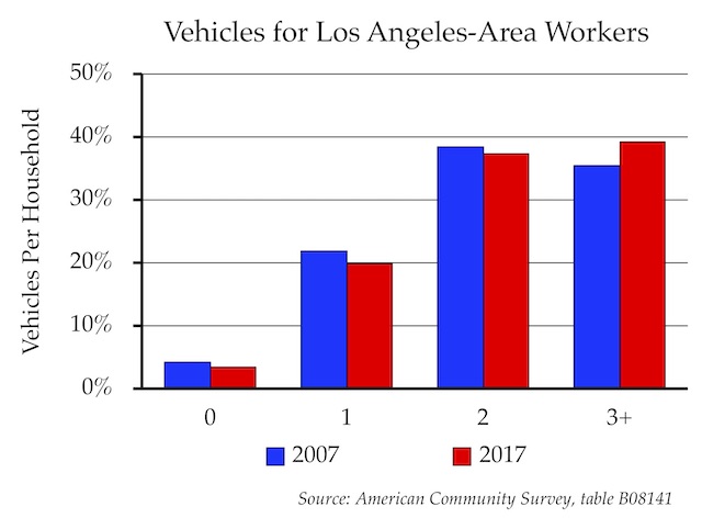
The main point is to show that, in most urban areas, the number of workers who live in households with zero vehicles is declining while the number living in households with three or more is increasing. Since transit in most urban areas only carries around 1 percent of passenger travel, a small increase in vehicle ownership can have a large impact on transit ridership.
Sources: Table B08141 of the American Community Survey for 2007 and 2017.
Chart 8: How Workers Without Vehicles Commute to Work
In all but a few urban areas, most people who live in households without cars don’t take transit to work. In fact, in some urban areas, more people who lack cars nevertheless are more likely to drive alone to work than to take transit. How can they drive alone if they don’t have a car? Probably they use employer-supplied vehicles. This shows that, in most places, transit isn’t useful even to most people without cars.
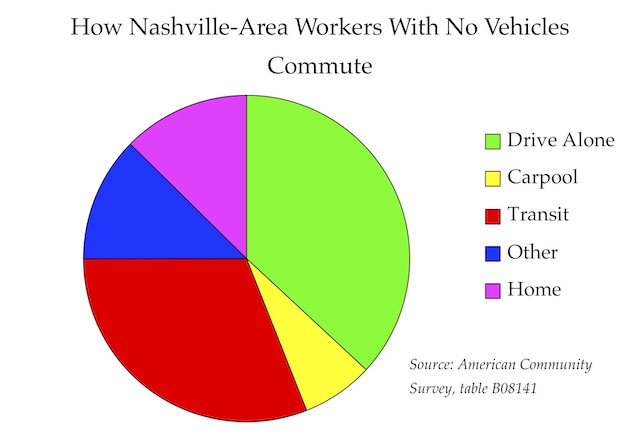
Sources: Table B08141 of the American Community Survey for 2007 and 2017.
Chart 9: Transit Commuting
This shows the change in both the share of workers who commute by transit and the number of transit commuters between 2007 and 2017. In many urban areas, both have declined. Like chart 6, this has two axes, and you may need to change the maximum bound for the second axes to get the numbers to line up.
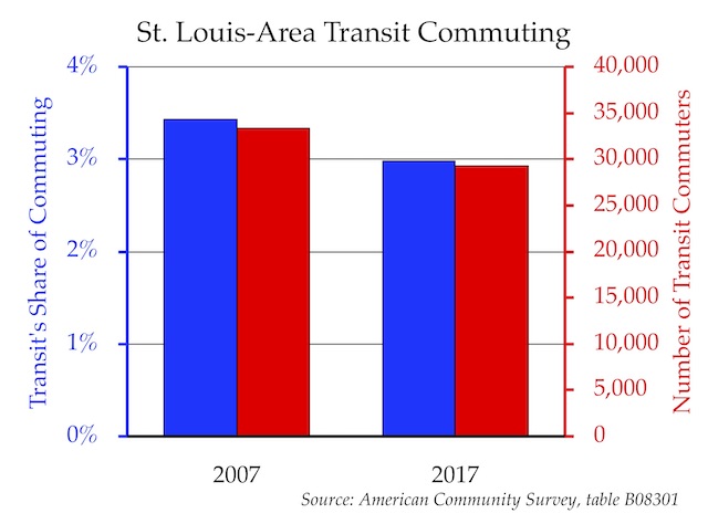
Sources: Table B08301 of the American Community Survey for 2007 and 2017.
Chart 10: Transit Commuter Incomes
This shows the number of people in each of eight income classes who commuted by transit in 2007 and 2017. In most urban areas, the number is declining for low-income classes and increasing for high-income classes.
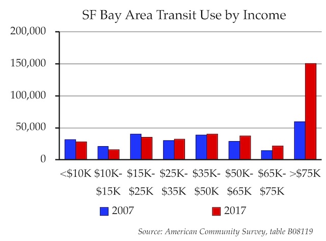
The chart title is “[Urban Area Name] Transit Use by Income.” I would have preferred “Transit Commuting by Income,” but this would have pushed the title onto two lines for urban areas with long names. If your urban area has a short name, you can substitute “Commuting” for “Use” in cell G12, which is the title cell for the chart.
Sources: Table B08119 of the American Community Survey for 2007 and 2017.
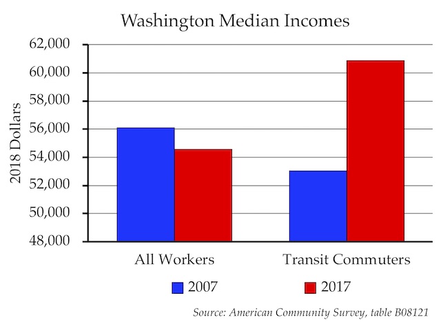
Chart 11: Median Incomes
This chart shows the median incomes of all workers in an urban area and of workers who commute by transit in 2007 and 2017, with dollars adjusted for inflation. Nationally, transit commuter medians exceeded those of all workers for the first time in 2017. That’s true in only the largest urban areas, but even in smaller urban areas, this chart will show that transit commuter incomes are growing faster than those of all workers.
Although the highest income bracket used by the Census Bureau is $75,000 and up, the median income of transit riders in a few places is much higher. The median in Concord, California is $97,000; the median in Bridgeport-Stamford, Connecticut is $81,000.
The highest median of transit commuters in the country is in the Great Falls, Montana urban area. Although just 128 people there commute by transit, 84 of them are in the over-$75,000 bracket, and the median income of transit commuters is more than $200,000. Great Falls isn’t in the top 100 so don’t look for it here, but you can find it in the source files below.
Sources: Table B08121 of the American Community Survey for 2007 and 2017.
Conclusions
Together, these charts show that, in most urban areas, transit’s importance is declining; it is less environmentally friendly than driving; and its use is increasingly dominated by high-income people. All of these indicators suggest that the reasons we once had for subsidizing transit are disappearing and those subsidies should be phased out.
Please feel free to use these charts in slide shows, papers, and blog posts. You can give appropriate attribution to the listed sources but you don’t need to credit the Antiplanner unless you want to. If you do use any of them, let me know and also let me know if there is any way I can make this spreadsheet more useful to you.


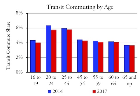
Wonder what the trends are for transit ridership by age cohort, if any? I guess with Uber and Lyft ride services, the older I get not necessarily dependent on public transit.
According to American Community Survey table B08101, between 2014 and 2017 transit’s share of commuting declined in all age classes, but declined much more in the younger age classes than the older ones.