More on March Transit Ridership

Transit is “obsolete and costs taxpayers billions, yet its ridership and productivity continue to decline,” observes an op-ed in Governing magazine, concluding that, “we should stop subsidizing it, saving taxpayers’ tens of billions of dollars a year.” More data supporting this position can be gleaned from the March ridership data recently published by the Federal Transit Administration.

In addition to ridership numbers, the FTA spreadsheet also includes revenue-vehicle miles. I’ve now enhanced that worksheet to include annual, agency, and urban area totals and have uploaded the result. (If you downloaded yesterday’s file after about noon Pacific Time, it already includes this update.)

Previous data have shown that, as some cities build light rail, they cut bus service, thus losing more bus passengers than they gain in rail riders. That may influence March numbers, but it is not the only factor. For example, Los Angeles Metro increased light-rail service by 3.7 percent while it cut bus service by 2.7 percent. Yet both bus and light rail lost riders: light rail declining 7.5 percent and bus 9.6 percent. Continue reading

March Transit Ridership Drops 5.9%

Some have blamed declining transit ridership on low gas prices, but gasoline was about 10 percent more expensive in March 2018 than March 2017, yet March transit ridership was 5.9 percent less than in the same month in 2017. To be fair, March had one fewer work day in 2018 than in 2017, which could account for some of the decline, but January had one more work day in 2018 than 2017, and ridership still declined.

The Federal Transit Administration released March ridership numbers over the weekend. As usual, the Antiplanner has supplemented the raw numbers with a spreadsheet that totals ridership by years (2002-2018) in columns GW through HM; by major modes in rows 2116 through 2122; by transit agency in rows 2131-3129; and by the 200 largest urbanized areas in rows 3131 through 3330.

Previous releases showed that transit has been declining in nearly all major urban areas except Seattle and, in some recent months, Houston. March’s numbers are even more dire, as ridership declined in all of the top 38 urbanized areas including Houston and Seattle. Of the top 50 urban areas, ridership grew only in Providence (by a mere 0.1 percent), Nashville (by a respectable 8.2 percent), Hartford (8.1 percent), and Raleigh (by 3.5 percent). Continue reading

2017 National Household Travel Survey

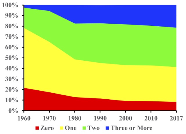
The average car carried 1.54 people in 2017 while the average SUV carried 1.84 people according to the just-released National Household Travel Survey (NHTS). That’s down slightly from 2009, when it was 1.59 and 1.92 respectively. Historically, auto occupancies have declined in parallel with the decline in household and family sizes; the 2009 survey reported a rare increase but the 2017 decline is not surprising.

The “explore data” button on the NHTS home page allows users to construct a huge variety of data tables. For example, I created a table showing miles of driving per driver by household income and urban area size. Annual miles of driving were roughly the same for all levels of income above $35,000 per year. In smaller urban areas, only people in households with incomes below $15,000 per year did significantly less driving, while people in households with incomes more than $150,000 did a little more driving. Variations by urban area size were small, though large urban areas with heavy rail had about 13 percent less driving than large urban areas without heavy rail; probably that result is driven by New York City.

Vehicle occupancies varied widely by trip purpose, ranging from 1.18 for work trips to 2.57 for recreation trips. However, occupancies seem to be independent of income. Continue reading

Home Price Data and Highway Update

The Federal Housing Finance Agency (which oversees Fannie Mae and Freddie Mac) has published home price index data through the fourth quarter of 2017. These data go back as far as 1975 for the states and many urban areas.

The Antiplanner has posted enhanced spreadsheets that use the raw data from the state and metropolitan area files to create charts like the one above showing housing trends. The metropolitan area spreadsheet allows users to create charts showing price indices in nominal dollars or dollars adjusted for inflation. The state spreadsheet only creates charts for inflation-adjusted indices. Continue reading

Urban Highway Data

Last November, the Antiplanner noted that the Federal Highway Administration had posted many of the tables for the 2016 Highway Statistics. However, two tables that had not then been posted dealt with highways and driving by urban area. Table HM71 shows miles and daily vehicles miles driven by type of road. Table HM72 shows miles of roads, freeways, and freeway lane miles as well as other characteristics such as land area and population density for each urban area.

When I downloaded the data, the first thing I noted was that the numbers for Los Angeles are wrong. The tables say that Los Angeles, an urban area of 12.5 million people, has just 813 miles of roads, 8 of them being freeways. Alphabetizing the list revealed that most of the data (other than population and land area) for urban areas from Lee’s Summit to Los Lunas had been pushed up one urban area. So I moved them all down one urban area, and took the data for Los Lunas and put them in the row for Lee’s Summit. I’m pretty certain this is right for all of the areas except Lee’s Summit; the 2015 spreadsheet for that area was all zeros.

To do this, I had to rearrange the spreadsheets. For some reason, the Federal Highway Administration breaks up the table into nine different worksheets, with about 70 urban areas per sheet. I find this annoying because it makes it difficult to find and compare many of the smaller urban areas. Continue reading

Transit’s February Numbers

Nine out of the top ten and forty out of the top fifty urban areas saw transit ridership decline in February, 2018 compared with the previous February, according to the latest data posted by the Federal Transit Administration. That’s slightly worse than in January: When compared with 2017, ridership in Buffalo, Denver, and Portland had grown slightly in the first month of 2018 but shrank in the second, which is slightly offset by Providence ridership growing in February after having declined in January.

The other regions seeing ridership grow are Los Angeles, San Francisco-Oakland, Seattle, San Diego, Riverside-San Bernardino, Las Vegas, San Jose, Hartford, and Raleigh. However, all of these regions except Seattle saw ridership decline in 2017, so the growth trend may be short-lived.

The declines are much more spectacular than the growth. While Los Angeles ridership grew by just 0.6 percent, Chicago lost 5.6 percent of its riders. San Francisco-Oakland did better with 6.9 percent growth, but Dallas-Ft. Worth lost 14.3 percent. Ridership in Seattle, which has been the only major urban area with consistent growth, grew by just 1.8 percent, but Portland ridership declined by the same percentage. Houston, which supposedly benefitted from a restructured bus system, saw ridership fall by 5.0 percent. Continue reading

New Transit Data

The American Public Transportation Association (APTA) posted, then withdrew, its fourth quarter 2017 ridership report last week. The Antiplanner downloaded it during the brief time it was available and reposted it here. I’ll let you know if there are any changes when APTA posts it again.

APTA collects its own ridership data from transit agencies, including agencies in Canada and a few U.S. agencies not in FTA’s National Transit Database (NTD). But the U.S. data should be pretty similar to the NTD numbers. Annual NTD numbers are based on the fiscal years of individual agencies so won’t be exactly similar to APTA’s calendar year data. But NTD also posts monthly numbers that should be similar to APTA’s.

APTA’s 2017 numbers show a 2.9 percent decline in U.S. transit ridership from 2016, while transit in Canada declined by 0.95 percent. Every major mode of transit declined except demand response (paratransit) and “other” (which includes ferries, people movers, monorails, vanpools, and a few other types). Heavy rail fell by 2.1%; light rail by 0.8%; commuter rail by 0.2%; and bus by 4.3%. In previous years, light rail ridership has grown faster than other modes mainly due to the opening of new lines. Apparently, either no new lines opened in 2017 or the gains from those openings weren’t sufficient to offset losses elsewhere. Continue reading

Graphing the Transit Apocalypse

The Washington Post has declared the continuing decline of urban transit ridership an emergency. The Post takes it for granted that the real purpose of cities is to maintain the transit industry and not the other way around. While it is clearly an emergency for those obsolete transit agencies, especially ones saddled with even more obsolete rail transit systems, it isn’t an emergency at all for cities and individual travelers who are finding faster, more convenient, and often less expensive ways of getting around.

And the decline continues. Nationwide transit ridership in January 2018 was 2.5 percent less than in January 2017, according to the latest National Transit Database numbers posted by the Federal Transit Administration (FTA). This drop was even more significant because January 2018 had one more work day in it than January 2017.

Supposedly, according to experts consulted by the Post, we have to maintain urban transit because it is more “space efficient” than other forms of travel. Yes, it is real space efficient to have 60-passenger buses that drive around with an average of 9 on board, or 150-passenger (some claim 200) light-rail cars that carry an average of fewer than 23 on board (the averages in 2016). If you drive alone in your six-passenger SUV, your car is carrying a higher percentage of its capacity than the average transit vehicle. Continue reading

New APTA Transit Data

The American Public Transportation Association has published some of the data for its 2017 Public Transportation Fact Book — though not, so far, the fact book itself. If, like the Antiplanner, you are a data junkie, the data is the important part anyway.

The new data, formally titled Appendix A, consists of a spreadsheet containing 136 tables of historical information on ridership, service levels, costs, fares, energy consumption, and other information broken down, where available, by mode through 2015. Although these data are based on the National Transit Database, the numbers are slightly different from my totals, but it is good to have a long-term set of numbers that come from a more-or-less consistent methodology.

The numbers show that, when compared with 2014, ridership in 2015 fell by 1.4 percent and passenger miles fell by 1.7 percent. But vehicle-miles of service grew by 0.8 percent, so boardings per vehicle-mile dropped by 1.9 percent. Operating costs grew by 2.1 percent, but fares grew by 3.9 percent (which only covered a portion of the growth in operating costs). Fares per trip grew by 4 percent, which probably didn’t help ridership. Continue reading

Will Density Make Housing Affordable?

California left-wingers who want to densify cities to make them affordable are getting some push-back from other left-wingers who think density will push low-income people out of neighborhoods. A proposed bill to eliminate zoning in transit-rich areas in order to allow developers to build high-density housing would, say opponents, displace low-income families from neighborhoods with high rental rates in favor of high-income whites who can afford to pay for high-rise housing.

The opponents aren’t wrong. On one hand, increasing housing supply would seem to make housing more affordable. But affordable for whom? With housing prices in some California cities averaging more than $1,000 per square foot, building high-density housing that costs $400 to $500 a square foot would allow people who can afford that to find a place to live. But hardly anyone can afford that.

The problem is that high-density housing–that is, mid-rise and high-rise housing–costs 50 to 68 percent more, per square foot, to build than low-density housing. If California really wants to build housing that is affordable to low-income people, it needs to build more low-density housing. To build that, it needs to open up land that has been off-limits to development because it is outside of urban-growth boundaries. Continue reading