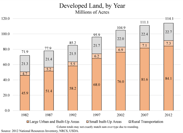
Suburbs Are Still Growing

Next time someone tells you about how everyone is returning to the cities, point them to these maps based on the 2010 census. Available for the forty largest urban areas in the United States, they show, almost without exception, the central cities losing population and the suburbs gaining.

According to the mapmakers, “deep blue indicates that the population doubled (or more), pure red means that everyone left, grey denotes no change, and the intermediate tones represent the spectrum of increases and decreases in-between.” The white beyond the urban periphery indicates very low densities.

Continue reading

Thank the Internal Combustion Engine

American forests are growing 42 percent faster than they are being cut and 380 percent faster than they were growing back in 1920. At least, that was true in 2000 when this report evaluating the state of forests in the United States was published by the U.N. Food and Agriculture Organization. Though the report is a bit old, its conclusions should be just as valid today.

What the report does not say is that the internal combustion engine is one of the main reasons for the healthy state of American forests. As recently as 1910, farmers used horses and other animals for almost all heavy-duty farm work. To supply these animals with food, farmers typically dedicated a third or more of their farms to pastureland. This pasture provided farmers with no direct revenue, just feed for their draft animals.

Continue reading

Are We at the Bottom Yet?

According to economists at Moody’s, the housing market will bottom out in 2011–which means now may be the time to hunt for cheap homes and be ready to flip them when prices start going up. Unfortunately, the Antiplanner can’t afford the $250 required to listen to Moody’s webconference, so let’s look at some other data to see how likely it is that prices will start to recover.

First, we can go to the Federal Housing Finance Agency (FHFA), which publishes home price indices beginning in 1975 for states, metropolitan areas, and the nation as a whole. Many news reports rely on the Case-Schiller index, but that index only covers a selection of metro areas and misses many states. The FHFA uses the Case-Schiller methodology but has a much larger database.

The Antiplanner has made a user-friendly Excel chart from FHFA’s state data. Simply enter the two-letter acronyms of up to six states in cells BK150 to BP150, and the chart should update with those states. Nationally, housing prices peaked in the first quarter of 2007, declined through the second quarter of 2010, and recovered slightly in the third quarter of 2010. But, as averages of the country as a whole, national data do not provide very useful indicators of what is really happening in housing markets.

Continue reading

2009 Transit Data

The Federal Transit Administration has published the 2009 National Transit Database, which includes loads of information on every federally subsidized transit system in America. Unfortunately, the data come on about 20 hard-to-read spreadsheets (this version, known as the “data tables,” are easier to read but harder to use for calculations).

So, once again, the Antiplanner has collected the most important data into one spreadsheet. You can also download similar spreadsheets for 2008, 2007, 2006, and 2005.

Continue reading

A Free Parking Space Grows in Manhattan

The Antiplanner blew it yesterday by saying there was no free parking in Manhattan, which shows this Oregon resident doesn’t spend much time in the Big Apple. It turns out Manhattan has lots of free on-street parking, though on many streets you have to move your car to the alternate side of the street every night.

This doesn’t change my main point, which is that it is one thing to argue that cities should not price parking below market rates where there is a market for parking. I have no problem with this. But it is quite another thing to argue, as many urban planners following the Shoup model do, that private businesses should be required to charge for parking (or be limited in how much parking they can provide) in areas where the market rate for parking is zero (meaning most areas outside of central city downtowns).

But I began to wonder: if there is so much free on-street parking in Manhattan, why would someone pay hundreds of thousands of dollars for their own personal parking space? Census data indicate that, outside of towns in Alaska that are not accessible by auto, Manhattan has about the lowest rate of auto ownership in the United States: just 22.5 percent of households have a car, compared with more than 90 percent in the rest of the country. So you might not think there would be much demand for parking.

Continue reading

2009 National Household Travel Survey

Every few years, the Federal Highway Administration conducts a major survey called the NHTS to find out how Americans travel. The 2009 survey collected questionaires from more than 150,000 different households. Some of the results from that survey are now available in several formats.

The complete dataset is about 500 megabytes in ASCII format. Much briefer are a number of frequently-asked for table, including tables showing daily trips and miles by household income, mode and purpose, and other variables. You can also design your own table, though many useful variables in the survey, such as person miles of travel, are not (yet?) included in the design-your-own tables.

The first thing that must be noted is that the 150,000 households surveyed were not an accurate cross-section of the nation. For example, they surveyed one household for every 1,000 people in the Dallas-Ft. Worth metropolitan area, but only one for every 11,000 people in the Chicago metropolitan area, and (apparently) no one at all in the Atlanta metro area. Further, though more than two-thirds of Americans live in urban areas of 50,000 people or more, only about 61 percent of the surveys came from such areas.

Continue reading

Clearing Up a Mystery

The 2001 National Household Transportation Survey (NHTS) found that the average motor vehicle contains about 1.6 people (see table 16). But a report from the Department of Energy observes that “intercity trips [have] higher-than-average vehicle occupancy rates” (see appendix C-3, page C-3.4).

How much higher? The answer, curiously, comes from the California High-Speed Rail Authority, which commissioned a study that found the average occupancy of autos in intercity trips is 2.4. Any fuel-efficiency comparisons of autos and intercity rail should use this number, not 1.6.

Continue reading

This Just In: Highways Are Subsidized

The Pew Charitable Trusts looked at highway revenues and found that they fail to cover highway costs. Only 51 percent of the cost of highways came from user fees in 2007, says Pew.

According to a Pew data file, 2007 highway user fees totaled to $98 billion while “non-user revenues” spent on highways totaled to $70 billion and another $25 billion came from bond issues. I’ve checked Pew’s source data (table HF-10 from Highway Statistics) and the numbers are accurate.

However, the Antiplanner has a few quarrels with Pew’s interpretation of the data. Most important, Pew counts as “user revenue” a number that the federal government identifies as “highway user revenues used for highways,” which in 2007 was $97.9 billion. But users actually paid $124.5 billion. Just because federal and state officials diverted most of the different to mass transit and non-transportation related funds doesn’t mean they aren’t paid by users.

Continue reading

More Transit Data

Recently, the Federal Transit Administration added Historical Data Files to the National Transit Database. These files include operating and capital expenses, trips, passenger miles, and other data for all federally funded transit agencies from 1991 through 2007.

I downloaded the files and put all the ones that were important to me — operating expenses, capital expenses, fare, vehicle revenue miles, vehicle revenue hours, directional route miles, trips, and passenger miles — on separate worksheets of a single spreadsheet (4.4 MB Excel file). All of the years in the columns of all of the worksheets are identical, and the agencies and modes in all of the rows are also identical unless you resort them.

Continue reading

Stuck in the 1960s

Each year, about one out of 40 households receive a letter from the Census Bureau demanding that they fill out an American Community Survey asking such nosy questions as how much money each person in the household earns each year, how they heat their house, and whether they have a flush toilet. Though some have suggested that people should boycott the decennial census as too “intrusive,” the Antiplanner is a voracious consumer of census data, and so I was proud to receive and fill out the 28-page survey form form this year.

This survey is an annual extension of the Census Bureau’s so-called long form, which has been given to one out of six households each decennial census since at least 1960 (including the Antiplanner’s in 2000). As I filled out the 2009 form, it occurred to me that some of the questions have not been significantly updated since 1960.

Continue reading