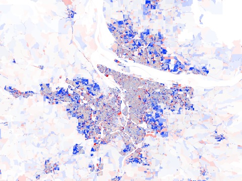
Next time someone tells you about how everyone is returning to the cities, point them to these maps based on the 2010 census. Available for the forty largest urban areas in the United States, they show, almost without exception, the central cities losing population and the suburbs gaining.

According to the mapmakers, “deep blue indicates that the population doubled (or more), pure red means that everyone left, grey denotes no change, and the intermediate tones represent the spectrum of increases and decreases in-between.” The white beyond the urban periphery indicates very low densities.


