
When the Federal Transit Administration released the 2022 National Transit Database, it also released updated time series data tables. These tables have operating data (including costs and ridership) from 1991 through 2022, capital costs from 1992 through 2022, and fare revenues from 2002 through 2022.
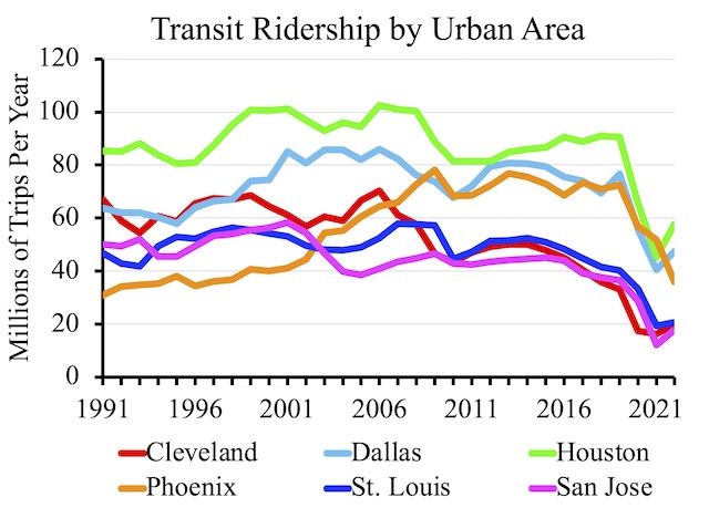
This chart shows ridership for six urban areas that I consider to be basket cases, with ridership steadily declining despite — or more likely because of — the construction of light-rail or some other transit infrastructure. Of course, ridership declined everywhere due the pandemic, but most of these are among the slowest to recover to their already low 2019 levels.
The release includes six data tables, but I find just two of them useful as they are the only two that break down data by mode. Table TS3.1 has capital costs by transit agency and mode. Table TS2.1 has all other information — operating costs, fares, service in miles and hours, ridership, passenger-miles, and miles of rail lines — by agency and mode.
In previous years, I’ve enhanced table TS2.1 by making it possible to create all kinds of charts, including charts showing ridership, operating costs per passenger-mile, and various other calculations. In fact, I estimated that one spreadsheet made it possible to create several quintillion charts. Although I put a lot of work into it, I’m not sure that anyone actually used this feature; I know I didn’t, and I thought that I would.
So this year, I’ve included only three charts in an enhanced table TS2.1: Ridership by urban area, ridership by transit agency, and ridership by mode for any single urban area. Each chart shows data for up to six urban areas, agencies, or modes. Since there are 524 urban areas, 2,680 agencies, and 19 possible modes (though most agencies only have 1 to 6 modes) in the data set, all of the possible combinations of six agencies, urban areas, or modes probably add up to several trillion if not quadrillion possible charts.
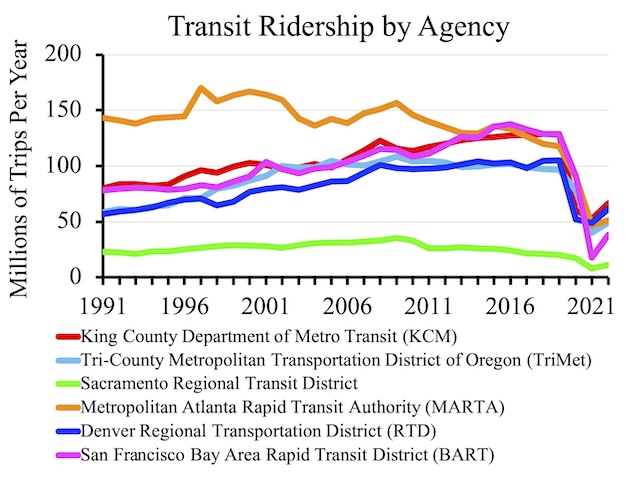
This chart shows ridership for six large areas. Some of them, including Atlanta’s MARTA, Portland’s TriMet, and Sacramento’s RTD, weren’t doing all that well even before the pandemic.
The charts appear in cells Q6094 through AC6225 on the UPT (unlinked passenger trips) worksheet. Directions for changing the urban areas, agencies, and modes are on the right of each chart. Since the urban area and transit agency identification codes are not easy to remember, they are listed in alphabetical order in cells BG2 to BH525 for urban areas and BM2 through BN2681 for agencies.
I’ve also fixed table TS2.1 in a couple of other ways. First, the table unaccountably was missing many of the urban area codes, which I replaced. Second, however the FTA entered 2022 data, any blank cells actually had an invisible character in them. Anyone trying to do calculations with those cells would get a frustrating error message. I removed those invisible characters from all of the worksheets in the spreadsheet.
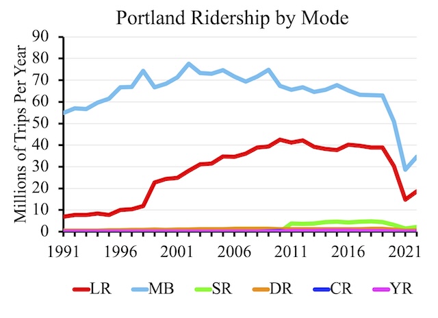
Portland’s bus ridership appears to have been declining since about 2002. Even though TriMet opened its latest — and most expensive — light-rail line in 2015, light-rail ridership peaked a few years before that in 2012. Ridership on Portland’s other modes is too low to be discernible at the bottom of the chart.
The only changes I made to Table TS3.1 (other than removing invisible characters from blank cells in the 2022 column) were to total capital costs, both in nominal dollars and in inflation-adjusted dollars. To adjust for inflation, I used gross domestic product deflators from the Bureau of Economic Analysis. Since the deflators apply to calendar years while data in the time series are from transit agency fiscal years, the numbers will be slightly off, but not by much. I hope you find these files useful.


How many transit systems could save lots of money by shutting down and giving free Uber fares to all needy people who cannot drive. Non-needy can get a car or pay their own way.
in raleigh nc years back, there were cab vouchers for the disabled to get to places… doctors, employment, etc….I’m sure they weren’t unique. i grew up on transit in a small southern capital city due to circumstances and to this day sometimes i hate getting in a car, cranking it up and entering ‘american’ traffic. i realize its usefulness and existential speed. ie, average commute times. eh….id prefer to live in the Netherlands under the current political climate.
In that first graph watch catches my eye is Cleveland. It looks like from 2005 – ~2018 — so all pre-Covid — they lost half their transit ridership.
”
How many transit systems could save lots of money by shutting down and giving free Uber fares to all needy people who cannot drive. Non-needy can get a car or pay their own way.
” ~Jim Karlock
Another way I like to frame this is look at Metro Transit’s failed Northstar line. They spent $300M to build a heavy rail commuter line facilities ( BNSF tracks ) and not a single rider got rid of their car. By it’s nature they all drive to the train station.
Had they spent $300M on transit improvements in Minneapolis, how many hundreds or thousands of household could’ve gone car free from that?