
Transit agencies carried 18 percent more riders in 2023 than 2022, but 29 percent fewer than in 2019. Average trip lengths declined from 5.5 miles in 2019 to 5.0 miles in 2023, probably because commuter rail and commuter buses, which tend to carry riders the longest distances, did particularly poorly. Overall transit carried 35 percent fewer passenger-miles in 2023 than in 2019. These data are based on the National Transit Database and in particular the 2023 database that the Federal Transit Administration released last week.
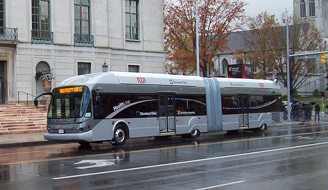
A bus-rapid transit line has generated lots of positive publicity for Cleveland transit, but the truth is that Cleveland has one of the worst-performing transit systems in the country, with ridership falling 35 percent between 2014 and 2019 and another 30 percent between 2019 and 2023. Photo by GoddardRocket.
Fares were proportional to passenger-miles being 35 percent less than in 2019, while operating costs were 22 percent greater. The result was that the operating subsidy per rider, at $7.26, was more than twice 2019’s, which was $3.51 and only a slight improvement over 2022’s operating subsidy of $7.59 per rider. Operating subsidies per passenger-mile grew from 64¢ in 2019 to $1.51 in 2022, declining only slightly to $1.45 in 2023.
Getting all of this information out of the National Transit Database is tedious as the database consists of 24 separate spreadsheets that total more than 24 megabytes in size. Calculating the operating subsidy per trip, for example, requires getting the operating cost from the Operating Expenses spreadsheet, the fares from the Fare Revenues spreadsheet, and the number of trips from the Service spreadsheet. Other spreadsheets have data regarding energy consumption, vehicle inventories, and capital expenses.
To make the database easier to use, I have compiled what I consider to be the most useful data into one 3.0-MB spreadsheet. It’s still not easy to use, so I will provide a column-by-column, row-by-row explanation of all of the data in this spreadsheet.
Columns A Through J: Agencies and Modes
Column A is a unique identification number for each transit agency. Starting in 2023, the FTA used two ID numbers, one a “state/parent ID” for rural agencies and the other a unique ID for all agencies. I combined them into one ID number with a hyphen in between them, which will make it easier to compare data with previous years when only the parent ID was used.
Calumn B is the name of the transit agency. Column C tells whether it is urban, rural, tribal, or “asset” (which apparently means a non-government organization). The 34 percent of agencies classified as urban carry 98.6 percent of all transit trips.
Column D shows a two-letter code for each mode. Most of these are self-explanatory, but a complete list of modes and the codes used for them can be found in cells A4266 through B4284. Column E is either DO, for transit directly operated by the agencies; PT, for purchased transportation or transit contracted to other organizations (often using vehicles and infrastructure owned by the transit agency); or TX, for taxis (presumably including ride-sharers) whose fares are partially paid for by the agencies.
Column F is the end of each agency’s fiscal year. Most agency fiscal years don’t end on December 31, so the number of trips reported in the annual database won’t match the total number of trips reported for each calendar year on the monthly updates.
Columns G and H are the urban area, if any, in which each transit agency predominately operates. G is the Census Bureau code for that urban area and H is the name of the urban area. Urban areas that are missing either have no transit service or, more likely, have transit provided by an agency that mainly works in another urban area. For example, the Utah Transit Authority is headquartered in the Salt Lake City urban area but also serves the Ogden and Provo-Orem urban areas.
Columns I and J are the square miles and population of the areas served by each transit agency. The population densities could be calculated by dividing population by square miles, but I don’t think the results would be very useful because many urban agencies include extensive ex-urban areas or rural within their service areas so they can tax those areas but provide little service to these areas.
Columns K through O: Service
Column K is the number of trips carried by each agency while L is the number of passenger-miles. The FTA has gone to some lengths to insure that agencies accurately report trip numbers, but the passenger-mile numbers are just estimates in many cases, particularly for buses, light rail, and other modes where people don’t have to go through gates to both enter and exit transit systems.
Columns M and N are the miles and hours of revenue passenger service. The American Public Transportation Association divides one by the other to get average speeds in miles per hour. Column O shows the average number of weekday riders carried by each system.
Columns P Through V: Financial Data
Column P shows fares paid by passengers while column Q is “fares” paid by organizations. For example, if a university paid an agency a million dollars so that its students could ride for free, that would be included in organization fares. In my opinion, these aren’t really fares but simply more subsidies as not all students use transit. In my calculations of fares I reluctantly used column R which is the sum of P and Q.
Nationwide, only 7 percent of fares were paid by organizations. However, in some urban areas, including Buffalo, Raleigh, Richmond, Salt Lake City, and Tucson, over half of reported fares were paid by organizations. In Raleigh and Tucson organizations paid more than 90 percent of the reported fares. Counting this income as fares deceptively exaggerates the apparent demand for transit in those areas.
Column S is operating cost while columns T, U, and V are capital costs. T shows capital expenditures for existing systems, also known as capital replacement, while U shows capital costs of new systems such as rail construction. Column V is capital costs spent by agencies that aren’t required to distinguish between existing vs. new capital costs.
Columns W Through Z: Vehicle Fleet
Column W reports the number of vehicles owned by each agency, while X is the total number of seats and Y the number of standees that can be carried by those vehicles. The standing room is often reported at “crush capacity,” which is more crowded than Americans feel comfortable with, so actual capacities may be lower. In any case, divide total seats and/or standees by number of vehicles to get average load capacities for each fleet.
Column Z shows the number of rail miles reported for each rail system. This includes rails in both directions so in most cases this will be about twice the number of route miles. Only revenue miles are show; rail miles within maintenance facilities and track connecting those facilities to the main routes are not included.
Columns AA Through AD: Energy and CO2 Emissions
The database reports the number of gallons of fuel or kilowatt-hours of electricity used by fuel type, such as Diesel, gasoline, or compressed natural gas. I used standard factors published by the Energy Information Agency to convert fuel consumption to British thermal units or BTUs.
Calculating carbon dioxide emissions is trickier. I used standard factors for fossil fuels. I assumed biodiesel was 20 percent from biological sources and 80 percent fossil fuels, but some agencies may use a different formula to power their Diesel buses.
For electricity, I used the carbon emissions per megawatt-hour generated within the state in which each agency is headquartered. This is only a first approximation as both transit and electricity can cross state lines. Perhaps the biggest problem is with the Washington Metro system, as the electricity produced in DC generates about 60 percent more carbon dioxide than that produced in Maryland or Virginia. I don’t know how much electricity WMATA buys in the states so I can’t easily correct for this. In any case, on average CO2 overestimates in some places are likely to be offset by underestimates in other places.
For comparison purposes, the Department of Energy’s Transportation Energy Data Book reports that the average car used fewer than 2,800 BTUs per passenger-mile in 2023, while the average light truck (pickup, SUV, van) used fewer than 3,300. Assuming these are powered by gasoline, the average car emitted fewer than 200 grams of CO2 and the average light truck fewer than 240 grams per passenger-mile. Even the light truck numbers are far less than most transit agencies.
Columns AE Through AL: Other Calculations
All of the data in cells A2 through Z4256 are straight from the database. Cells AA through AD are calculated from energy data as described above. I added a few more interesting calculations in columns AE through AL.
Column AE is the average occupancy of transit vehicles, calculated by dividing passenger-miles by vehicle revenue-miles. Because most agencies didn’t reduced service by as much as the pandemic reduced ridership, occupancies in 2023 were only about 71 percent of what they were in 2019.
Columns AF through AH are the operating costs and fares per trip and per passenger-mile. Subtract one from the other to get subsidy per trip or passenger-mile. As noted above, I included “organizational fares” with fares though I don’t really consider those to be fares. Even including them, fares only covered 17 percent of operating costs, as shown in column AJ, farebox recover.
Column AK is average speed in miles per hour (vehicle revenue-miles divided by vehicle revenue-hours) while column AL shows the average trip lengths.
Rows 2 Through 4256: Agency and Mode Data
Data for all federally funded transit agencies and each of the modes they operate are shown in rows 2 through 4256. Oddly, this is about 100 fewer rows of data than were in the 2022 database. I haven’t looked closely, but the missing rows in 2023 may represent planned transit services that were never put into operation and have since been cancelled.
Rows 4258 Through 4262: Annual Totals
Row 4258 shows the totals or averages for all transit agencies in 2023. Rows 4259 and 4260 show the same totals for 2022 and 2019, which I copied and pasted from the summary spreadsheets I made for those years. Rows 4261 and 4262 show the change from 2022 to 2023 and from 2019 to 2023.
Rows 4265 Through 4310: Mode Totals
The database reports 19 different modes ranging from AR for Alaska Railroad to YR for hybrid rail, which is the FTA’s term for Diesel-powered light rail. The totals for each of these modes are shown in rows 4266 through 4284, followed by totals of major bus and rail modes. Because some agencies aren’t required to report energy consumption, rows 4289 through 4307 show mode totals only for systems for which energy was reported. This makes it possible to calculate average energy usage and CO2 emissions for individual modes.
The only mode that uses less energy per passenger-mile than the average car is vanpools. The only other mode that comes close is commuter buses. Some modes report low CO2 emissions per passenger-mile, probably because many of the operators of those modes are on the West Coast (which gets lots of its electricity of hydroelectric power) or Northeast (which gets lots of its electricity from nuclear power).
Rows 4312 Through 4677: Urban Area Totals
Many modes do not exist in isolation. Most rail transit lines, for example, depend on buses to feed passengers to rail stations. One mode may appear to be effective at reaching some goal, but that apparent effectiveness may decline when adding other modes into the mix. These rows count all transit within each urban area.
As noted above, some urban areas are missing, in most cases because their transit is provided by an agency in a nearby area. Salt Lake City, Ogden, and Provo-Orem are all served by the same agency but only Salt Lake has a line in the data set; that line includes ridership in Ogden and Provo-Orem. The service area and population reported for Utah Transit covers all three regions.
Rows 4680 Through 7578: Transit Agency Totals
Many urban areas are served by more than one transit agency. These rows include the totals for each agency, including all of the modes operated by or for that agency.
Data Not Included in the Summary Spreadsheet
To make the summary spreadsheet, I used data from nine of the 24 spreadsheets that make up the National Transit Database. Among the ones I didn’t include were Transit Agency Employees, Revenue Sources, and Statement of Finances.
Transit Agency Employees is potentially interesting because the transit industry has seen a huge decline in worker productivity over the last 50 years. The data in this spreadsheet shows number of full-time and part-time workers and numbers of hours worked, with breakdowns for capital, operations, general administration, and maintenance. While the decline in worker productivity is an indictment against public ownership of transportation services, the data in this spreadsheet isn’t terribly useful for critiquing the policies of any individual transit agency. I would like to see someone compare rail vs. bus worker productivity.
Revenue Sources reveals how agencies fill the gap between fares and expenses. Many of the taxes used to support transit agencies are regressive, which means many agencies do more harm than good to low-income residents of their regions. I use this spreadsheet when evaluating individual agencies, but there are so many different sources of revenue I didn’t want to double the size of the summary spreadsheet just to cover them all.
I haven’t studied the Statement of Finances spreadsheet in the past, but it is probably revealing if specious claims of asset values are ignored. For example, the New York MTA has $21.6 billion of pension liabilities, yet it claims its assets exceed its total liabilities by $6.7 billion. However, those assets are mainly its rail system, which loses money. It would be hard pressed to find a buyer willing to pay the supposed asset value of that system. If you can’t find a someone willing pay that price, then the asset value is exaggerated.
Conclusion
To compare data in the 2023 database, you can download summary spreadsheets that I’ve prepared for 2022, 2021, 2020, 2019, 2018, 2017, 2016, 2015, 2014, 2013, 2012, 2011, 2010, 2009, 2008, 2007, 2006, and 2005. Not all of these spreadsheets include all of the items in the 2023 spreadsheet.
For many purposes it is easier to use the FTA’s own historic time series, which includes cost and service data going back to 1991, though capital expenses by mode go back to 1992 and fares by mode go back only to 2002. Although this historic time series is issued in the form of six different spreadsheets, I find TS2.1, operations and service data by mode, and TS3.1, capital expenses by mode, to be the most useful. TS1.2 is useful if you want to trace the source of subsidies (federal, state, local, other) over time since 1991.
In any case, I hope readers find the 2023 summary spreadsheet I prepared to be useful in looking at transit agencies in their states or regions.


Wow! Two great articles about financial ignorance and/or financial irresponsibility in one morning.
1. Lower Fares, Higher Operating Costs — The Antiplanner.
2. Their Car Is Totaled, but They Still Owe Years of Payments — Roughly a third of people who financed cars owe more than their vehicles are worth, which can be consequential once they get rid of the car — The Wall Street Journal.
https://www.wsj.com/personal-finance/auto-loans-negative-equity-aa742965?st=YTFR1N&reflink=desktopwebshare_permalink
Related: Some years ago, local banks were promoting “Home Equity Line of Credit” loans. Instead of borrowing money from GMAC or Ford Motor Credit for a new car, banks were allowing customers to finance a new car using a second mortgage on their house. Interest on the second mortgage was income-tax deductible which saved the buyer some money. It also meant that if the buyer couldn’t make his/her car payment, the bank could reposes (or put a lien on) their house.
The first is a case of OPM — Other Peoples’ Money. The second is simply financial ignorance.
carmax can maybe help there