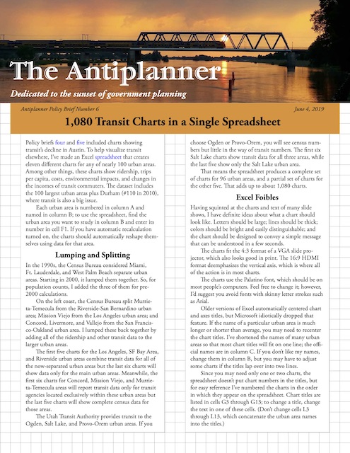
Policy briefs four and five included several charts showing transit’s decline in Austin. To help visualize what is happening to transit in other urban areas, I’ve made a spreadsheet that creates eleven different charts for any of nearly 100 urban areas. Among other things, these charts show ridership, trips per capita, costs, environmental impacts, transit’s share of commuting, and changes in the incomes of transit commuters.
 Click image to download a four-page PDF of this policy brief.
The dataset includes the nation’s 100 largest urban areas. Because of the transit controversy in Durham, which as of 2010 was only the 110th largest urban area, I included it on the list as well. Continue reading


