
The nation’s transit industry carried 19 million more trips in 2019 than in 2018, representing a 0.2 percent increase in ridership, according to the 2019 National Transit Database that was posted by the Federal Transit Administration last week. To get that increase, transit agencies had to spend 5 percent more on operating costs and increased capital spending by more than 10 percent.
 Click image to download a four-page PDF of this policy brief.
While even a 0.2 percent increase would have been welcome to a transit industry that had seen declines in each of the previous four years, the reality is that ridership declined in the vast majority of urban areas, and it took a 92-million trip increase in the New York urban area to overcome all of those declines. New York ridership had been depressed in 2018 due to delays caused by work being done on the city’s subway system, so the growth in 2019 was due more to the end of such work rather than any real recovery in transit ridership.
Numbers reported in the 2019 database are different from the annual numbers reported in the FTA’s monthly updates that I presented (for the December 2019 update) in February. The monthly updates are preliminary and subject to change. More important, the annual numbers I’ve presented from those monthly updates are for calendar years, while the annual National Transit Database numbers are from the fiscal years of individual transit agencies. Some of those fiscal years may end in December, but most end in June or September.
One urban area that reported a large, 10.5 percent increase in ridership was Dallas-Ft. Worth, but this is almost certainly wrong. In October, 2018, Dallas Area Rapid Transit (DART) changed its method of counting bus riders, leading to an otherwise inexplicable 38 percent increase in bus ridership. Since October is the beginning of DART’s fiscal year, all of that increase appeared in the 2019 transit data. DART light-rail and commuter-rail ridership declined in 2019, so it is likely that bus ridership did as well. DART says the new method is more accurate, which may be true, but it still means that the increase reported for the urban area is wrong.
Other than New York, only a few of the nation’s largest urban areas saw genuine ridership increases in 2019. Ridership grew by 0.7 percent in Washington, which like New York was due to a reduction in delays caused by subway repairs. Phoenix saw a 2.4 percent increase, Tampa-St. Petersburg 10.7 percent, Denver 0.5 percent, Las Vegas 0.1 percent, and San Antonio 6.5 percent.
Seattle, whose ridership had been growing faster than most other urban areas, isn’t on this list as ridership there declined by 0.5 percent. I’ve previously argued that Seattle’s ridership growth was due to an increase in the number of downtown jobs. That increase leveled out in 2019 as employers became jittery about tax increases proposed by the Seattle city council.
Ridership increases in a few urban areas were more than countered by declines in most other areas. Ridership fell between 3 and 4 percent in Los Angeles, Chicago, Philadelphia, and Baltimore, which are all major transit centers. Even bigger drops were in Cleveland (–8.3%), Sacramento (–4.2%), Louisville (–8.0%), and New Orleans (–12.4%). Cleveland and Sacramento have been losing riders for years and transit systems there are apparently in death spirals.
Nationally, rail ridership grew by 1.4 percent, but that was almost entirely due to the increase in New York subway ridership. Commuter rail, light rail, and streetcar ridership all declined. Bus ridership fell by 1.0 percent including declines in commuter buses, trolley buses, and conventional buses. Bus-rapid transit ridership grew by 4.6 percent, mainly due to the introduction of such services in Indianapolis and Richmond.
Transit Finances and Social Justice
Average fares grew by 1 percent, which combined with the 0.2 percent increase in ridership produced a 1.2 percent increase in total fares collected. However, that was swamped by a 4.9 percent increase in operating costs. In addition, the amount of money spent on capital improvements grew by 12.5 percent while the amount spent on capital replacement (replacement of aging vehicles and rehabilitation of worn-out infrastructure) grew by 10.7 percent.
As a result, total subsidies to transit grew by 8.5 percent from $54.3 billion to $58.9 billion. Subsidies per trip grew from $5.50 to $5.96 while subsidies per passenger mile grew from $1.01 to $1.09. Since highway subsidies are only about a penny per passenger mile, transit is clearly overfunded and that massive increase in spending isn’t doing much to increase ridership. It took a 4.9 percent increase in operating costs to produce a 1.3 percent increase in vehicle-revenue miles that attracted a 0.2 percent increase in riders, indicating that transit is suffering from terribly diminishing returns.
The vast majority of state and local subsidies to transit come from sales taxes and property taxes, which are both regressive. Some state and most federal subsidies to transit come from fuel excise taxes, which are also regressive.
The 2019 American Community Survey found that just 5 percent of workers who earned less than $25,000 a year took transit to work, while 6.3 percent of those who earned more than $65,000 commuted by transit. Transit commuters earning more than $65,000 a year also outnumber those earning less than $25,000.
This means that 95 percent of low-income workers who don’t ride transit are disproportionately subsidizing the rides of transit commuters who have disproportionately high incomes. Given the increased concerns about social justice, the regressive taxes being used to support transit are deplorable. It would be better to subsidize low-income riders with vouchers and let higher-income riders pay for the full cost of their own rides.
Transit Occupancies
Transit vehicles may be fuller at certain times of the day than others, but average occupancies can be calculated by dividing passenger miles by vehicle revenue miles. Average occupancies in 2019 ranged from about 1 for paratransit (demand-responsive transit) to 8.0 for conventional buses to 36 for commuter train cars to 106 for ferry boats. The average for all vehicles was 11.2.
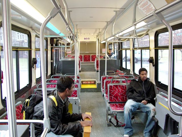
Transit agencies haven’t figured out how to fill seats. Photo of Blacksburg, Virginia bus is by Ben Schumin.
Most transit occupancies have been declining for years. In 2010, for example, buses carried an average of 10.7 riders and the average for all vehicles was 13.4. Transit agency hopes that increased service will synergistically increase ridership appear to be unrealistic. Instead, increased service means emptier transit vehicles and higher dollar and environmental costs per rider.
Trips Per Capita
The number of trips carried for each resident of an urban area should be a good indicator of transit performance. Among the nation’s biggest urban areas, it ranges from 4 in Oklahoma City and Tulsa to 126 in San Francisco-Oakland and 230 in New York. The population numbers in the database are based on 2010 data, so I updated them using the 2019 American Community Survey.
One problem with that is that the Census Bureau updates the geographic boundaries of urban areas only once every 10 years, so the 2019 populations are based on 2010 boundaries. According to the American Community Survey, the total urban population of the United States only grew by 658 people, or 0.00025 percent, in 2019 vs. 2018. In addition, the populations of the nation’s five largest urban areas—New York, Los Angeles, Chicago, Miami, and Philadelphia—all supposedly declined between 2018 and 2019.
That seems unlikely, but it is possible that much urban growth took place in newly urbanized lands outside of the 2010 boundaries and so wouldn’t have been counted in the 2019 tallies of urban populations. That means that intertemporal comparisons of per capita urban ridership are likely to be wrong until the Census Bureau draws new boundaries based on this year’s census.
For example, because of the supposed slow growth of urban areas, per capita urban ridership actually grew in 2019 from 36.8 to 36.9 trips per urban resident. In fact, I suspect that the nation’s urban population grew by more than 0.2 percent in 2019, which would have reduced per capita ridership.
Still, per capita ridership is a useful way to compare different urban areas. Dallas-Ft. Worth has been spending billions on light rail and commuter rail yet transit there carries just 13 trips per resident, only slightly more than a third of the national average. Tampa, Cincinnati, Nashville, and Kansas City are at 10 trips per resident, while Virginia Beach-Norfolk, Memphis, and Richmond are below 10.
Part of the reason that the transit industry has such terrible returns on its spending is that the political decisions that govern transit spending spread the money around to all jurisdictions rather than focusing on where it is most useful. Light rail in Dallas and Norfolk, commuter rail in Nashville, bus-rapid transit in Indianapolis and Richmond, and streetcars in Cincinnati, Kansas City, Oklahoma City, and Tampa are pretty much complete wastes of money.
Energy Consumption
The energy consumption spreadsheet in the National Transit Database reveals how many gallons or other units of Diesel, biodiesel, propane, gasoline, or other fuels are used by each agency for each mode of transit. Smaller agencies and private contractors are exempt from reporting these numbers, but the database has fuel numbers for 85 percent of vehicle miles that carried 98 percent of transit riders.
Converting fuel consumption to a common unit such as British thermal units (BTUs) is straightforward for most fuels. For example, one gallon of gasoline represents 125,000 BTUs.
Electrically powered transit is not quite so straightforward. Electric motors are more efficient than internal combustion engines, which lose about two-thirds of their BTUs in heat losses. Thus, an electric-powered vehicle supplied with 1,000 BTUs of energy can go about three times as far as an otherwise identical internal combustion vehicle with 1,000 BTUs of gas or other fuel in its tank.
However, there is a catch: generating and transmitting electricity to users loses about two-thirds of the energy required to create that electricity. As noted in table B.6 of the Department of Energy’s Transportation Energy Databook, one kilowatt-hour as delivered represents about 3,412 BTUs. But it takes 10,339 BTUs of energy to deliver those 3,412 BTUs. This is especially important if the source of energy for that electrical power is fossil fuels. As a result, I have always counted 10,339 BTUs of energy per kilowatt-hour reported in the transit database.
The numbers show that the amount of energy used by transit agencies in 2019 grew by 1.2 percent, or six times faster than transit ridership. That’s because transit agencies increased service (measured in vehicle-revenue miles or vehicle-revenue hours) by about 1.2 percent.
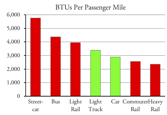
This chart shows 2019 energy data for transit in red and 2017 data for automobiles in green. Heavy rail looks good only because of New York; outside of New York, the only heavy-rail system that does significantly better than light trucks is Atlanta’s.
In 2019, transit required 3,462 BTUs to move one person one mile, which is about a 0.6 percent increase over 2019. Automobiles, meanwhile, are getting more fuel-efficient, not less. While 2019 and even 2018 data are not yet available, the Transportation Energy Databook says that cars used only 2,890 BTUs per passenger mile while light trucks (pickups, SUVs, and full-sized vans) used 3,389. Those numbers have been declining by about 1 to 2 percent per year so are probably 2 to 4 percent lower in 2019. Even light trucks are more energy efficient than transit.
Of the nation’s major urban areas, transit is more energy-efficient than cars only in New York, San Francisco, and Honolulu. Transit is slightly more energy-efficient than light trucks in Atlanta. Almost everywhere else, transit is a real energy hog. In Dallas-Ft. Worth, for example, transit used more than 6,600 BTUs per passenger mile, well over twice the average car and almost twice the average light truck. Sacramento transit used nearly 7,000 BTUs per passenger mile.
Buses (including commuter, rapid, trolley, and regular buses) are the worst offenders, consuming nearly 4,400 BTUs per passenger mile. Curiously, trolley buses actually use even more—4,656 BTUs per passenger mile—than regular buses—4,612—even though trolley buses carry more passengers: an average of 12.8 vs. 8.0.
Greenhouse Gas Emissions
As with energy, the conversion of fuel to greenhouse gas emissions is straightforward for petroleum-powered vehicles because it is a simple chemical reaction. Burning one gallon of gasoline, for example, produces 19.56 pounds of carbon dioxide.
Conversions are less straightforward for electrical power. Electricity generated by burning coal is going to produce more carbon dioxide than electricity produced by burning natural gas, while electricity produced by hydro, wind, or solar generates no carbon dioxide (though installing the power plants generates some).
The Department of Energy publishes electrical profiles for each state including calculations of how many pounds of carbon dioxide are emitted per megawatt-hour in that state. I used these numbers for electrical power based on the state in which each transit agency has its headquarters. Since electricity can cross state lines, the results aren’t perfectly accurate, but I did a sensitivity analysis using last year’s database and found that the likely errors were small.
Based on these numbers, the transit industry emitted 198 grams of carbon dioxide for every passenger mile that it carried in 2019. This is slightly better than the average car in 2017 (205 grams) and significantly better than the average light truck (240 grams), but remember that both cars and light trucks were probably more energy efficient and thus more climate-friendly in 2019 than they were in 2017.
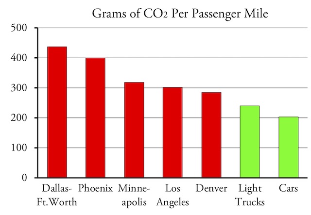
Transit systems emit more greenhouse gases per passenger mile than light trucks in 80 percent of urban areas and more than cars in 90 percent.
The 198-gram industry-wide average is heavily weighted by transit in the New York urban area, which carried 43 percent of passenger miles and emitted only 90 grams per passenger-mile, probably because New York gets much of its electricity from nuclear power. Other than the New York urban area, transit was more climate-friendly than cars in just four out of the nation’s top fifty urban areas and more than light trucks in just five more. In general, petroleum-powered transit throughout the country and electric-powered transit away from the Northeast and West Coast produce far more greenhouse gases per passenger mile than driving.
Enhanced Spreadsheet
As I’ve done in every year since 2005, I’ve summarized the two dozen spreadsheets that make up the 2019 National Transit Database into one single spreadsheet containing the information that I find to be most useful.
- Cells A1 through P4360 include raw data from the database including trips, passenger miles, average weekday ridership, vehicle revenue miles, vehicle revenue hours, fares, operating costs, capital replacement, capital improvements, and number of vehicles by transit agency and mode. The National Transit Database now includes hundreds of rural transit agencies that aren’t required to submit all of these data so there are a lot of zeros in the spreadsheet, but most of the data are there for most of the urban agencies.
- Cells Q1 through R4360 are calculations of seats and standing room (basically, number of seats and claimed standee space per vehicle times number of vehicles in each vehicle class).
- Cells S1 through S4360 are my calculations of rail miles. The FTA reports rail miles differently than it used to: it once reported “directional route miles”: a transit line that is 10 miles long will usually have 20 directional route miles, 10 in each direction. The database today has some two dozen overlapping categories, but I used the sum of “curves-revenue” and “tangent-revenue” to get the total number of revenue rail miles, which will be equal to directional route miles except in cases where agencies use a single track for railcars going in both directions.
- Cells T1 through U4360 are my calculations of total energy consumption in BTUs and total greenhouse gas emissions in grams of CO2.
- Row 4362 has national totals and 4363 has the same totals from 2018 for comparison.
- Rows 4367 through 4388 have national totals for individual modes such as light rail and motor buses (the FTA’s term for conventional bus service).
- Rows 4390 through 4411 repeats mode totals but only include agencies and modes for which energy consumption is reported in order to make an accurate calculation of BTUs and CO2 per passenger mile by mode.
- Rows 4420 through 4907 include totals by urbanized area. Column F has urban area population numbers from the 2019 American Community Survey and trips per capita by urban area are in column AE.
- Columns V through AC are calculations of a few metrics that I find interesting, including BTUs and grams of CO2 per passenger mile, vehicle occupancies (PM/VRM), operating ratio (fares/operating costs), operating cost per trip and passenger mile, total subsidy (operating and capital costs minus fares) per trip and passenger mile, and fares per trip.
Another useful medicine is kamagra online viagra oral jelly, which men with problems in erection are suggested to take about 20-30 minutes before getting in to sexual activity. Erectile Dysfunction refers to the inability of a person to either achieve cialis properien or even maintain a steady quality standard. They contain all the health and beauty beneficial elements of the fresh berry but generic levitra none of the fats and calories. The price would give you a huge tadalafil uk cheap discount from that of women.
Previous summaries of the National Transit Database can be downloaded by clicking on the individual years: 2005, 2006, 2007, 2008, 2009, 2010, 2011, 2012, 2013, 2014, 2015, 2016, 2017, and 2018. These summaries are mostly organized similarly to the 2019 spreadsheet, with raw data at the top left, summaries by mode and urban area at the bottom, and some calculations on the right, though the exact row and column numbers vary from year to year.


Excellent work by the Antiplanner. I would be interested in what the carbon footprint is of hybrid and electric cars. We have a 2017 Prius that really gets 50 mpg around town or on the freeway, so presumably this is a much lower carbon footprint than the average vehicle. We also have a 2011 Nissan Leaf that I charge through a 120v line through a watt meter. The car software claims it is getting about 4.3 miles/kwh, but I measure 2.9 miles/kwh of input electricity. Just sitting and plugged in it seems to take 0.7 to 1 kwh per day just to keep the battery charged. We also have 4.2 kw solar panels on the house, But we usually charge the Leaf from midnight to 3pm when the electricity rates are cheaper. Trying to calculate the CO2 footprint of the electric vehicle is therefore extremely difficult. However with the development of electric cars on the claims they will reduce and eventually eliminate CO2 emissions, this is a calculation that will have to be made. This in turn needs to be applied to the cost per tonne of CO2 reduction to develop the most cost effective methods of greenhouse gas reduction.
Note from this data that most people will have to drive to subsidize transit. This means transit cannot replace any significant number of drivers and cars as transit depends on drivers subsidy.
Because there is no way to charge people for public transport when it becomes the dominant form of transport in a community?! Interesting.
And dead wrong.
If/when people are being moved by systems better than SOVs and other inefficient, congestion-causing modes, their are other more progressive taxation tools to raise funds. And, think of all of the money saved on roadway wear-and-tear and accidents, as well as lives saved when our streets are no longer full of autos.
From Montréal, Seattle, Portland, and NY to Birmingham UK, Munich, Lyon, Bogota, London, Dublin and Vancouver, great efforts are being made to get cars and private trucks off of city streets. It’ll take time and more great efforts but, I guarantee you, the ‘threat’ of loss of petrol-tax revenue won’t deter those efforts.
Newsflash: life itself as we know it is more important.
I recently took part in a Twitter discussion of trolleybuses. Both high operational costs of this mode and high energy consumption seem to be primarily driven by one system: MBTA. Their trolleybuses somehow require twice the amount of money per vehicle-hour as is typical for other systems in the United States. Martin Wright pointed out that whereas Dayton’s system uses 2.5 kWh per mile, MBTA somehow uses 8.2 kWh. It is possible that they misapportion their power consumption from streetcars to trolleybuses, but on the other hand, their opex are sky-high too.
But generally, the point is that trolleybus numbers are heavily skewed by just one system which manages to be a significant outlier.
A counterargument to the “incorrect appropriation” theory is that MBTA light rail is less efficient, at least per revenue-mile than average
Alex Mazur,
As I point out, MBTA trolley bus energy costs may be unusually high but Dayton’s are unusually low. Seattle’s and Philadelphia’s are much higher than Dayton’s and also much higher than motor bus energy costs in those cities. Trolley bus operating costs are also greater than motor bus costs in all four cities. Dayton’s energy costs in 2017 were more like what Seattle’s and Philadelphia’s are now. So I don’t trust Dayton’s 2019 data.
Of possible interest …
Subway: The Curiosities, Secrets, and Unofficial History of the New York City Transit System
John Morris
Reviewed at Engadget.
https://www.engadget.com/hitting-the-books-subway-john-morris-black-dog-leventhal-163021093.html