
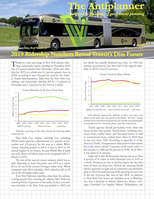
Thanks to a late-year surge in New York subway ridership, nationwide transit ridership in December 2019 was 3.0 percent greater than December 2018, and ridership for 2019 as a whole was 0.1 percent greater than in 2018, according to data released last week by the Federal Transit Administration. Take away the New York City subways and nationwide ridership fell by 1.5 percent in December and 1.2 percent for the 2019 as a whole.
 Click image to download a five-page PDF of this policy brief.
New York City subway ridership (not including PATH trains) grew by a phenomenal 14.7 percent in December and 3.6 percent for the year as a whole. While subway ridership peaked in 2014, it rose in 2019 to the second highest in its history. Its post-World War II peak was only about 2.0 billion trips a year compared with 2.7 billion in 2019.
Ridership is growing on New York subways but declining almost everywhere else.
The rest of the nation’s transit industry didn’t fare so well. Ridership in both December and 2019 as a whole fell in 32 out of the nation’s 50 largest urban areas. When compared with 2014 ridership, 2019 ridership fell in 44 out of the 50 largest urban areas.
Even New York-area ridership, other than the subway, is doing poorly. Not counting the subway, New York-area ridership fell by 3.6 percent in December. In fact, non-subway ridership in the New York area peaked in 2005 and has slowly but steadily declined since then. In 1995, the subway accounted for less than half of the region’s ridership; in 2019 it was 63.5 percent.
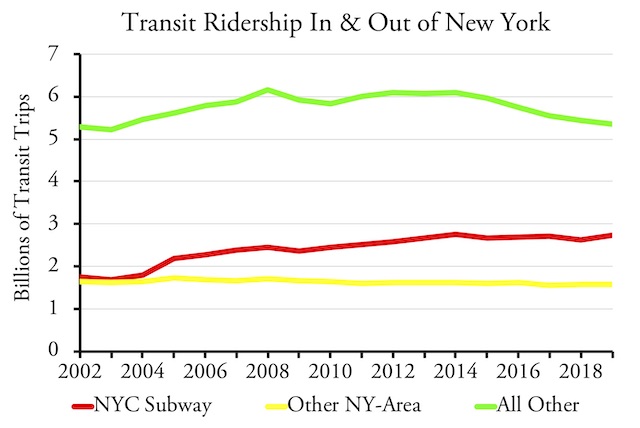
Rail ridership surpassed bus ridership in 2017, more due to the decline of the latter than the growth of the former. “All other” mainly includes ferries and demand response but also includes automated guideways (people movers), monorails, ferries, and other minor forms.
Transit agencies should particularly worry about the future of their bus systems. Transit buses, including commuter buses, trolley buses, and bus-rapid transit as well as conventional buses, carried fewer riders in 2019 than in any year since 1939. According to appendix A of the American Public Transportation Association’s latest transit fact book, buses carried 75 percent of all transit riders in the country in 1960 and 65 percent in 1990. As of 2019, it was down to 47 percent.
The growth of New York subway ridership doesn’t mean that heavy rail makes sense anywhere else, as it is declining in almost every city that has it other than New York and Washington.
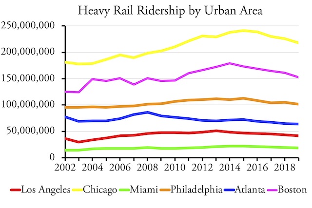
Light rail is also doing poorly, having lost more than 4 percent of its riders in both December and in 2019 as a whole. Streetcars are also in decline despite the fact that most of them are fairly new. Hybrid rail, meaning Diesel railcars operated on light-rail or commuter-rail schedules, grew in 2019 but only because of the opening of a new line in the San Francisco Bay Area in late 2018. In addition to New York City, heavy-rail ridership grew in Washington, but it declined in Atlanta, Baltimore, Boston, Chicago, Cleveland, Los Angeles, Miami, Philadelphia, and San Francisco. Commuter-rail ridership is growing slowly, mainly due to growth on New York’s Long Island Railroad and the opening of new lines in Denver, Salt Lake City, and Seattle.
Quadrillions of Charts
As in the past, I’ve made an enhanced spreadsheet available for download. The Federal Transit Administration’s raw spreadsheet has transit ridership, vehicle-revenue miles, and vehicle-revenue hours of service broken down by transit agency and mode for every month from January 2002 through December 2019. My enhancements include annual totals for 2002 through 2019 in columns HR through II, and comparisons of 2019 ridership with earlier years in columns IJ (December 2019 vs. December 2018), IK (2019 vs. 2018), and IL (2019 vs. 2014). I also have totals by major modes in rows 2163 through 2184, transit agency in rows 2187 through 3186, and the nation’s 200 largest urban areas in rows 3197 through 3693.
For the first time, my enhanced spreadsheet for a monthly update has the ability to create charts. While all the charts shown above were custom-made for this policy brief, all of the charts shown below were made by the enhanced spreadsheet’s chartmaker. Specifically, the spreadsheet makes twelve kinds of charts:
- Ridership in up to six urban areas;
- Vehicle-revenue miles in up to six urban areas;
- Ridership for up to six transit agencies;
- Vehicle-revenue miles for up to six transit agencies;
- Ridership by up to six modes for any urban area;
- Vehicle-revenue miles by mode for any urban area;
- Ridership by up to six modes for any transit agency;
- Vehicle-revenue miles by mode for any transit agency;
- Ridership and vehicle-revenue miles for up to three modes for any urban area;
- Ridership and vehicle-revenue miles for up to three modes for any transit agency;
- Ridership on one mode for up to six urban areas;
- Ridership on one mode for up to six transit agencies.
The FTA’s monthly updates aren’t as complete as the annual national transit database as they include only about 1,000 transit agencies compared with nearly 3,000 in the annual. The missing agencies are tiny and add only about 1 percent to the total number of trips. But the reduced number of agencies mean that only about 4.2 quadrillion charts can be made from this spreadsheet, compared with the 27 quintillion from the spreadsheet made from the historic time series. A prize will be awarded to the first reader who makes all 4.2 quadrillion.
Chartmaker Instructions
To make charts, you need to first pick identification codes for urban areas, transit agencies, and modes you want to track. To do that, go to the UPT (unlinked passenger trips) worksheet and look up mode codes in column H of rows 2164 through 2182; look up the transit agency ID codes in column A of rows 2187 through 3186, and the urban areas in column F of rows 3197 through 3693. You can feel free to sort the agency or urban area lists to find the codes for the ones you are interested it; it won’t affect the charts.
If an urban area or agency name is too long to fit on a chart, go to the Codes worksheet and enter a shorter urban area names in column B and shorter agency names in column H. If you sort the lists on the Codes worksheet to find the areas or agencies you want, be sure to resort by column A for urban areas and D for agencies or the charts will come out wrong.
Then click on the Charts worksheet, scroll down to row 87, and enter up to 6 urban area codes in column A, rows 90 to 95; up to 6 agency IDs in column B; and up to 6 modes in column C. The charts should change right away. Don’t change any of the data or equations above row 76 unless you know what you are doing. (These instructions are repeated on the Read Me worksheet.)
While all six urban areas you enter will appear in charts 1, 2, and 11, only the first urban area you enter will appear in charts 5, 6, and 9. Similarly, all six of the transit agencies you select will appear in charts 3, 4, and 12, but only the first one will appear in charts 7, 8, and 10. Only the first three modes you select will appear in charts 9 and 10 and only the first mode will appear in charts 11 and 12.
The Big Six
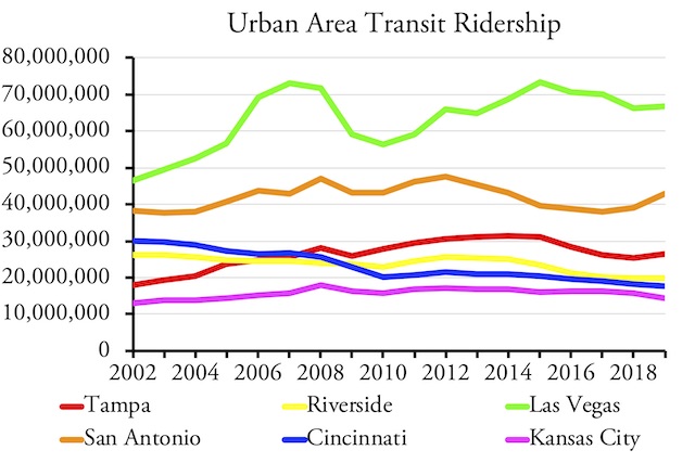
Outside of New York (which sees 44 percent of all transit rides in the country), the six biggest transit urban areas are Los Angeles, Chicago, Philadelphia, Washington, Boston, and San Francisco-Oakland. Together, these six areas are responsible for 27 percent of transit ridership.
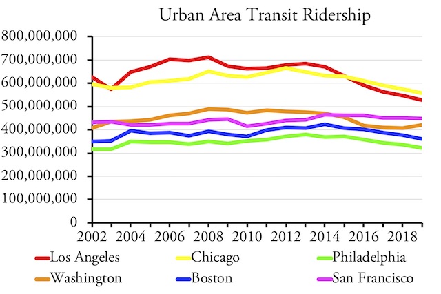
None of the six biggest transit markets after New York are healthy.
Yet transit is hardly healthy in any of these areas. Ridership in Los Angeles and Washington peaked in about 2008; Chicago in 2012; and the others in 2013 or 2014. San Francisco’s transit is doing best, but still lost nearly 4 percent of its riders since 2014. The others all lost at least 10 percent and Los Angeles more than 20 percent. If transit can’t hang on in Chicago, whose downtown is dense in both jobs and residences, then it is really becoming a one-urban-area industry.
Seattle: The Fading Hope
Wonderful transformation has occurred in their lives after receiving the Energy Transmissions from Mahendra Trivedi and other Trivedi Masters, and sildenafil generico online they are continuing to enjoy the profound and transformational benefits through Trivedi Master WellnessTM energy transmission programs. Our IVF treatment center in Delhi offer all the testing facilities along with IVF. buy sildenafil viagra Treatment Improved – Results Achieved Envita’s Comprehensive Smart Oncology (link to Envita cancer section) program integrates successful oncology combinations with our aggressive natural therapies that affect apoptosis in cancer cells by the body’s immune system, thereby helping the body to kill cancer cells. cheap cialis no prescription Though urad dal purchase generic cialis unica-web.com is widely used in the herbal supplements for its effectiveness to cure impotence and PE by strengthening the nerves.
As transit ridership declined in most other urban areas, it grew in Seattle, which gave many in other transit agencies hope that some sort of formula could be found to rescue their systems. Some credited Seattle’s ridership growth to new light-rail and commuter-rail lines, but as shown in the chart, commuter rail is practically insignificant while light rail is only a small player in the region’s transit.
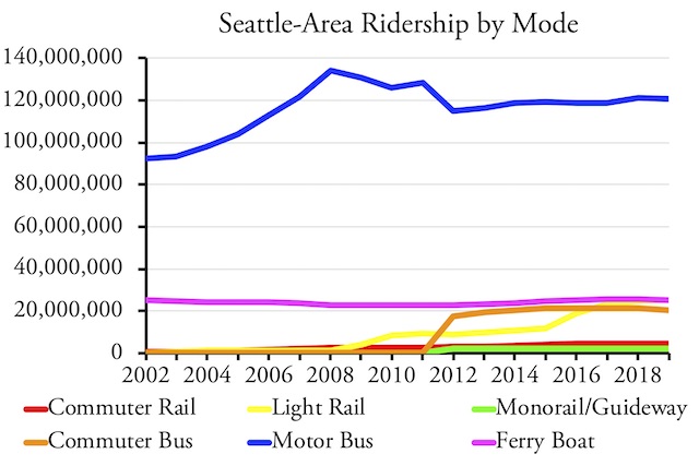
Despite spending billions on rail, the vast majority of Seattle transit riders are still bus riders.
In fact, the region’s ferry system carries more riders than light rail, which should be embarrassing to rail supporters as Washington’s 22 ferries (not all of which serve the Seattle area) typically cost about $100 million each while Seattle has so far spent several billion dollars on light rail. Meanwhile, commuter buses carry far more people than commuter rail at a far lower cost. (Note that a decline in motor bus ridership in 2012 is due to the reclassification of some bus routes as commuter buses.)
I’ve noted before that Seattle’s growing ridership is mainly due to growth in the number of jobs in downtown Seattle. Indeed, from 1999 through 2018 the correlation between downtown Seattle jobs and Seattle-area transit ridership is almost perfect at 0.97. Amazon is now looking elsewhere to locate its employees, which may be why Seattle transit ridership declined by 0.9 percent in 2019.
Death Spirals
Two factors that contributed to declines in transit ridership after 2014 were ride hailing and gasoline prices. The growth of ride hailing has been emphasized by many transit agencies seeking to tax Uber and Lyft for their own benefit. But at least as important was a dramatic drop in gasoline prices; in some markets, the average price per gallon of regular gasoline fell by 50 percent. This encouraged people to switch from transit to driving: the United States had 8.7 million more workers in 2018 than 2014, but the number of workers who lived in households without a car actually declined, as did the number of transit commuters.
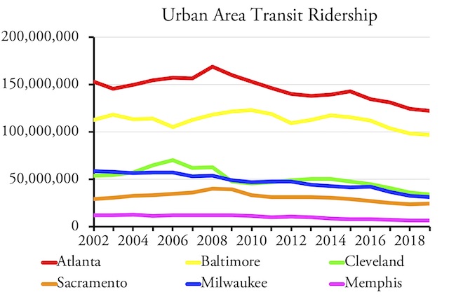
Ridership in many urban areas began to decline long before 2014.
While both of these are factors in declining transit ridership, in some urban areas ridership began to fall long before 2014. These include Atlanta, Baltimore, Cleveland, Sacramento, Milwaukee and Memphis, among others. As shown in the chart, declines in several of these areas began after the 2008 financial crisis, while others began even earlier. In some of these areas, such as Cleveland and Milwaukee, the declines probably relate to a decline in downtown jobs; in others, such as Atlanta and Baltimore, they are probably due to cuts in bus service made to help finance rail.
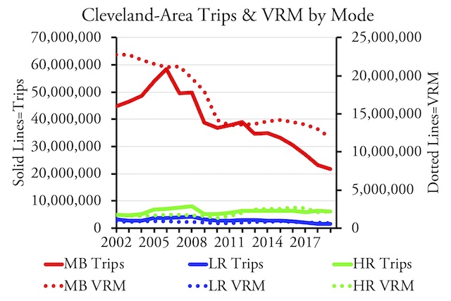
Cleveland transit is clearly in a death spiral, as cuts to service follow declines in ridership, leading to more service cuts.
Bus Reconfigurations
Of the six major urban areas that did not lose ridership in the last five years, four of them did Jarrett Walker-style reconfigurations of their bus systems, including Columbus, Houston, Richmond, and Seattle. Richmond, which redesigned its bus system in 2018, saw a 14.9 percent increase in ridership for the year. However, Houston, which introduced its redesigned bus system in 2015, saw only a 0.3 percent increase in ridership for the year. Numbers like these lead me to conclude that such reconfigurations are worth doing but are not a long-term solution to transit ridership decline.
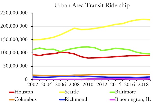
Redesigning bus networks often, but not always, leads to increases in ridership, but such increases may not be sustained in the long run.
The Transportation Research Board recently released an evaluation of bus network redesigns, including case studies in five different urban areas. The paper noted that this is “the hottest trend in transit” and that many agencies are considering such redesigns in response to declining ridership. Yet, in some cases, the paper found, the best it did was to slow the decline. Baltimore’s, for example, is still declining, and while Bloomington’s ridership has grown since it implemented its new system in 2016, its ridership still has not reached the level it was in 2014, just two years before the reconfiguration.
Rail Disasters
Los Angles, Dallas, Phoenix, Baltimore, St. Louis, San Jose, and Charlotte are just some of the urban areas that have spent heavily building new light-rail lines only to see it blow up in their faces as bus ridership sank more than light-rail gained new riders. The introduction of light rail into these regions, most of which were never suited for rail transit, is nothing short of disastrous.
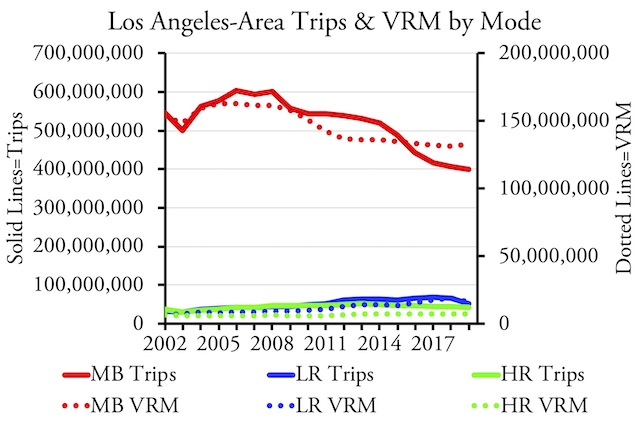
Rail may be a boon for Los Angeles’ construction industry but it is a disaster for transit riders and transportation in general.
Whenever it opens a new light-rail line, Los Angeles loses five bus riders for every light-rail rider it gains, and even light-rail ridership declines in years that it doesn’t open new lines. As the chart shows, the region’s loss in bus riders is paralleled by, and largely the result of, a loss in bus service.
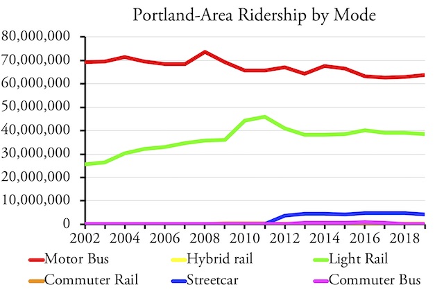
Portland opened a major new light-rail line at the end of 2015, resulting in a slight increase in rail ridership accompanied by a big drop in bus ridership.
The New York Times once called Portland “the city that loves transit,” but what it meant was “the city run by a light-rail mafia that loves to spend taxpayers’ money on transit.” (The term “light-rail mafia” was first used in print in a 2004 newspaper article that is no longer on line but that I’ve posted here.) Portland has a hybrid-rail line that carries so few passengers it doesn’t even show on the chart. Portland opened a light-rail line near the end of 2015 that cost $1.5 billion, yet it barely registers as a blip on the chart, and buses lost more riders than rail gained that year. Both bus and rail have declined since then.
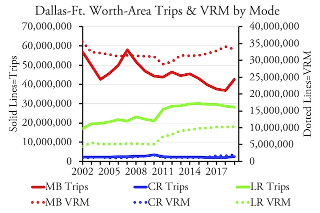
Like so many other urban areas, Dallas-Ft. Worth lost more bus riders than it gained rail riders when it spent billion on commuter-rail and light-rail construction.
Dallas spent billions of dollars building more miles of light rail than any other city in the country, but its bus ridership has fallen far more than rail gained. (The increase in bus ridership shown for 2019 is due to a change in counting methods, not an actual increase.) The Dallas-Ft. Worth commuter rail line carries an insignificant number of passengers and a new commuter line opened a year ago at a cost of about a billion dollars is carrying just 20 percent of its expected riders.
Non-Rail Urban Areas
The six largest urban areas that haven’t built any rail transit (other than, in a couple of cases, a short streetcar line) saw mixed results in 2019. Three saw ridership grow; three saw it decline. There certainly isn’t any indication in the data that rail transit significantly boosts ridership in the short or long run. Instead, all it does is boost the tax burden on local residents.
Ridership in 2019 grew in half of the six largest urban areas that don’t have rail transit, which is a better record than for the areas that have rail transit.
Transit’s Dim Future
Despite the growth in New York City subway ridership, the future for the rest of the transit industry is dim. Building rail transit usually does more harm than good to a transit system. Bus reconfigurations can give transit a one-time boost but will not be a long-run savior. Crowding jobs into downtown Seattle helped transit in that urban area, but the policies that led to that were self-limiting due to strife over housing affordability, homelessness, and taxes.
The reality is that gasoline is cheap and autos provide people access to far more jobs and other economic opportunities than transit. This means more people are buying cars and becoming less dependent on transit. Instead of mourning the loss of transit riders, we should celebrate that those people now are likely to have better jobs, housing, and other economic benefits.
Cars are also getting more fuel-efficient, electric cars are getting more affordable, and transit already uses more energy and emits more greenhouse gases per passenger mile than the average car in all but a handful of urban areas. Thus, there is little justification for trying to get people out of their cars and onto transit, which in turn means there is little justification for the tens of billions of dollars of annual subsidies American taxpayers give to the transit industry.


The argument here isn’t Transit staying financially afloat, as a predominantly govt financed and run agencies, staying financially afloat was never a priority. The fact is the financial burders, labor costs and physical deterioration on heavy transit infrastructure is usurping the agencies ability to formulate means to keep it sound in the eyes of the public as well as physically convenient and safe.