More Signs of the Transit Apocalypse

According to the Washingtonian, a transit advocacy group called TransitCenter “analyzed” the data and found that declining ridership on the Washington Metro system is “dragging down national ridership figures.” With the Metro’s numbers, the national total of heavy-rail riders is declining; without Metro, heavy-rail plus light-rail ridership is increasing. In other words, just give Metro $15 billion or so to restore its system and ridership will recover, both in DC and nationally.

I haven’t been able to find TransitCenter’s analysis, but I didn’t tried very hard because it is clearly out of date. TransitCenter used the National Transit Database to compare data for 2015 and 2016. But the database uses data from each agency’s fiscal year, and for most transit agencies, fiscal year 2016 ended more than a year ago. As the Antiplanner noted last week, the Federal Transit Administration has published ridership data through August, 2017, and it shows ridership declining in all major categories and in almost all major transit agencies and urban areas.

If that’s not enough, the American Public Transportation Association just published its second quarter ridership numbers. APTA collects its data separately from the FTA, though it later corrects its numbers if there are major discrepancies or gaps in its data that can be filled by the FTA numbers. In any case, the second quarter numbers confirm that, when compared with the second quarter of 2016, ridership declined for both light rail (which, in APTA’s world, includes streetcars) and heavy rail, as well as commuter rail, buses, and trolley buses. The only categories that did not decline were demand response (paratransit) and “other,” which includes people movers, monorail, ferries, cable cars, and van pools.

Continue reading

Protecting Cities in Fire-Prone Regions

If you live in a fire-prone area, which includes most of California, it is not a good idea to allow ivy and other plants to cover the sides of your building, as this winery and this church did near Santa Rosa. Both were lost to last week’s wildfires.

Similarly, if you are a legislator in a fire-prone state, it is not a good idea to outlaw fire-resistant developments. As now-retired Forest Service researcher Jack Cohen relates in the above video, one requirement for making your home fire-safe is to have no large flammable structures within 100 feet of the home. That pretty much means people should build on one-acre or larger lots. Continue reading

FTA Historic Times Series Through 2016

Since 1992, taxpayers have spent $364 billion (in 2016 dollars) on transit capital improvements. More than $257 billion of this went to rail transit, while $94 billion went to bus transit. The Antiplanner calculated this information on the Federal Transit Administration’s historic time series capital costs spreadsheet.

The official data show that transit ridership peaked in 2014 at 10.5 billion trips and by 2016 had declined 2.5 percent to 10.2 billion trips. This ridership includes urban, rural, and tribal transit agencies, but rural and tribal together add up to only about a million trips per year. The Antiplanner calculated this information on the Federal Transit Administration’s operations spreadsheet.

Tuesday’s post about the 2016 National Transit Database mentioned that the Federal Transit Administration has also posted the 2016 update to its historic time series, which has operating and ridership data back to 1991, capital costs back to 1992, and fares back to 2002 broken down by transit agency and mode. Except for the capital costs, which are in a separate file, all of the information is on worksheets that can be sorted in the same order, allowing users to make such calculations as operating cost per trip or fare per passenger mile. Continue reading

2016 Road Fatalities Increase by 5.6 Percent

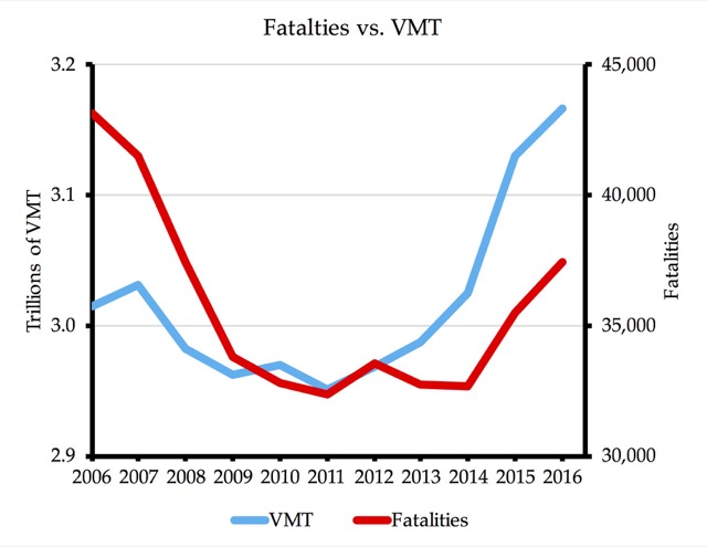
The National Highway Traffic Safety Administration (NHTSA) released its final calculation of 2016 crash fatalities, finding 37,461 traffic deaths, compared with 35,485 in 2015. The only good news is that the 5.6 percent increase was less than 8.4 percent increase from 2014 to 2015.

This is the highest number of traffic fatalities since 2007. After that year, there was a dramatic decline in fatalities to a low of 32,367 in 2011. Though fatalities had remained roughly constant at about 42,000 per year from 1995 to 2007, they suddenly declined by 10 percent in 2008 and another 10 percent in 2009. Fatality rates — deaths per billion vehicle miles driven — had been declining for more than a century, but traffic experts could not explain why there was a large decline in total fatalities in that two-year period. Continue reading

FTA’s 2016 National Transit Database

The Federal Transit Administration has posted its 2016 National Transit Database in the form of some two dozen Excel files. As in each of the past ten years, the Antiplanner has summarized some of the most important data in a single spreadsheet. This spreadsheet includes trips, passenger miles, fares, costs, vehicle data, rail miles, energy consumption, and greenhouse gas emissions (in grams) for every transit agency and mode of travel (rows 2 through 3798), totals for each mode (rows 3802 to 3820), and totals by urbanized area (rows 3851 through 4339). Because some of the smaller agencies were not required to report energy consumption, there are also totals for those systems for which energy consumption can be calculated (rows 3826 through 3844), making it possible to calculate average BTUs and greenhouse gas emissions per passenger mile.

In making this spreadsheet, I noticed some minor errors in my 2015 spreadsheet, mainly in some of the mode totals. So I’ve posted a revised version. It includes all of the calculations I’ve happened to make in the past year, including (in cells BH3644 through BK4150) a comparison of passenger miles by automobile vs. transit for each urban area. (Transit carried 11 percent of passenger miles in the New York urban area, 7 percent in San Francisco-Oakland, 4 percent in Honolulu, 3 to 4 percent in Chicago, Seattle, and Washington, 2 to 3 percent in Baltimore, Los Angeles, Philadelphia, and Portland, and under 2 percent just about everywhere else.) I won’t be able to make this calculation for the 2016 database until the Federal Highway Administration posts 2016 Highway Statistics.

In addition to the National Transit Database, the FTA has posted transit data tables in about a dozen different spreadsheets. The tables contain much of the same information but are a bit easier to read than the database, though a bit harder to use for mass calculations (especially since the spreadsheets have been “locked”). This year, some of the data tables come with interactive graphics, though they don’t seem to work on my Mac. Continue reading

August 2017 Ridership Down 4.0% from ’16

Last week, the Antiplanner reported that July 2017 transit ridership was 3.6 percent below the same month of 2016. Now the Federal Transit Administration has posted data for August 2017 showing that ridership for that month was 4.0 percent less than in August 2016.

Naturally, the Antiplanner has posted an enhanced version of this data file showing totals by year from 2002 through 2017, as well as totals by transit agency and for the 200 largest urban areas. The file also shows the change in transit riders in August 2017 vs. August 2016, January-August 2017 vs. same in 2016 as well as 2014 and 2010, and 2016’s total vs. the peak for each mode, transit agency, or urban area from 2008 through 2015.

These numbers have to be frightening transit industry leaders. Update: They are. Just comparing the first eight months of 2017 against 2016, ridership has fallen by more than 10 percent in Philadelphia, Milwaukee, Charlotte, El Paso, and Albuquerque, and nearly 10 percent in Miami, Cleveland, San Jose, and Raleigh, among other urban areas. Since this decline is, in most cases, on top of declines in 2016, we’re seeing 25 to 40 percent declines in some urban areas over the past few years.

Continue reading

Ready for More Subsidies

Amtrak has kicked off a “ready-to-build” campaign, making it clear that the money-losing company faces close to $30 billion in major infrastructure projects in the Northeast Corridor on top of the corridor’s $11 billion “basic infrastructure backlog,” meaning tracks, signals, and power facilities. In addition to the $20 billion Hudson River tunnels project, Amtrak wants to spend $5 billion on a new tunnel under Baltimore, $1.7 billion on a new Susquehanna River bridge, $1.5 billion on another new bridge in New Jersey, and unspecified billions more for building or rebuilding train stations in New York (which alone is costing more than $2 billion), Philadelphia, Baltimore, and Washington.

In short, taxpayers are looking at a bill of well over $40 billion just to keep the supposedly profitable Northeast Corridor running. Amtrak must believe that “ready to build” sounds like a more positive message than “we need at least $40 billion just to keep the wheels turning.” No doubt Amtrak is relying on the image it has create that its Northeast Corridor trains make money, when in fact they merely cover operating costs, not the costs of maintenance or depreciation. Adding maintenance and depreciation not only eliminates profits, it brings subsidies to at least 10 cents per passenger mile–and that’s before counting the $40 billion or so needed to bring the corridor up to a state of good repair.

Amtrak divides its operations into three categories: the Northeast Corridor, state-supported day trains, and overnight long-distance trains. In addition to claiming that the Northeast Corridor makes money, Amtrak strongly implies that subsidies to the day trains are entirely covered by the states, leaving only the long-distance trains requiring federal subsidies. In fact, before adding depreciation and maintenance, federal taxpayers fund more than 20 percent of the subsidies to the day trains, and after depreciation and maintenance, it is more than half. Continue reading

Ending Economic Apartheid

Thanks to its greenbelt and slow-growth policies, Boulder, Colorado is the nation’s most-expensive and least-affordable housing market of any city not in a coastal state. As a result, as noted in an op-ed in The Hill, the number of black residents in Boulder declined by 30 percent between 2010 and 2016, leaving less than 1.6 percent of the city with African-American ancestry.

Closer to my home, the Bend Bulletin argues that the state of Oregon “works against affordable housing by, among other things. . . artificially increas[ing] the price of land through its urban growth boundary system.” Although cities are required to maintain an inventory of developable land within their growth boundaries, the paper notes that permission to expand their boundaries takes years.

The Oregon legislature effectively admitted that this is a problem last year when it passed a law allowing two cities to develop land on up to 50 acres of land outside of their growth boundaries. But can anyone seriously believe that adding 100 acres of new housing will make housing more affordable in Oregon? Continue reading

Rail Runner Runs Away with Taxpayers’ Money

Commuter rail on existing tracks sounds seductively attractive at first glance. You don’t have to buy right of way or build new rail lines; you merely have to make a few upgrades and buy some used commuter cars and locomotives and–voila!–you have a hip new rail transit line to attract Millennials to your urban area.

If politicians ever did more than take a first glance at these projects, they would realize that it never works out that way in practice. Costs are a lot higher than expected, and even if you only run a handful of commuter trains a day going a maximum of 40 miles per hour, the feds have added to your costs by requiring you to install the same positive train control systems designed to handle the hundreds of 110-mph trains per day that use the Northeast Corridor.

Worse, existing freight lines rarely go where people want to go, so ridership is often low and fares sometimes cover less than 10 percent of operating costs, and of course zero percent of capital costs. Orlando’s SunRail fares aren’t even enough to pay for the ticket machines, much less any of the costs of operating the trains themselves. Continue reading

July 2017 Transit Riders Drop 3.6% from 2016

Nationwide transit ridership continues to decline, and that decline, if anything, is accelerating. Ridership in July 2017 was 3.6 percent lower than the same month in 2016, while ridership in the first seven months of 2017 was 3.0 percent lower than the same months in 2016. These numbers are from the National Transit Database monthly data reports.

The monthly reports have every month from January 2002 through July 2017. The Antiplanner has summed the data by year, and also summed the first seven months of 2016 and 2010 for comparison with 2017. At the bottom of the original spreadsheet, the Antiplanner has also summed the data by transit agency (rows 2100-3098) and for the 200 largest urbanized areas (rows 3102-3301). Finally, columns HH through HJ calculate the percentage change from July 2017 vs. July 2016; January-July change from 2016 to 2017; and the January-July change from 2010 to 2017. Data junkies are welcome to download this 7.7-MB Excel file.

As shown in the table below, of the nation’s 100 largest urbanized areas, only a handful enjoyed ridership gains for all three time periods considered: Houston, Minneapolis-St. Paul, New Orleans, McAllen (TX), Albany, Columbia (SC), and Colorado Springs. Houston’s ridership may have grown since 2010, but its 2010 ridership had fallen by more than 20 percent since 2006, and 2017 numbers were still well short of 2006. Previous reports had shown Seattle ridership growing, but that region’s ridership declined by 1.8 percent in July 2017 vs. July 2016. Update: I am reliably informed that the Seattle decline is solely due to an error in the data. It should be corrected by FTA’s August update. Continue reading